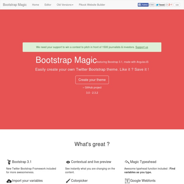


http://pikock.github.io/bootstrap-magic/index.html
Jeditable - Edit In Place Plugin For jQuery Hi! My name is Jeditable and I am inplace editor plugin for jQuery. With few lines of JavaScript code I allow you to click and edit the content of different html elements. I am based on Dylan Verheul’s editable. For those in hurry download latest source or minified. Flippant.js Heading Donec id elit non mi porta gravida at eget metus. Fusce dapibus, tellus ac cursus commodo, tortor mauris condimentum nibh, ut fermentum massa justo sit amet risus. Etiam porta sem malesuada magna mollis euismod. Donec sed odio dui. Modal » Card »
Eric Meyer's css/edge Please note that none of the demonstrations in css/edge are intended to work in Navigator 4.x. I say this not to denigrate that browser, but instead to spare you any frustration you might otherwise feel. This site exists to explore the cutting edge of HTML+CSS design, and Navigator 4.x is, at four years and counting, just too old to keep up with most things that will be done here. Bootstrap Date/Time Picker Introduction Simple date/time picker component based on the work of Stefan Petre, with contributions taken from Andrew Rowls and jdewit. Demo Code: Similar to above example, but in US date/hour format:
Bootstrap Material Material Design for Bootstrap is a theme for Bootstrap 3 which lets you use the new Google Material Design in your favorite front-end framework. If you like this project you can support me by donating something on Gratipay, starring this repository, or reporting bugs and ideas. Read more about Material Design for Bootstrap at the Github page. If you want support the development of this project please consider donate something: Donate with Gratipay Thanks to all the people that donate me weekly on Gratipay and all the ones which has donated on PayPal!
DevDocs/HTML HTML, which stands for HyperText Markup Language, is the most basic building block of a webpage and used for creating and visually representing a webpage. It determines the content of a webpage, but not its functionality. HTML adds "markup" to standard English text. Justified Gallery Category: JQuery plugin Release Date: 10/2012 Technologies: Javascript, CSS, HTML, JQuery
How to install php-login on Windows 7 / 8 - Dev Metal In this tutorial we’ll work through the installation process of “php-login” (a user authentication system, and it’s my project btw) under Windows 7 (which is basically the same as in Windows 8 and 8.1). This tutorial has been created in addition to the official installation tutorial for Ubuntu 12.04 LTS as lots of people develop locally under Windows. Some things first: PHP applications usually run on linux servers, so it’s very useful and very clean to develop on a linux server. There’s absolutly no need to develop on a real live server (security, costs, remote problems, etc.), instead virtual machines are the way to go: There’s an excellent software called Vagrant, letting you easily setup real linux servers on your local computer within seconds, servers that can exactly represent your production server.
User Cake Welcome to Usercake, a simple and secure user management system. Docs What is UserCake? UserCake is a free, open source user management framework designed in PHP. It is meant to be a foundation upon which web applications which involve user management can be quickly and easily developed. Bootstrap datetimepicker Note All functions are accessed via the data attribute e.g. $('#datetimepicker').data("DateTimePicker").FUNCTION() Minimum Setup Essential jQuery Plugin Patterns Advertisement I occasionally write about implementing design patterns1 in JavaScript. They’re an excellent way of building upon proven approaches to solving common development problems, and I think there’s a lot of benefit to using them.
Bootbox.js—alert, confirm and flexible modal dialogs for the Bootstrap framework Bootbox.js is a small JavaScript library which allows you to create programmatic dialog boxes using Bootstrap modals, without having to worry about creating, managing or removing any of the required DOM elements or JS event handlers. Here’s the simplest possible example: bootbox.alert("Hello world!") Introduction - Documentation - Spine Spine is a lightweight framework for building JavaScript web applications. Spine gives you an MVC structure and then gets out of your way, allowing you to concentrate on the fun stuff, building awesome web applications. Spine is opinionated in its approach to web application architecture and design. Spine's architecture complements patterns such as de-coupled components and CommonJS modules, markedly helping with code quality and maintainability. The library is written in CoffeeScript, but doesn't necessarily require CoffeeScript to develop applications.
API When working with TableTools, there will be times when you want to interaction with it more than just setting up buttons and actions for them. You might want to modify the data set used for file exporting, or work with the row selection options that TableTools provides. For this you should use the API.