
Build a Killer Website: 19 Dos and Don'ts | Inc.com - Aurora I’m continually surprised by how many people call my design company with very firm ideas about what they want on their business website and yet, they haven’t thought through some of the most basic questions first. For this reason, our first question is always “Why do you need a site?,” not “What do you want on it?” At bottom your website is a marketing tool. Here’s my quick-hit list of the top dos and don’ts before you get started: Do: Set smart goals. Don’t: Do it yourself. Anatomy of a Perfect Landing Page · Formstack Placement and Content 7. Keep It Above the Fold The space a visitor sees without having to scroll is where the most important parts of the webpage should be. Place the call-to-action button above the fold and in a location where the viewer's eye will scan to. 8. Optimize a landing page for conversion over time. 9. Implementing motivational speeches, videos of user testimonials, and product images into a home page can have a positive impact on viewers, as well as give shoppers an extra push to look further into a product. Bellroy uses great imagery and videos on many of their pages. 10. Links connecting the user to a bunch of other sites or pages will distract them and have a negative impact on conversions. This landing page is designed well, but look at all those header links getting in the way of the message!
Principles for good navigation design Navigation encompasses the range of ways a user may move around a web site, and the tools designers offer to help them. Good navigation needs to complement the information architecture, and be totally clear. Principles for good navigation design A site must: 1. ‘Signposting’ is part of navigation (how can you navigate somewhere if you don’t know where you’re starting from). Where navigation includes “where you are now”, it must be clearly indicated. Note: Tabs naturally show “here” from “there”. 2. When navigation is apart from content, differentiate through complete physically separation, grouping and/or style from content. When links are within content, you have to use style to differentiate. 3. It must be obvious at a glance where I can go from here. 4. Being able to see pages you’ve already visited helps you to filter where you might want go now. HTML differentiates between unvisited and visited links by default. 5. 6. The target of a link must be obvious. i.e. e.g. e.g. inShare4
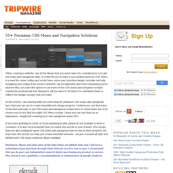
Mastering CSS Coding: Getting Started Advertisement CSS has become the standard for building websites in today’s industry. Whether you are a hardcore developer or designer, you should be familiar with it. Overview: What We Will Cover Today We’ll start with what you could call the fundamental properties and capabilities of CSS, ones that we commonly use to build CSS-based websites: Once you are comfortable with the basics, we will kick it up a notch with some neat tricks to build your CSS website from scratch and make some enhancements to it. 1. Most beginners get padding11 and margins12 mixed up and use them incorrectly. What Is Padding and Margin? Padding is the inner space of an element, and margin is the outer space of an element. The difference becomes clear once you apply backgrounds and borders to an element. Take a look at the visual below: Margin and padding values are set clockwise, starting from the top. Practical example: Here is an <h2>heading between two paragraphs. Margin and Padding Values Quick Tip 2. 3. 4. 5. 6. 7.
Six Key Lessons from a Design Legend (a before-and-after) | GiftRocket Blog When we first built GiftRocket 1.0, our team was absent designers. As the only one without a CS degree, I ended up spending a few weeks reading design books and mocking up the site before our March launch. Eventually we recruited a professional designer named Mike Kus to help us out. We liked his emphasis on large text, illustration, and simplicity. He redesigned our site and we released the results last week. I did a quick comparison of the before and after, and wanted to point out some things any developer can do to improve the feel of their site. 1. We were extremely conservative when we started, So we made the site… blue and gray. Mike, experienced and unhesitant, presented the cream, gold, and black palette we currently use. 2. We suffered from two contrast issues. Mike approached the app as a cousin to the website, using the same branding but inverting colors and layout. 3. Our Yelp business icons started out tiny at 60px by 60px. 4. 5. 6. Mike applied them everywhere on the site.
HTML5test - How well does your browser support HTML5? 7 Tips for a Polish Web Page Different web designers make use of simple techniques to allow their web page to stand out. Here are 7 tips that I have made use of for one of the mock ups I’m working on. It’s the little, subtle things that really make the biggest difference. Just a note, this article is not for advanced users, but it is good to have a re-read about it. 1. Anti-aliasing improves reading speed and accuracy. 2. Blend modes give us different ways for a layer to interact with, or "blend" with, the layer or layers below it. 3. By adding 1 pixel of stroke to your layout, makes a whole lot of difference by making your site stand out. 4. Another great way for your page to stand out is by adding a subtle shadow along the edges of your page. 5. Whenever you have a box with transparency on top an image, try blurring only the portion of the image below the box. 6. You may not have noticed that images and icons lose their clarity when you resize or rotate them. 7.
Color Theory 101 First impressions are everything. How you look and how you present yourself can determine how you are perceived. The same goes for our design work. The impression that our work gives depends on a myriad of different factors. One of the most important factors of any design is color. Color reflects the mood of a design and can invoke emotions, feelings, and even memories. Figuring out which colors work well with others isn’t just a matter of chance. Primary Colors Colors start out with the basis of all colors, called the Primary Colors. Secondary Colors If you evenly mix red and yellow, yellow and blue, and blue and red, you create the secondary colors, which are green, orange and violet. Tertiary Colors Tertiary colors are made when you take the secondary colors and mix them with the primary colors. So, now that you know how colors are made, you can understand how the color combinations on the color wheel model work. Complimentary Colors Analogous Colors Triads Split Complimentary Colors Red
The Anatomy of a Perfect Landing Page - Formstack - Aurora Placement and Content 7. Keep It Above the Fold The space a visitor sees without having to scroll is where the most important parts of the webpage should be. Place the call-to-action button above the fold and in a location where the viewer's eye will scan to. Never have the button or form in a place where it has to be searched for. 8. Optimize a landing page for conversion over time. 9. Implementing motivational speeches, videos of user testimonials, and product images into a home page can have a positive impact on viewers, as well as give shoppers an extra push to look further into a product. Bellroy uses great imagery and videos on many of their pages. 10. Links connecting the user to a bunch of other sites or pages will distract them and have a negative impact on conversions. This landing page is designed well, but look at all those header links getting in the way of the message!
25 Creative and Cool T-Shirt Designs – Part 2. Collection of ‘Creative and Cool T-Shirt Designs' from all over the world. Apartment Building T-shirt: Designed by SQY-T designer Yan Hu, it is a part of the "Skin and the City" collection. T-shirt Designs by Shikisai: The designers are incorporating the interactivity and the sense of fun through the use of black print on white surface. Rita T-shirts: "Carry less. Wi-Fi Detector T-shirt: You don't need to open your laptop to check the Wi-Fi signal status; this interactive t-shirt with a built-in Wi-Fi signal detector will do it for you. Equation T-shirt: Wet Pixels T-shirt: "The design features a pixelated paint bucket symbol spilling paint down the top". Intern T-shirt: These creative t-shirts were given out to new interns at a New York advertising agency to prepare them for the intense training. Come To The Dark Side, We Have Cookies T-shirt: Hi, and your name is? Ninja! We're only Human T-shirt: Zoo Safari T-shirts: Creative t-shirts were designed to promote Zoo Safari in Brazil.
Email Marketing and Email List Manager | MailChimp - Aurora Playtype | Typographer's Glossary Serif: Serif's are semi-structural details on the ends of some of the strokes that make up letters and symbols. A typeface that has serifs is called a serif typeface (or seriffed typeface). Some of the main classifications of Serif type are: Blackletter, Venetian, Garalde, Modern, Slab Serif, Transitional, and Informal. Fonts in each classfication share certain similiar characteristics including the shape or appearance of their serifs. Serif fonts are widely used in traditional printed material such as books and newspapers. 24 Must-Have Social Media Marketing Tools Are you looking for ways to enhance your social media marketing? Do you want new tools to simplify your job? We asked a group of social media pros for the hottest social media tools they use today. Check them out to see if these social media tools are a good fit for you! #1: Unlock to Share Plugin My favorite social marketing tool of all time is the unlock to share plugin. Make your site go viral by requiring the user to share your link to unlock content. Why is this so valuable? In my most recent experiment, I had 452 people land on a page where they had access to royalty-free music they could use in their videos. These unlock to share plugins are everywhere. James Wedmore, co-founder of Video Traffic Academy and founder of Video Sales Magic and Video Copy Pro. #2: SlideShare This isn’t a “new” tool, but I’m amazed by the number of marketers who still don’t use SlideShare as a main staple in their social media distribution. #3: Commun.it #4: YouTube’s Audience Retention Report #5: Cyfe #6: Cloze