
David Rumsey Historical Map Collection | The Collection Tour Builder Important: As of July 2021, Google Tour Builder is no longer available. On July 15, 2021, Tour Builder was shut down and the following associated data will be deleted: Links to tours that you created or were shared with you Publicly available tours Information in the Tour Builder Gallery If you want to create new 3D maps and stories about places that matter to you, use the expanded functionality of Google Earth’s creation tools. About Tour Builder When Tour Builder launched in 2013, Google wanted to share a web-based tool that made it easy to add and share photos and videos to a sequence of locations on Earth. With Projects, you can turn our digital globe into your own storytelling canvas and collaborate with others through Google Drive. Learn about Google Earth & Google Earth Pro You can learn more with the Google Earth help center articles and frequently asked questions.
History in Motion How Far Is It Between This tool can be used to find the distance between two named points on a map. You can decide which two points to measure and then find out the distance between them as the crow flies and distance when driving. Type in the names of the places below and click the Show button. [15th July 2018] Unfortunately, due to a large price increase in back-end services, we can no longer offer some features on this page. How to Use Simply type in the name of the two places in the text boxes and click the show button! The best format to use is [City, Country] to enter a location - that is [City(comma)(space)Country]. When you click the search button, a search will be made to find which place you are referring to. Once a result is returned, you can copy a URL to use as a permanent link back to the result for your own reference or to pass on to other people. Note : For ZIP Codes, use Distance Between ZIP Codes, For UK Postcodes, use the UK Postcode distance tool. About How Far is it Between Known Issues
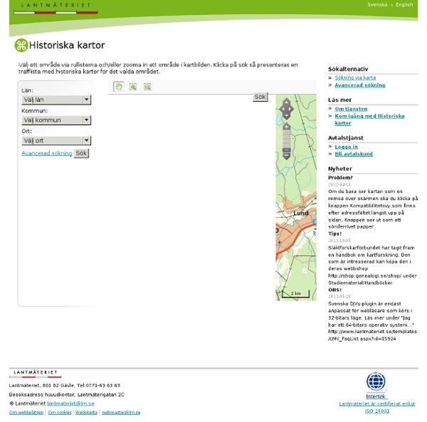
Digitala kartor och källkritik Digitala kartor förändrar undervisningen Den digitala tekniken har fullständigt revolutionerat användningen av kartor, inte minst inom skolans undervisning. Tidigare var vi lärare hänvisade till de väggkartor som råkade finnas i klassrummet, de kartböcker skolan hade köpt in, de kartbilder som fanns i läroböckerna samt de köpta eller egenhändigt tillverkade overhead-bilder vi hade tillgång till. Antalet möjliga kartor att studera i klassrummet var därför starkt begränsat. Genom internet och annan digital teknik har både lärare och elever tillgång till ett mycket stort antal kartor från i stort sett hela världen på ett sätt som var helt otänkbart tidigare. Kompletterar de tryckta kartorna Kartor i tryckta böcker (till exempel en skolatlas eller en lärobok) följer oftast en gemensam standard när det gäller layout, färger och symboler, något som underlättar förståelsen. Hur kan vi bedöma trovärdigheten? Även kartor kan innehålla värderingar Manipulering av digitala kartor
40 maps that explain the world By Max Fisher By Max Fisher August 12, 2013 Maps can be a remarkably powerful tool for understanding the world and how it works, but they show only what you ask them to. So when we saw a post sweeping the Web titled "40 maps they didn't teach you in school," one of which happens to be a WorldViews original, I thought we might be able to contribute our own collection. Some of these are pretty nerdy, but I think they're no less fascinating and easily understandable. A majority are original to this blog, with others from a variety of sources. [Additional read: How Ukraine became Ukraine and 40 more maps that explain the world] Click to enlarge. 32 maps that will teach you something new about the world EVER THOUGHT TO YOURSELF, “How many smaller countries could you fit into Australia?” Or possibly, “Which countries in the western hemisphere have legit secessionist movements?” Or, perhaps most pressing of all, “Where does it pay best to be a lifeguard?” We live in the age of the map now, so these are no longer questions you have to continue simply wondering about. Maps are spectacular at conveying a lot of information in a simple image. h/t: Thanks to the MapPorn subreddit for being a great resource for both finding maps and for getting criticism and analysis of those maps.
40 Maps That Will Help You Make Sense of the World If you’re a visual learner like myself, then you know maps, charts and infographics can really help bring data and information to life. Maps can make a point resonate with readers and this collection aims to do just that. Hopefully some of these maps will surprise you and you’ll learn something new. A few are important to know, some interpret and display data in a beautiful or creative way, and a few may even make you chuckle or shake your head. If you enjoy this collection of maps, the Sifter highly recommends the r/MapPorn sub reddit. You should also check out ChartsBin.com. 1. 2. 3. 4. Pangea was a supercontinent that existed during the late Paleozoic and early Mesozoic eras, forming about 300 million years ago. 5. 6. 7. 8. 9. 10. 11. 12. 13. 14. 15. 16. 17. 18. 19. 20. 21. 22. 23. 24. 25. 26. 27. 28. 29. 30. 31. 32. 33. 34. 35. 37. 38. 39. 40. *Bonus* World Map Tattoo with Countries Visited Coloured
Atlas for a Changing Planet Understanding natural and human systems is an essential first step toward reducing the severity of climate change and adapting to a warmer future. Maps and geographic information systems are the primary tools by which scientists, policymakers, planners, and activists visualize and understand our rapidly changing world. Spatial information informs decisions about how to build a better future. Scroll down or click below to explore a sampling of maps from Esri's ArcGIS Online resource on these themes: 1. 2. 3. 4. 5. Photo by DAVID ILIFF. Tap for details Swipe to explore Tap to get back to the Map Swipe to explore For hundreds of millions of years, carbon has cycled through the Earth and its atmosphere, oceans, and biosphere. Click on the map for details. Source: European Space Agency (ESA) Climate Change Initiative (CCI) Forests are a carbon sink—they absorb more carbon than they release via photosynthesis. This map features world forests and is derived from Landsat data. Source: Esri, Mark J.
new map [MapFab.com] MapFab.com is a google maps editor. It offers you a clever way to create and share Google Maps. Your map was successfully stored on the server. Press the right mouse key to end drawing. Remove a vertex by right clicking on it. Don't show this message again. Draws a line that follows the course of a road. Don't show this message again.