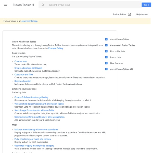
Create with Fusion Tables - Fusion Tables Help
Creating Animated Bubble Charts in D3 - Jim Vallandingham
Update: I moved the code to its own github repo - to make it easier to consume and maintain. Update #2 I’ve rewritten this tutorial in straight JavaScript. So if you aren’t that in to CoffeeScript, check the new one out! Recently, the New York Times featured a bubble chart of the proposed budget for 2013 by Shan Carter . It features some nice, organic, animations, and smooth transitions that add a lot of visual appeal to the graphic. As FlowingData commenters point out , the use of bubbles may or may not be the best way to display this dataset. In this post, we attempt to tease out some of the details of how this graphic works. #Simple Animated Bubble Chart In order to better understand the budget visualization, I’ve created a similar bubble chart that displays information about what education-based donations the Gates Foundation has made. You can see the full visualization here And the visualization code is on github The data for this visualization comes from the Washington Posts DataPost .
Open Data Kit » Use
To use ODK, you need to do three things -- design a form, setup a server, and connect the device to that server. Once those three things are done, you'll be ready to start data collection. You'll need three tools: Build or XLSForm -- to design your survey form.Collect -- running on an Android device to download and fill-in the survey.Aggregate -- for hosting the survey form and gathering the survey results. If any of this sounds complicated, we promise it's not! Below is a demo video of Collect, our Android-based data collection client.
GitHub - rkhatib/topotext
Travail Pratique 6 : Google Fusion Tables - udemgeo6352h12rochevincent
Résumé Lors de ce travail pratique nous découvrons et apprenons à utiliser l'outil Google Fusion Tables. Dans un premier temps, nous travaillons avec une base de données existantes sur GeoNames. Nous avons pris l'exemple de l'Égypte comme pays d'Afrique du Nord. Utilisation de cet outil Visualisation Nous voyons ci-dessous une carte qui indique le nombre moyen de cigarettes consommé par un adulte par année et par pays. Cigarettes per adult per year Cigarettes per adult per year Ce gadget permet de visualiser l'information sous la forme d'une carte d'intensité. Pour ce gadget, nous accédons à un camembert qui représente toujours la même information. Fusion de deux tableaux Dans cet exemple, nous utilisons deux tables publiques existantes(NRDC Water-Related Effects of Climate Change & US Cities). Pour accéder à la nouvelle table, cliquez ici. City and Climate City and Climate Infos-bulles Données GéoNames Dans cette exemple nous utilisons une base de données provenant du site Géonames. Conclusion
Gapminder: Unveiling the beauty of statistics for a fact based world view.
nodegoat
Travail Pratique 6: Google Fusion Tables - udemgeo6352h12amadorohtenrodrigo
GeoNames Dans cet exemple nous utilisons une base de données de GeoNames sur la Mauritanie. L'abréviation de ce pays est "MR" (cliquez ici pour télécharger la base de données originales). Cliquez ici pour visualiser la table utilisée dans cet exemple sur la Mauritanie. Dans cet exemple, nous allons produire une carte marquant la localisation des aéroports en Mauritanie. Dans la base de données un marqueur représentant la localisation d'un aéroport est codé par l'expression "AIRP" sous le champ "Feature code" dans notre table. Plus précisement, l'expression "AIRP" désigne la chose suivante: «A place where aircraft regularly land and take off, with runways, navigational aids, and major facilities for the commercial handling of passengers and cargo». Pour ne disposer que des marqueurs pour la localisation des aéroports nous appliquons le filtre suivant: Feature code = AIRP Cela nous permet d'afficher uniquement les marqueurs satisfaisant cette condition (19 marqueurs). <? Voici la carte résultante:
Gephi, an open source graph visualization and manipulation software
Related:
