
Color Wheel Pro: Color Meaning Red Red is the color of fire and blood, so it is associated with energy, war, danger, strength, power, determination as well as passion, desire, and love. Red is a very emotionally intense color. It enhances human metabolism, increases respiration rate, and raises blood pressure. It has very high visibility, which is why stop signs, stoplights, and fire equipment are usually painted red. Red brings text and images to the foreground. Light red represents joy, sexuality, passion, sensitivity, and love. Orange Orange combines the energy of red and the happiness of yellow. To the human eye, orange is a very hot color, so it gives the sensation of heat. Orange has very high visibility, so you can use it to catch attention and highlight the most important elements of your design. Dark orange can mean deceit and distrust. Yellow Yellow is the color of sunshine. Yellow produces a warming effect, arouses cheerfulness, stimulates mental activity, and generates muscle energy. Green Blue Purple White
Color Palette Generator Color Palette Generator #ffeeff #ffccdd #eeaaaa dull #33aa77 #ffeeee #ffbbdd #ff7799 vibrant URL of image: Make color schemes. If you like this you might also like my logo maker All Tools Biorhythms Business Card Generator Calendars, Printable Swiss Style Color Hunter Color Palette Generator Color Picker Comic Strip Maker Crapola Translator Drawmigo Favicon Generator Flickr RSS Feed Generator Free PDF Cards IMG2TXT Invent-a-Word Landscape Art Bot Logline Library Logoshi Logo Maker Pixel Art Generator Rainbow Words ROT13 Subwords! Reference ASCII Table Current Stamp Price Filler Text & One Liners Jedi Robe Pattern Recipes Special Characters URL Encoded Chars © 1999 - 2024 DeGraeve.com
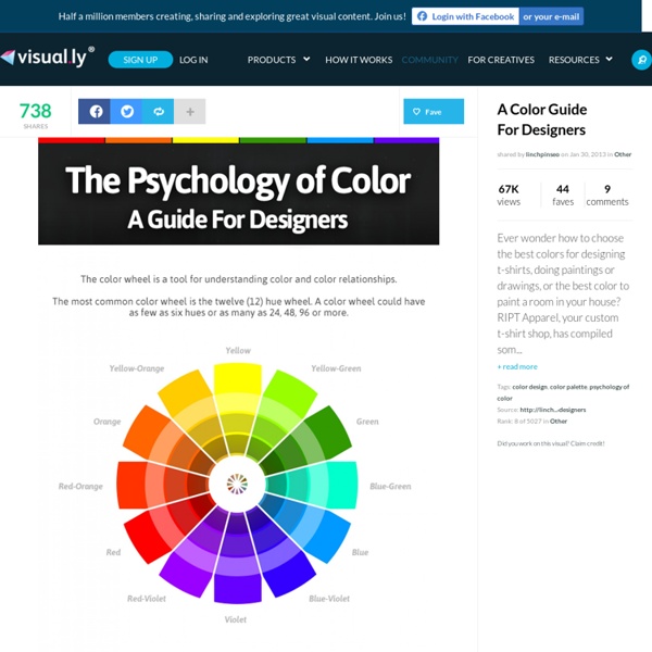
Basic Color Theory Color theory encompasses a multitude of definitions, concepts and design applications - enough to fill several encyclopedias. However, there are three basic categories of color theory that are logical and useful : The color wheel, color harmony, and the context of how colors are used. Color theories create a logical structure for color. The Color Wheel A color circle, based on red, yellow and blue, is traditional in the field of art. There are also definitions (or categories) of colors based on the color wheel. Primary Colors: Red, yellow and blueIn traditional color theory (used in paint and pigments), primary colors are the 3 pigment colors that cannot be mixed or formed by any combination of other colors. Secondary Colors: Green, orange and purpleThese are the colors formed by mixing the primary colors. Tertiary Colors: Yellow-orange, red-orange, red-purple, blue-purple, blue-green & yellow-greenThese are the colors formed by mixing a primary and a secondary color. Color Harmony 1. 2.
Effective Use of Color Psychology in Web Design Colors are vital elements it web designing. It can make a site look visually attractive. It is important for web designers to consider colors for it can greatly influence the site and the visitors as well. The choice of colors has different effect to a person. That is why one should think before choosing the color to use. Different colors influence the mood and state of the human mind. 1. The color red is considered as the hottest and most dynamic color. View Site Finer Home uses red as its primary color and is made even more appealing with the use of floral patterns. View Site Also using patterns and two shades of red for its stripe background, Holiday To Go succeeded to make the site look more inviting for costumers. 2. The color orange can show comfort, creativity, celebration, fun, youth, and affordability. View Site Colourpixel managed to use different shades of orange for their site which make it look creative and vibrant. View Site 3. View Site View Site 4. View Site View Site 5. View Site
5 tips for choosing the right typeface There are thousands of paid-for and free fonts now available for creatives to choose from. However, when it comes to picking a typeface, you can't rely on gut alone. Making the right choice depends on function, context and a whole host of other factors. But how do you ensure you're going about it the right way? With these pointers, you won't go far wrong... 01. Always think about function as well as form. 02. Type should be in your consciousness, not something you only think about when you need to use it. 03. Always test your type in ways that are relevant to the project. 04. Like any design decision, typeface selection needs to be the result of effective thinking. 05. If you're trying to pair two typefaces, start by defining what you want to achieve: are you aiming for harmony or contrast? The tips are taken from an article that originally appeared in Computer Arts issue 237. Words: Anne Wollenberg
색상 휠 | 색상 구성표 색상 규칙 유사단색삼각형보색혼합음영사용자 정의 기본 색상으로 설정기본 색상기본 색상으로 설정기본 색상으로 설정기본 색상으로 설정 Name Color Rules of Thumb "I just wanted to send you a quick email on behalf of some of the children I volunteer with at the Family Nature Club here in Utah. We've been reviewing some resources on the Internet for our science projects and came across your page and found it extremely helpful! As a thank you, a couple of the kids wanted to send you back another page they found about eco-friendly wall painting that they thought you might want to add to your site because it could help you and your visitors as well They've actually been using it as much as your page to complete their project and thought it would be exciting to see it up on the same page as where they got the information from your site that helped them so much. I even offered Jenny, the student that presented it to me, extra credit if you wanted to help us! Would you be able to consider adding it for them? Top Top
Mammoth Watercolour for Illustrator ~ Display Fonts on Creative Market $200 worth of BRAND NEW goods! Lovingly packed into a $50 Giant Watercolour Kit :) I'm spreading the love! Brace yourself...for the all-new, MAMMOTH Watercolour Media-Maker Kit......FOR ILLUSTRATOR! Equipped with just this pack - you will be an unstoppable watercolour design machine...without even picking up a paint brush :) Make greetings, logos, packaging, invitations, stationery, merchandise, posters, websites, digital presentations and more....You need nothing else! What to see what you can do? ♥♥♥♥♥ This Utterly MAMMOTH Kit Includes : ♥♥♥♥♥ (See a visual representation of whats listed below, via the images you see above - click them and scroll down, to see it all!) VECTORS! WATERCOLOURS! FONTS - YES...FONTS!! HOT FOILS 8 New Foils Styles - because who can live without foil right now? TRENDY PATTERNS 6 Super-Trendy Watercolour-Ready Vector Pattern swatches : DOTS,STRIPES,CHEVRONS....stay with whats in fashion and you are set! So there you have it! Have Fun!!
+ 70 infográficos que todo designer DEVE conhecer | DESIGN on the ROCKS Informação é tudo, mas como temos muitos assuntos que precisamos conhecer, uma solução prática é criar um infográfico. Este post não só é um post de referências bacanas de infográficos, mas também uma fonte de informação onde podemos aprender sobre vários assuntos relevantes para quem trabalha com criatividade, design e arte. Confiram abaixo e boa golada! Compartilhe Comentários comments Compartilhe Sobre o autor Designer apaixonado pelo que faz, fundador e editor do DESIGN on the ROCKS. Veja todos os artigos deDomenico Justo Logar Assine os comentários de posts deste blog através... Feed RSS Assine via email Assinar Seguir a discussão Logando... Fechar Logar no IntenseDebate Or create an account Cancelar Logar WordPress.com Lost your password? Painel | Editar perfil | Sair Logado como Commenting Disabled Commenting on this page has been disabled by the blog admin. Comments by IntenseDebate ©Design on The Rocks Site desenvolvido por Smuzi
Color Think Tank - the psychology of color Our personal and cultural associations affect our experience of color. Colors are seen as warm or cool mainly because of long-held (and often universal) associations. Yellow, orange and red are associated with the heat of sun and fire; blue, green and violet with the coolness of leaves, sea and the sky. Although red, yellow and orange are in general considered high-arousal colors and blue, green and most violets are low-arousal hues, the brilliance, darkness and lightness of a color can alter the psychological message. Colors act upon the body as well as the mind. People will actually gamble more and make riskier bets when seated under a red light as opposed to a blue light. For most people, one of the first decisions of the day concerns color harmony. How often have you caught your breath at the sight of a flowerbed in full bloom? Color is light and light is energy. An executive for a paint company received complaints from workers in a blue office that the office was too cold.
Colors Tutorial The Psychology of Color Reprinted from Vol 5-1 of the BT Journal In wildlife photography, I think the psychology of color plays an overwhelming role in the success of an image to communicate. I've waited a long time to present this piece and I can't think of a better time than with the Journal's first color issue to bring you what I think are critical concepts for success. Advertising-grabbing the attention of the buyer to buy one's product. In a sense that's exactly what we're attempting to do with our photographs. When I was in college, I took a class that was just about color in advertising. There's an age-old adage that when photographing birds, if you don't have a good background, find something green to put behind them. The Basic Psychology of Color With the human brain able to distinguish over two hundred shades of white, able to see the same color no matter the light source, saying color is essential to our perception is no slight exaggeration. Red - is a bold color that commands attention! top of page
Color Emotion Guide DELL JPMorgan DIVERSITY Nikon ups IMDB BOL SUBWAY NBC DIVERSITY SUBWAY ebay BEST BUY DHL Hertz amazon Sprint TRUST IKEA PENNZOIL NBC monster - Your calling is calling - Google NATIONAL GEOGRAPHIC CHANNEL CAT Denny's HOOTERS NICKELODEON Fanta Lego Kellogg's Nintendo KMART YouTube ORACLE Coca-Cola Syfy Virgin Lowe's CNN starz Cadbury bp vimeo hp intel NASA flicr LAND ROVER Girl Scouts Big Brothers Big Sisters NETFLIX HARLEY-DAVIDSON MOTOR CYCLES AUSSIE Crush Orange Welch's Ford Wordpress Barbie American Express T-Mobile Animal Planet EXXON Walmart Lays ACE The helpful people FritoLay KFC NABISCO Heinz Gulf IBM pfizer publix HESS Apple Nike Hallmark Mercedes Hertz Yahoo! orkut tropicaña Spotlfy LYNX payless facebook Canon Walmart OREO puma WHOLE FOODS SunChips McDonalds GOOD YEAR shutterfIy Blogger boost Ferraro AVIS TACOBELL Oral-B CN Cartoon Network
Color Schemes, Color Palettes, Color Theory Color in Motion Available in English and Spanish, this flash presentation presents an animated, interactive demonstration of the symbolism and emotions associated with various colors, including the best uses of these colors. Colors on the Web Color theory, color combinations, color physics, and the use of colors on web pages are discussed, and a color wheel allows users to test out what they have learned. ColorExplorer This online toolbox permits users to work with palettes in a variety of ways, creating, managing and evaluating color palettes for use in graphic or web designs. Adobe Kuler Color Scheme The Kuler color wheel allows users to experiment with various color combinations. Color Scheme Designer This web page design tool can be used to create color combinations and to visualize them, in order to determine which work well together. ColorRotate Color palettes may be browsed, created, adjusted, mixed, or blended, then viewed in 3D. Color Palette Peter Piper’s Palette Picker Mudcube EasyRGB