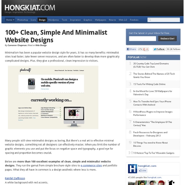
100+ Clean, Simple and Minimalist Website Designs
The 10 Most Common Mistakes Web Designers Make | Noupe
Aug 03 2009 There are plenty of mistakes web designers (especially new ones) make when designing websites. Everything from poor design to simple oversight happen every day. But with a little diligence, they can easily be avoided. Below are ten of the most common mistakes web designers make, along with examples of sites who do things right. Some of these are easy to correct if you’re aware of, others might take a bit more time. 1. “White space” or “negative space”, space that is empty of elements other than your background design, is an incredibly important design element. In addition to white space, don’t try to put too much on a single page. 2. Unless the sites you’re designing are completely static, somehow showcasing new information and content is vital to good design. There are a few ways to approach this. 3. Links are one of the most important parts of a website. There are two things to keep in mind here. 4. GIF format is great for images that use a limited color palette. 5. 6. 7.
300+ Jquery, CSS, MooTools and JS navigation menus | Graphic and
If You are web developer great navigation menus always comes handy. I united this list for people like me, who sometimes wants to do job fast and choose from already prepared examples, which are easy to use. So here are many resources starting from very simple HTML and CSS navigation menus, until very complicated and advanced jQuery, JavaScript and MooTools techniques used to get maximal control with fading, sliding, dragging etc. effects. 1.Fancy menu – very cool navigation menu: 2. Download dock menu 3. 37 different CSS navigation techniques: 4. 5. 6. 7. 8. 13 hand-picked Vertical and horizontal CSS Menus ; 9. 10. 11. I really recommend You to visit this site: 12. 13. 14.Accessible Image-Tab Rollovers; 15. 16. 17. 18.CSSmenumaker.com – offers professional CSS menus; 19. 20. 21. jdMenu Hierarchical Menu Plugin for jQuery – vertical multilevel dropdown list; 22. 23. 24. 25. jQuery Treeview Plugin: 26. 35 different unique Jquery demos with different features 27. 32. 33. Download all menus 34. 37.
50 Beautiful and Effective Package Designs
When choosing one product over another, the design of the packaging probably influences your decision far more than you realize. Effective packaging design breaks away from the standard rules and conventions that we are accustomed to, giving the product a unique edge to stand out from the rest. The packaging should appeal to your target market. It’s also vital to ensure that you’re conveying the necessary information about the contents and quality of the product, while triggering the desired emotion in your customer. Here are 50 beautifully designed packages that you can draw inspiration from.
15 sites web developers and designers should know
Creating a good website isn't an easy task, but there's a few tools that can definitely make your developer or designer life easier. In this article, I have compiled 15 extremely useful website that any web developer or web designer should have bookmarked. ColorCombos When designing a website, one of the firsts (and most important) steps of the process is to choose a color scheme. Color Combos allow you to browse thousand of different colors combinations for getting inspired for your upcomming design. LIpsum Who doesn’t know the extremely popular Lorem Ipsum text? What the font? You just saw a logo or website using a particular font and you enjoyed it. ConvertIcon Favicons are a must have for any website, mostly because on modern browsers as such as Firefox, it is displayed along with the site name in tabs. BgPatterns background Patterns is definitely one of the current webdesign trends. HTML Encoder Do you display code on your website? Test Everything Sprite Generator Load Impact IconFinder
Related:
Related:
