New High-Quality Free Fonts
12 Examples of Paragraph Typography
These are supporting examples for the blog entry, The Paragraph in Web Typography & Design. Only standard <p> tags have been used. Some of these styles are experiments using pseudo elements and adjacent sibling selectors; browser support is not consistent. Paragraph font size is set at 1em (equivalent to 16px if browser font size is unchanged) and line height set at 1.25em. Georgia was used exclusively. No browser specific CSS has been used—any inconsistency in the rendering of line-height, baseline and element positioning has been left for cross browser comparison before implementing. 1. Much of the material for this volume was collected during the time that I was preparing for the press the Evolution of Woman, or while searching for data bearing on the subject of sex-specialization. 2. 3. 4. 5. 6. 7. 8. 9. 10. 11.
Invisible | Otro sitio de WordPress
60 Brilliant Typefaces For Corporate Design - Smashing Magazine
Advertisement Typography is more than being legible and looking good. Among other things, effective typography manages to achieve two important objectives: a) to create an appropriate atmosphere and enable users to develop trust toward the site and b) to make sure visitors get the main message of the site and (if possible) become interested in the services offered on the site. Since written text is the most efficient instrument to communicate with visitors precisely and directly, the power of typography shouldn’t be underestimated. To communicate effectively, typography requires appropriate typefaces. Below you’ll find over 60 first-class typefaces for corporate design. You might also want to take a look at the 60 Excellent Typefaces For Corporate Design Haptic The Haptic family is a sans serif typeface which was optimized for use in small sized text. FF Meta Serif A collaborative work by Erik Spiekermann, Christian Schwarty and Kris Sowersby. Museo A contemporary semi-slab serif font.
Expressive Web Typography: Useful Examples and Techniques
Advertisement Wherever we turn online, typography jumps out at us — sometimes literally, with the assistance of some clever coding. And now more than ever, we are seeing greater focus on this design element and its varied implementations around the Web. With the growing popularity of font embedding services and @font-face, typography is the talk of the town, but even though it is a regular topic among communities, not all of our typographic efforts are successful. Sometimes we swing for the fences, only to miss or fall short. This is what brings us together today. Typography Examples Denise Chandler1 When we look at the portfolio of Denise Chandler, right away the typography begins talking. The only critique really would be in the contact area. Jessica Hische2 Using a good type that doesn’t detract from the content is imperative. MCQ3 The portfolio of Mike McQuade has a truly remarkable interactive page change effect that really grabs your attention. Related Posts
"People who don't like Comic Sans don't know anything about design"
Interview: ahead of his talk at London's V&A museum on Friday, typographer Vincent Connare talks to Dezeen about creating the typeface that designers love to hate. Vincent Connare was one of the early pioneers of digital typeface design, working on fonts for Agfa and Apple in the early 1990s before joining Microsoft, where he designed both the web-friendly Trebuchet font family and the now infamous Comic Sans MS. "It was important at Microsoft to show people how things could be done. Originally designed in 1994 to fill in the speech bubbles in a programme called Microsoft Bob, which featured a cartoon dog that offered tips on how to use a computer, Comic Sans was based on the hand lettering in comic books that Connare had lying around in his office. "I was asked to comment on what I thought of the use of typography in this new application. In 1995 it was included in the company's standard font package for Windows, putting it in the hands of millions of computer users. What the Font?
New High-Quality Free Fonts (2012 Edition) - Smashing Magazine
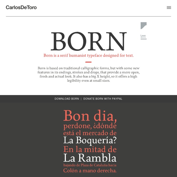
Advertisement Every now and then, we look around, select fresh free high-quality fonts and present them to you in a brief overview. The choice is enormous, so the time you need to find them is usually time you should be investing in your projects. We search for them and find them so that you don’t have to. In this selection, we’re pleased to present Homestead, Bree Serif, Levanderia, Valencia, Nomed Font, Carton and other quality fonts. Please note that while most fonts are available for commercial projects, some are for personal use only and are clearly marked as such in their descriptions. Free Fonts HomesteadHomestead is a very distinctive Slab Serif typeface that leaves a lasting impression with its geometric forms and a modern, progressive look. Bree Serif RegularThis typeface is the serif cousin of the playful, charming and versatile type family Bree which was designed by Veronika Burian and José Scaglione back in 2008. Novecento (Registration on MyFonts is required!) Last Click
fonts, typefaces and all things typographical — I love Typography (ILT)