
70 Things Every Computer Geek Should Know. | Arrow Webzine The term ‘geek’, once used to label a circus freak, has morphed in meaning over the years. What was once an unusual profession transferred into a word indicating social awkwardness. As time has gone on, the word has yet again morphed to indicate a new type of individual: someone who is obsessive over one (or more) particular subjects, whether it be science, photography, electronics, computers, media, or any other field. A geek is one who isn’t satisfied knowing only the surface facts, but instead has a visceral desire to learn everything possible about a particular subject. How to become a real computer Geek? Little known to most, there are many benefits to being a computer geek. You may get the answer here: The Meaning of Technical Acronyms 1. One of the best list of default passwords. 1A. 2. If you rolled your eyes here, that is a good thing. 3. 4. 5. 6. 7. 8. 9. 10. 11. 12. 13. 14. 15. 16. 17. 18. 19. 20. 21.
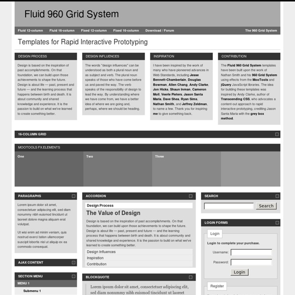
Tutorial 960 Grid por Jepser Bernardino Grid 960 es un framework de css que facilita la maquetación a un estándar de 960px. En este tutorial vamos a crear un página utilizando este framework. Para empezar, ¿Qué es 960 Grid? 960 Grid es un framework de CSS que nos facilita la vida en un mil por ciento (si lo sabemos utilizar). Este grid se creó por la necesidad de tener un “estándar” en el ancho de los sitios web. Conociendo el grid Como les mencionaba, podemos utilizar 12 o 16 columnas para crear nuestros layouts, cada una de las columnas tiene un margen izquierdo y derecho de 10px, para crear 20px de separación entre columnas. Veremos ahora como es que se divide el grid en una configuración de 12 columnas: 60px140px220px300px380px460px540px620px700px780px860px940px Como verán, cada una de las filas lleva un número, que será el identificador; es decir, el ancho de la columna corresponde al número de a la par. Basta de palabrería, vamos a crear una página web con utilizando este framework y 12 columnas. Maquetando con 960 Grid
25 Useful HTML5 Tools For Designers & Developers | Resources The latest version of HTML – HTML5, adds many cool new elements to the applications that are being developed. These days it has become important for the web developers to learn and use the intricate elements of HTML5 to develop web apps and iOS-friendly sites. Did you know that Google has developed a HTML5 version of YouTube? This further encourages the developers to explore the potential of the markup language. Here we have fresh HTML5 resources which are very useful for both designers and developers. HTML5 is an extremely useful markup language for enhancing user experience and usability. Today’s we put together a list of twenty five useful HTML5 Tools and resources to help save you time and energy along the way. You may be interested in the following modern trends related articles as well. Subscribe to our RSS via email, simply enter your email address & click subscribe. HTML5 is making the web design more powerful in different areas. Demo Download Demo Download Demo Download
960 Grid System | 16-column Grid JQuery Article Heading Subheading Lorem ipsum dolor sit amet, consectetuer adipiscing elit, sed diam nonummy nibh euismod tincidunt ut laoreet dolore magna aliquam erat volutpat. Ut wisi enim ad minim veniam, quis nostrud exerci tation ullamcorper suscipit lobortis nisl ut aliquip ex ea commodo consequat. Visit site. Heading 3 Heading 4 Heading 5 Duis autem vel eum iriure dolor in hendrerit in vulputate velit esse molestie consequat, vel illum dolore eu feugiat nulla facilisis at vero eros et accumsan et iusto odio dignissim qui blandit praesent luptatum zzril delenit augue duis dolore te feugait nulla facilisi. Heading 6 Epsum factorial non deposit quid pro quo hic escorol.
40 Awesome jQuery Plugins You Need to Check Out Scrolling jQuery Waypoints Waypoints allows you to easily trigger JavaScript events at specific scroll points. Ever wonder how people build those amazing scrolling effects? This could be your answer. skrollr Parallax scrolling for the masses. Charts, Animations & Tables Handsontable A minimalistic approach to an Excel-like table editor in HTML & jQuery. jQuery Sparklines jQuery Sparklines helps you build little inline charts that are supplied with information via HTML or JavaScript. Teamwork Gantt Build incredible Gantt charts with jQuery. DataTables A jQuery plugin for creating impressive, highly functional data tables. arbor.js Build crazy looking, futuristic, animated and modular graphs. Layout Wookmark jQuery Plugin Easily build a Msonry-like layout like the one seen on Wookmark. jQuery Masonry The original jQuery Masonry. Isotope An amazing layout plugin that allows for intelligent and dynamic grids of items that can be easily sorted and filtered. FitVids.JS gridster.js Freetile.js Text Jeditable
Tutorial 960 Grid System de Raul Alvarez Desde que probé este framework de CSS, el ‘960 grid system’ venía barruntando la posibilidad de dedicarle un tutorial más o menos amplio en este blog. Pero me cuando finalmente me he decidido ha sido el sábado, tras estar comentándolo con Alberto, cuando me he dado cuenta de que si bien todavía hay cosas que se me escapan, tengo ya muchas cosas claras en cuanto al funcionamiento de este framework. Así que me tomaré este post como una recopilación de todo lo que he sacado en claro sobre el sistema y de paso, dejo disponible un poco de documentación que, de momento en español escasea. El sistema 960 ofrece una rejilla de doce o de dieciséis columnas sobre la que podremos maquetar a nuestro gusto el diseño de nuestra página web. De la web 960.gs nos descargamos una serie de archivos. Las clases que hay que conocer A partir de ahora, te vendrá bien tener el archivo demo.html a mano, a modo de chuleta. Y si queremos que esas dos columnas las deje después sería: header Y el CSS: personal posts
Portfolio Image Navigation with jQuery « Previous Demo: Expanding Fullscreen Grid Portfolio Images by Angelo González back to the Codrops post Portfolio Image Navigation Up Down Previous Next Grails Templates and the 960 Grid System I stumbled across the 960 Grid System and wanted to see if it could serve as the layout foundation in a Grails application. I am pleased with the results and believe this will help speed up the initial design of new web sites. Having read several articles and blog posts demonstrating the use of templates in Grails, I could have started from scratch but decided to follow along with Mo and add the 960 Grid System to the mix. My first impression was, "That's a lot of stylesheets!" It took me awhile to decide if I liked the modularization of the CSS but I grew to appreciate it because it helped me focus. This is the same reason I like breaking a layout into Grails templates. I ended up with five templates stored in a folder named common. The only feature of 960 Grid System that didn't perform as I wanted it to right out of the box (no offense Dave Klein) was centering the page in Internet Explorer. Here is main.gsp: Here is layout.css:
10 Best Sites to Learn How to Code Quickly Web development has become a very important topic on the web these days and the internet has become the best source for developers to learn more about code. It is a very easy way and a very popular one and the developers can find important information related to anything on the internet very easily and do not have to face any kind of difficulty to lean new development ways. Web application development has some of its own unique features. Through the medium of the internet website developers can get a lot of information about the already existing applications and can very easily get to know about all the new tools very easily. Its our pleasure to share best and useful resources for web developers and designers. 1) Codecademy Codecademy is the easiest way to learn to code. 2) PHP Academy This site provide free PHP tutorials and other web development tutorials, including tutorials for MySQL, JavaScript (including jQuery) and CSS. 3) Code School 4) Code Google 5) School of Webcraft 6) jQuery Air
960 Grid System 40 Online Generators for Web Designers Should Bookmark Online Generators for Web Designers can be a great way to save time in your web design projects. High-quality generators can create graphics or code or even layouts in a matter of seconds or minutes, things that might take an hour or more if done by hand. Online generator are those tools that help us to create those popular “XHTML valid” CSS banners, micro buttons or css website templates in seconds. In such cases online generators can be of great help which do the necessary job and some tools don’t have to be downloaded also. We all know that backgrounds play a crucial role in a design. Web Designers sometimes spend a lot of time in making pattern or stripe backgrounds and there are also tool to help you out here. Advertisement 1. XML /SWF charts are used to create attractive graphs and charts from XML data, Create a source either manually or generate dynamically then pass it to the XML chart’s flash file. 2. 3. 4. 256 Pixels 5. 80 x 15 brilliant Button Maker 6. 7. 8. 9. 10. 11. 12. 14.