background preloader

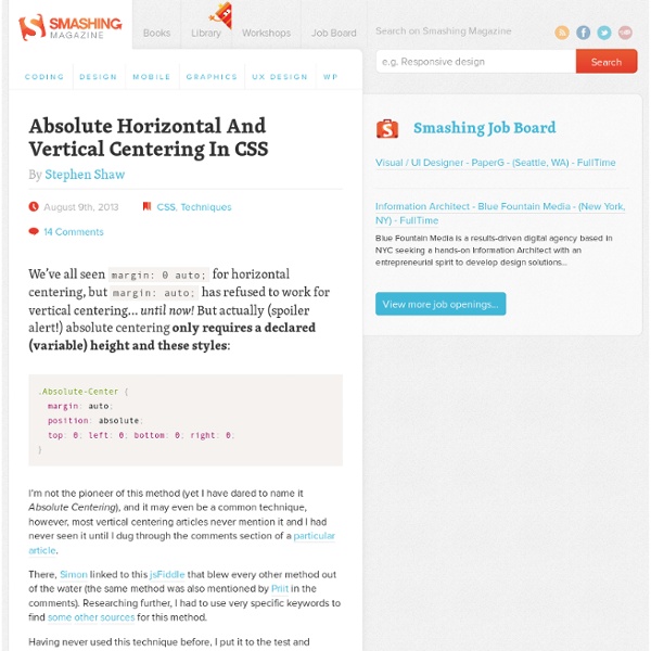
Absolute Horizontal And Vertical Centering In CSS
Absolute Horizontal And Vertical Centering In CSS
Rethinking Mobile Tutorials: Which Patterns Really Work? Pattern libraries are a great source of inspiration and education for designers. But common practice doesn’t always equal best practice. In this post, we’ll look at why many common tutorial patterns are ineffective and how you can leverage game design principles to increase user engagement. After the release of the first edition of Mobile Design Pattern Gallery, Intuit asked me to speak with its mobile team. Read more... After Editorially: The Search For Alternative Collaborative Online Writing Tools I’m going to let you in on a little secret: the best writers, be it your favorite authors or those that write for Smashing Magazine, don’t do it alone. Having worked with several editors — and having been a technical editor myself — I’ve really come to appreciate this aspect of the writing process. Read more... What You Need To Know About WordPress 3.9 Read more... Understanding CSS Timing Functions Read more... Read more... Read more...

CSS3 Animation Cheat Sheet - Justin Aguilar How it works The CSS3 Animation Cheat Sheet is a set of preset, plug-and-play animations for your web projects. All you need to do is add the stylesheet to your website and apply the premade CSS classes to the elements you want animated. The CSS3 Animation Cheat Sheet uses CSS3 @keyframes and works on all the latest browsers (that's IE 10). Using CSS3 @keyframes, you don't have to worry about positioning the element to accomodate the animations - it will animate into place. Add the animation stylesheet to the <head> element of your webpage: Replace css with the name of the directory where the animation stylesheet is. Add an animation class to the element you want animated: Replace slideUp with the desired animation class. For entrance animations, you need to make them invisible by adding the visibility: hidden property to the animated element: visibility: hidden; is used to hide elements before the animation is activated. The values for these animations are relative to the element's size.

How Apple Just Made Me Care Less About Technology I love technology. I love Apple products. I’m not ashamed to say it. I am writing this from my Macbook Pro on an Airport-based wireless network while I check my iPhone for e-mail. There, now that that’s out of the way, I wanted to share an interesting quote or marketing blurb (whatever you wanna call it) from the new iOS 7 mini-site on Apple.com . It made me care less about technology (in a good way). This post isn’t about the new operating system(s) the Cupertino company just announced, instead it’s about the single quote that really drew my eye. Source: the iOS 7 Apple.com mini-site I agree. Education and Technology Edudemic is all about technology and education. You simply can’t use every piece of technology out there in education. So I’d recommend not even trying to! But enough about the technology. It’s Just A Tool Technology is a tool meant to enhance your life . The new iOS 7 screenshots via Apple.com But the power of technology doesn’t mean we have to use it all the time.

Centering with margin:auto; CSS play - Centering images and information panels using margin:auto; 17th October 2013 For IE8+, Firefox, Chrome, Safari, Opera etc. Heading This is a text panel with percentage width/height that is centered within an outer container using margin:auto; copyright © stu nicholls - CSS play Information A simple method of vertical and horizontal centering anything using just margin:auto; This can include text, images, forms etc. The centered content can be sized in pixels, ems or percentage and can also be responsive if the outer container is resized. See the page source code for the simple stylesheet and html code. Copyright You may use this method on your personal 'non-profit' web site without seeking my permission. Commercial usage is also permitted without seeking approval, but I would ask that a donation is considered to support my work on CSSPlay.

UX Scotland - UX Patterns case study CSS-Guidelines/README.md at master · flexbox/CSS-Guidelines least.js - Random & Responsive HTML 5, CSS3 Gallery with LazyLoad Monday, 14th April 2093: sit amet, consetetur sadipscing elitr, sed diam nonumy eirmod tempor invidunt ut labore et dolore magna aliquyam erat, sed diam voluptua. At vero eos et accusam et justo duo dolores et ea rebum. Monday, 14th April 2093: sit amet, consetetur sadipscing elitr, sed diam nonumy eirmod tempor invidunt ut labore et dolore magna aliquyam erat, sed diam voluptua. Monday, 14th April 2093: sit amet, consetetur sadipscing elitr, sed diam nonumy eirmod tempor invidunt ut labore et dolore magna aliquyam erat, sed diam voluptua.

Easy Responsive Tabs to Accordion Lorem ipsum dolor sit amet, consectetur adipiscing elit. Vestibulum nibh urna, euismod ut ornare non, volutpat vel tortor. Integer laoreet placerat suscipit. Sed sodales scelerisque commodo. This tab has icon in consectetur adipiscing eliconse consectetur adipiscing elit. Suspendisse blandit velit Integer laoreet placerat suscipit. Photobox - CSS3 image gallery modal viewer A lightweight image gallery modal window script which uses only CSS3 for silky-smooth animations and transitions, utilizes GPU rending, which can be completely controlled and themed directly from the CSS. Lightweight! jquery.photobox.js is only 5kb (gziped & minified) Hardware accelerated, CSS3 transitions and animations Mobile friendly Support videos via iframe embedding Stunning UI and user-friendly UX Images & videos can be zoomed using mousewheel Thumbnails can be zoomed using mousewheel Keyboard & mouse navigation. Even using mousewheel left/right ;-) Exposed UX control up to 99%. Supports: Firefox, Chrome and IE8+ (This plugin has nothing to do with Flickr) Github project page

Simple Grids with CSS Multi-Column Layout Last week I began researching CSS layout — what’s achievable with the various spec modules — and grid systems (the myriad of solutions from 960gs to Zen Grids). My notes have quickly grown to thesis-level — I do eventually plan to publish something — but for now here’s a nice example demonstrating what is sure to be my take-away message: keep it simple. The image below shows a very minimal design for my website’s footer (menu and copyright notice) as it appears in a small viewport: The HTML (sans class attributes for readability) is basic: <ul><li><a href="/">Home</a></li><li><a href="/about/">About</a></li><li><a href="/services/">Services</a></li><li><a href="/portfolio/">Portfolio</a></li><li><a href="/blog/">Blog</a></li><li><a href="/contact/">Contact</a></li></ul><p><small>Copyright &copy; David Bushell</small></p> If I was building on top of a framework or grid system I might be inclined to over-think the CSS here. In this situation CSS Multi-column Layout is the perfect solution.

Animenu - a responsive dropdown navigation made with SASS Check out the Animenu GitHub repository for the updated version of this dropdown navigation concept. I’ve been pretty happy lately to see I’m still receiving a lot of positive feedback on my animated dropdown menu. I found that quite encouraging and I decided to start working on an improved version of it using SASS & Compass. The new version is responsive, has no JavaScript dependency and it’s hosted on GitHub too. View demo or download the .zip from GitHub Some words on this project Some of the decisions I had to take on this new improved dropdown navigation were on the browser support and number of levels this menu will support. But, this time the accent is put on responsiveness. Browser support The browser support for this dropdown navigation is IE8+, so it uses the new box model triggered by box-sizing: border-box and the shortest clearfix ever. One dropdown level The markup As you may have guessed, there’s nothing complicated here. SASS and Compass Variables On customization Final words

Related: