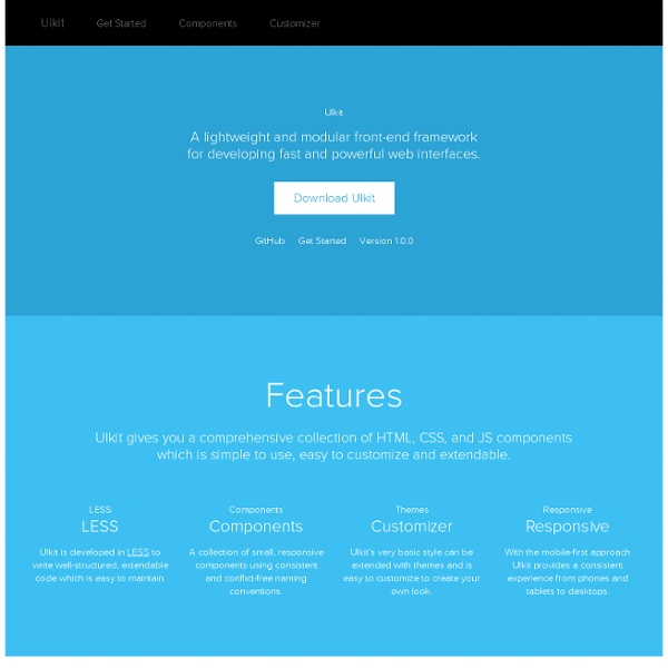


20 Exceptional CSS Boilerplates and Frameworks CSS frameworks have been the foundations of web projects for many years. However, in the age of responsive design, a framework has even more benefits. A well-built CSS framework or boilerplate can streamline the design process, save huge chunks of development time and ensure your website scales properly on all devices. With so many choices available, though, it can be difficult to choose a framework to build on. It's important to consider the following when making a decision: whether you require a grid, and if so, will it be fluid or fixed? What level of customization do you require? This post details 20 CSS boilerplates, frameworks and systems to help you make that decision. 1. Bootstrap is a "sleek, intuitive and powerful front-end framework for faster and easier web development." 2. Catering for four layouts (default, tablet, mobile and wide mobile), with three sets of typography presets, Less is a responsive CSS grid system for designing adaptive websites. 3. 4. 5. 6. 7. 8. 9. 10. 1.
Skeleton: Beautiful Boilerplate for Responsive, Mobile-Friendly Development JCE Editeur Par Sarki lundi 14 avril 2014 Select Language Kits Joomla! Découvrez JCE avec les kits Joomla! JCE Editeur - Le portail francophone JCE est l'éditeur le plus complet pour Joomla! JCE est capable de gérer les mise en page comme un éditeur de type Word ou Open OfficeIl permet d'insérer des images et médias de tous types, affichables dans des fenêtres popup Web 2Il permet de créer des liens externes, des liens e-mail, sur des fichiers et des contenus du siteIl permet la création de groupes possédant leur propre barre d'outils avec les fonctions souhaitéesIl utilise la gestion des droits et des membres de Joomla pour adapter les accès aux fonctions et répertoires Vous pouvez tester l'éditeur grâce aux kits Joomla à installer ou les sites exemples Joomla avec JCE déjà intégré.Pour acquérir les plug-ins complémentaires, veuillez vous rendre sur le site officiel de l'auteur de JCE JCE 2 pour Joomla! JCE 1.5 pour Joomla! Accueil - Présentation - Télécharger - Tutoriels - Forum - Contact - Sites exemples Nom
18 Best CSS Frameworks for Accelerated Development According to Wikipedia, CSS frameworks are pre-prepared libraries that are meant to allow for easier, more standards-compliant styling of web pages using the Cascading Style Sheets language. In this article we have gathered ready-to-use frameworks which will enable you to reduce your task flow and code LESS. We hope you will find the list handy and useful for your development needs. If you know any other CSS frameworks which are handy and useful, give your opinion in comment box, we would love to hear from you. 1. Pure is a fresh one that is created by Yahoo!. Source 2. Fitgrd is not a framework. Source 3. Fries is a solid HTML-CSS-JS framework for creating Android-like UIs both for real-world usage and prototyping. Source 4. Markup Framework, a fresh one, is a collection of layouts, widgets, typographic styles and other UI components which can be used as a base for any web project. Source 4. Source 5. Metro UI CSS is a set of styles for creating such interfaces. Source 6. Source 7. Source 8.
HTML KickStart HTML Elements & Documentation Setup Download HTML KickStart Include jQuery and HTML KickStart <script src=" src="js/kickstart.js"></script><!-- KICKSTART --><link rel="stylesheet" href="css/kickstart.css" media="all" /><! Browsers HTML KickStart Tested and working in IE 8+, Safari, Chrome, Firefox, Opera, Safari IOS, Browser and Chrome Android. Notes Don't forget to use an HTML5 Doctype <! Buttons A.button With Icons Colors .orange Styles .pop Tooltips Tooltips are awesome. Hover over the examples on the right to preview. Use: class="tooltip" + title="my tooltip content" Tooltip Positions .tooltip (default) .tooltip-top .tooltip-right .tooltip-left .tooltip-bottom Tooltips with HTML Content .tooltip + data-content="#ID" HTML Content This is more HTML content. Paragraphs Lorem ipsum dolor sit amet, consectetuer adipiscing elit, sed diam nonummy nibh euismod tincidunt ut laoreet dolore magna aliquam erat volutpat. Blockquote Blockquote Small Inline Styles
JCE - A Content Editor for Joomla!® www.getuikit.com/index.html Less Framework 4 I called Less Framework "a CSS grid system for designing adaptive websites". It was basically a fixed-width grid that adapted to a couple of then popular screen widths by shedding some of its columns. It also had matching typographic presets to go with it, built with a modular scale based on the golden ratio. The resources it was originally published with are still available on GitHub. Contrary to how most CSS frameworks work, Less Framework simply provided a set of code comments and visual templates, instead of having predefined classes to control the layout with. This is how I still work today and definitely a method I advocate. /* Default Layout: 992px. Less Framework was popular in the early days of responsive design. Eventually, I moved on from fixed-width grid systems and worked on a fully fluid-width one, in the form of Golden Grid System. Less Framework's popularity was helped by the following contributions and the lovely people behind them (dead links crossed off):
Joomla!fr Initializr - Start an HTML5 Boilerplate project in 15 seconds! KNACSS, a simple and lightweight CSS framework