
Simple Sidebar - Bootstrap Sidebar Template Need a Custom Build? If you like this theme, but need something a bit more custom, you can hire the Start Bootstrap design team to create a custom version of this template! Email us at feedback@startbootstrap.com for more information! Theme Description: Simple Sidebar is a basic sidebar menu page layout for Bootstrap websites with off canvas navigation on smaller screen sizes. Theme Features: Responsive Bootstrap sidebar navigation Off-canvas navigation toggling on smaller screens Responsive page content area Similar Themes & Templates: Tags: Please visit our resources page for design ideas and our help page if you need assistance with this theme. Scaffolding Requires HTML5 doctype Bootstrap makes use of certain HTML elements and CSS properties that require the use of the HTML5 doctype. Include it at the beginning of all your projects. <! Typography and links Bootstrap sets basic global display, typography, and link styles. Remove margin on the body Set background-color: white; on the body Use the @baseFontFamily, @baseFontSize, and @baseLineHeight attributes as our typographic base Set the global link color via @linkColor and apply link underlines only on :hover These styles can be found within scaffolding.less. Reset via Normalize With Bootstrap 2, the old reset block has been dropped in favor of Normalize.css, a project by Nicolas Gallagher and Jonathan Neal that also powers the HTML5 Boilerplate. Live grid example The default Bootstrap grid system utilizes 12 columns, making for a 940px wide container without responsive features enabled. Basic grid HTML <div class="row"> <div class="span4">... Offsetting columns Nesting columns Fluid offsetting
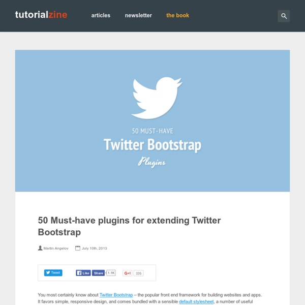
18 Useful Twitter Bootstrap Goodies You Should Know Introduction Twitter Bootstrap is one of my favourite framework for quick website prototyping and default style for my CMS. If you don't know about Twitter Bootstrap, it's a simple and flexible HTML, CSS, and Javascript for popular user interface components and interactions. Created by the developers from Twitter, this great tool contains base CSS, grid, responsive, general styling, UI components and javascript plugins that can speed up your development process. I have been using it for a while now, it allowed me to have full concentration on the functionality of the website instead of cross browsing testing and styling. In this post, I have found many useful tools, plugins and themes created specifically for Twitter Bootstrap. Update I also created a post about third party Twitter Bootstrap javascript plugins - Extend Twitter Bootstrap Javascript Plugins. Everybody seems to like this post a lot, it's mentioned on The Treehouse Show! Tools - Wireframing, Generators and Template
Magnific Popup: Responsive jQuery Lightbox Plugin Magnific Popup is a responsive lightbox & dialog script with focus on performance and providing best experience for user with any device(for jQuery or Zepto.js). Examples Single image lightbox Three simple popups with different scaling settings. 1 — fits horizontally and vertically, 2 — only horizontally, 3 — no gaps, zoom animation, close icon in top-right corner. Lightbox gallery You may put any HTML content in each gallery item and mix content types. Zoom-gallery If you wish to open the popup only after image is fully loaded, you may preload image via JS. Popup with video or map In this example lightboxes are automatically disabled on small screen size and default behavior of link is triggered. Dialog with CSS animation Animations are added with simple CSS transitions, you can make them look however you wish.More animation effects on CodePen. Popup with form Entered data is not lost if you open and close the popup or if you go to another page and then press back browser button. Ajax popup Fast
Create Custom Icons for Twitter Bootstrap Easily - Tutorial Twitter bootstrap is one of the most effective frameworks available online at the moment to speed up frontend web development process. We have covered it in our previous post before, we reckon it’s the ultimate frontend framework which covers almost all UI. It has base CSS, grid layout, responsive layout, general base styling for all HTML elements such as buttons, form, table, a good collection of UI components and a dozen of javascript plugins. Also, there are quite a few extensions such as extra javascript plugins, themes, skin, generators available online for Twitter bootstrap, for more useful tools that extend the capability, you can read from this post – 18 Useful Twitter Boostrap Goodies You Should Know. Currently, this bootstrap is using icons provided by Glyphicons, it’s minimal and simple icons. Step 1: Get the icons We downloaded FamFamFam Silk Icon set, and it has total of 1000 icons for free! Step 2: Create the Sprite Settings And the CSS code looks something like this: css Done!
5 Easy Ways to Modify Your Bootstrap Button Styles - BootstrapBay In the following tutorial, we’re going to show you 5 easy ways to modify your Bootstrap button styles. This is a quick and easy way to differentiate your site from the default Bootstrap look. If you like what you see, you can download our free Bootstrap button pack (Demo | Download). Initial Setup We modified the default Bootstrap .btn class with the following CSS styles. Now that we’ve modified our .btn class, let’s go over our custom button classes. Sharp Buttons To create sharp buttons, simply set your border radius to 0. See the Pen YPKbxW by BootstrapBay (@bootstrapbay) on CodePen. Outline Buttons The first step in creating an outline button is to remove the background. Next, you need to increase the thickness of the border and change the color to match the border. Finally, you can add some hover effects by modifying the color and border colors when hovering over the button. See the Pen PwYvaO by BootstrapBay (@bootstrapbay) on CodePen. Gradient Buttons Rounded Buttons Raised Buttons
Bootstrap, from Twitter Bootstrap was built with Preboot, an open-source pack of mixins and variables to be used in conjunction with Less, a CSS preprocessor for faster and easier web development. Check out how we used Preboot in Bootstrap and how you can make use of it should you choose to run Less on your next project. How to use it Use this option to make full use of Bootstrap’s Less variables, mixins, and nesting in CSS via javascript in your browser. Not feeling the .js solution? What’s included Here are some of the highlights of what’s included in Twitter Bootstrap as part of Bootstrap. Variables Variables in Less are perfect for maintaining and updating your CSS headache free. Commenting Less also provides another style of commenting in addition to CSS’s normal /* ... */ syntax. // This is a comment/* This is also a comment */ Mixins up the wazoo Mixins are basically includes or partials for CSS, allowing you to combine a block of code into one. Font stacks Gradients Operations Compiling Less Ways to compile
Testing. Heading Donec id elit non mi porta gravida at eget metus. Fusce dapibus, tellus ac cursus commodo, tortor mauris condimentum nibh, ut fermentum massa justo sit amet risus. Etiam porta sem malesuada magna mollis euismod. Donec sed odio dui. Modal » Card » Donec sed odio dui. Whys and hows: Flippant is tiny. Flippant is easily customized. Flippant exports a single function: flip. var front = document.getElementByID('flipthis') , back_content = "<h1>I'm the back! Two modes: card (the default), and modal. back = flippant.flip(front, back_content, 'modal') The back gets the default class of flippant-modal-dark for modal flips and flippant-modal-light for cards. back = flippant.flip(front, back_content, 'modal', 'my-modal-classname') The full API: flip(element_to_flip, content_for_back, type(modal/card), classname_for_back) -> back_element 74.3% of the magic is in the css file.
JavaScript · Bootstrap $(document).off('.data-api') $(document).off('.alert.data-api') $('.btn.danger').button('toggle').addClass('fat') var bootstrapButton = $.fn.button.noConflict() // return $.fn.button to previously assigned value$.fn.bootstrapBtn = bootstrapButton // give $().bootstrapBtn the Bootstrap functionality $('#myModal').on('show.bs.modal', function (e) { if (!data) return e.preventDefault() // stops modal from being shown}) <div class="modal fade"><div class="modal-dialog"><div class="modal-content"><div class="modal-header"><button type="button" class="close" data-dismiss="modal"><span aria-hidden="true">×</span><span class="sr-only">Close</span></button><h4 class="modal-title">Modal title</h4></div><div class="modal-body"><p>One fine body…</p></div><div class="modal-footer"><button type="button" class="btn btn-default" data-dismiss="modal">Close</button><button type="button" class="btn btn-primary">Save changes</button></div></div><! <! <! $('#myModal').modal(options) .modal(options) <!