background preloader

So you want to create a font. Part 1

So you want to create a font. Part 1
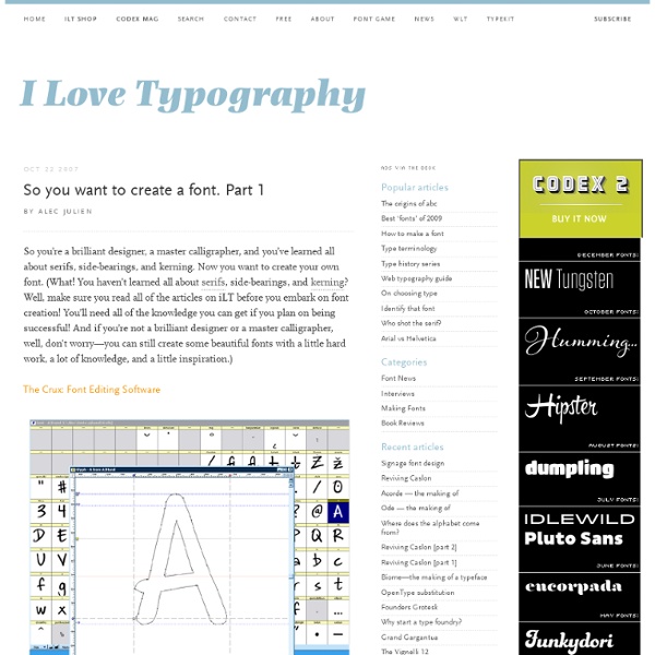
By Alec Julien So you’re a brilliant designer, a master calligrapher, and you’ve learned all about serifs, side-bearings, and kerning. Now you want to create your own font. (What! You haven’t learned all about serifs, side-bearings, and kerning? The Crux: Font Editing Software All the brilliant design, precise calligraphic work, and deep knowledge of kerning won’t mean anything if you can’t translate your work into a computer-friendly format, which is why you’ll need a good piece of font editing software at your disposal. Font Editing Programs FontLab Studio is what I use to make my fonts. All of these programs operate on the same principles, differing in specifics, interface, and levels of options and power. Once you have a good font editing program, there are three basic routes to creating a font. Method 1: Draw it on paper Tools You’ll Need Are you artistic? Scan your beautiful work into Photoshop, and then turn your image into a bitmap (black and white—no shades of grey). Almost there.

10 Typography Trends for Web Designers in 2013 | Groove CommerceGrooveCommerce.com It was in my second to last semester of grad school when I took Typography with Professor Max Boam – if you are able to take him at the University of Baltimore, I highly recommend it – and it was around this time when my obsession with typography began. Both in print and, more recently, web, I have come to appreciate the dominating effect that it can have on overall design. And thankfully nowadays, with the help of services like Google Fonts, web designers like myself have a ton of freedom to get creative with new typefaces throughout their design projects. So, what are some new typography trends that I’m especially looking forward to this year? #1: Slab Serif Slab Serif is my favorite classification of typography. #2: Large Text If you want to make an impact, try large type. #3: Handmade Typography Most of us want to be unique in our design and that’s perfectly okay for certain types of websites. #4: White Space #5: Simplified Content and Typography #6: “Make it Look like a Book” Typography

fonts, typefaces and all things typographical — I love Typography (ILT) Case Study — Typographic Design Patterns And Current Practices (2013 Edition) Good typography has always been a defining aspect of effective Web design, and this holds true especially for websites in which the emphasis is on presenting a large amount of content — specifically, articles, news and stories. Whether for a magazine or international newspaper, the designer of any website that distributes a lot of content has always had to consider typographic details as seriously and thoroughly as a print designer would. In 2009, we conducted a survey of then current typographic practices. Since then, responsive design techniques have clearly gained momentum and established their place in the landscape of CSS layout. Online publications have had to reevaluate how their content is presented on mobile devices. Now, three years later, we’ve reviewed the original study and explored how Web typography has changed over these years. How Did We Conduct The Study? We have compiled relevant data from over 50 well-respected websites to address these questions. Other Findings Link

Fonts - using them in web design This gives information about fonts in web pages. Note : this page uses the word font for what is more correctly termed a font family. E.g., this page uses “Arial font” to refer to all members of the Arial font family, in all its sizes, weights, and variations; and this page uses “generic font” for the term “generic font family” which appears in CSS specifications. User Default Fonts Browsers typically let users pick fonts to be used when pages do not suggest fonts using either CSS or <font>, or when the user has set an option not to use fonts suggested by the page. E.g. With many browsers these fonts may be different from the 5 CSS generic fonts. Generic Fonts When using the CSS font-family property to style text, there are five generic fonts: serif, sans-serif, cursive, fantasy, and monospace. There are three important issues to consider about these fonts. Let’s consider each of these issues. Selecting Installed Fonts as Generic Fonts CSS List of Fonts Suggesting Fonts Common Fonts Mobile Fonts

20 {FREE} FONT FAVORITES Sure, we get a lot of emails about paint colors, hardware finishes and even questions about Disney World here and there. But we also get a decent number of questions about is the fonts we use here on the blog. Being a graphic designer by trade, I am a total font addict! With hundreds of fonts on my computer, there are a handful of them that I constantly find myself going back to. The best part? So, how about you? ** Some of the fonts listed ask for a donation of $5 or more. **Installing Fonts: If you need help installing fonts, here’s a great (and easy!)

@font-face and 15 Free Fonts You Can Use Today Fonts are a huge part of design (as we all know). Text on the web needs to be much more dynamic than in any other media. We have solutions like Cufón, sIFR, etc. but perhaps one of the better options is using @font-face in CSS. We’ll take a quick look at using @font-face in CSS and 15 great free fonts you can start using today. What is @font-face? @font-face is a CSS rule that lets web designers link to a font that visitors may not have installed. Once the font is linked, it is used just like you would use any other font in your CSS. You MUST be sure the font you intend on using is appropriately licensed for @font-face linking/embedding. Why Use @font-face? @font-face doesn’t rely on any technologies other than good’ol CSS, the font file you want to use and a capable browser. Browser compatibility is getting much better too. While that still leaves a lot of web users without @font-face support, it’s okay because they will just get another font in your font stack. Here’s what we get. ttf2eot

10 Typography Tips to Bring your Skills to the Next Level An often overlooked aspect of web design, by those just starting out, is typography. In fact, web designers that have been around for a couple years even have a tendency to overlook and undervalue the power of typography. Don’t be mistaken though, it’s one of the most powerful tools web designers have. In this article, we’ll review ten web typography tips that will bring your typographic design skills to the next level. 1. Leading is the space between lines of text and probably one of the more commonly known elements of typography. I generally stick with about 2-5pt’s larger leading than font size depending on the type face, size, etc. and how it feels reading it. 2. Measure seems to be overlooked quite often in many of the templates I review. Measure is the width of your text. This will be a little harder to show you at a normal font size so I’ve reduced the font sizes for the example below. 3. On the web it’s not a good idea to use justified text alignment. 4. 5. 6. 7. “It’s boring” 8.

10 Web Typography Rules Every Designer Should Know When someone visits a website you’ve designed, the odds are that they don’t care much about the colors, images or sounds, they’re immediately looking at the text. No matter how many bells and whistles you’ve built into a website, everyone relies on text to accomplish whatever they’re visiting the site to do. That alone should make typography, the art of arranging type, a priority for any web designer. In this article we take a look at 10 easy rules to keep in mind when designing your next web project. 1. With a design like JonesingFor a designer without a great grasp of the text would have struggled to put together the typography that makes this site really work. Some web designers think that just copying and pasting out of a text file constitutes the total of their textual duties. You can kick your typography up yet another notch, if you can read through the text once it’s in place in your design. 2. 3. 4. 5. 6. 7. 8. 9. 10. It’s not possible to entirely avoid serifs, of course.

25 Font Management Tools Reviewed - Smashing Magazine If you are one of those people who work with fonts on regular basis, then choosing, comparing and analyzing fonts is a serious business for you. Font management is not always as easy as a walk on the cake. Font management issues like installing and uninstalling fonts, handling missing fonts, taking care of font conflicts always keep graphic designers and typographers on their toes. Also hundreds or thousands of fonts activated on the system can use up considerable amount of system resources which in turn reduces efficiency and productivity. Below we have reviewed 25 free/commercial font managers for Mac, Windows and Linux. Suitcase (Win) / Suitcase Fusion (Mac) Link Suitcase Fusion2 (Mac) and Suitcase3 (Win) are powerful, quick and clever font managers which have a simple and an intuitive user interface. While previous versions of Suitcase created a database of information about your fonts, the fonts remained in their original location. Main features: MasterJuggler (Mac) Link

Related: