
JuiceKit for Visual Analytics - JuiceKit™ SDK Graphviz Screensaver - visualizing the global blogosphere Twingly Screensaver Beta Twingly screensaver is visualizing the global blog activity in real time. Forget RSS readers where you see only what you're interested in. With Twingly screensaver you get a 24/7 stream of all (viewer discretion advised) blog activity, straight to your screen. To use the screensaver you need a PC with Windows and a graphics card supporting OpenGL. How to install: Download the installation files by clicking the download button. To use Twingly as the system screensaver: Right click the desktop.
Learn how to code in Gephi For developers only. If you're looking for Gephi, click on Learn. The Gephi Development Center is a repository of code, collection of builds, and a library of API references all designed to help you extend Gephi's functionalities and build new cool applications upon Gephi Platform. New to Gephi Development? Start here if you are new to Gephi Development. API References Current Javadoc » These documentation files may be outdated compared to the development trunk. Business API are available to make plugin development really easy: Toolkit The Toolkit project packages essential modules (Graph, Layout, Filters, IO…) in a standard Java library, which any Java project can use for getting things done. Read more » Plug-in Bootcamp The bootcamp is a large set of plug-in examples to guide developers create Gephi plugins easily. Read more » Wiki The Dev portal shares everything about the core development and related projects specifications, beta testing and releases. Bug reports Feature requests Mailing Lists
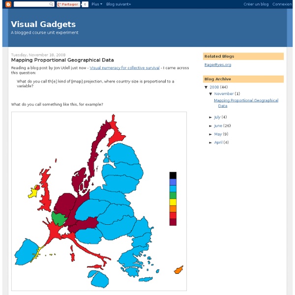
Upshot: Online mapping software for business & foundations | Rhiza Labs One tool. Countless possibilities. Rhiza Analytics is a powerful and elegant analytics research tool that fuses your company’s data with public and syndicated data to give you a 360 view of a situation. Whether it’s making sense of complex customer purchasing patterns across distinct geographies or delivering the right message to the right customer at the right time, Rhiza Analytics produces deep insights about customers, operations and the competitive landscape. Actionable answers to your toughest questions Rhiza Analytics is not a general data exploration tool. All of your data in one place Why use 5 tools, when you can use 1? Fast, at your desk and on the go Whether you are performing a detailed nationwide search across millions of customers, or rolling up data to custom geographies in your market, we make sure you get your answers fast. Rhiza for Media increases targeted advertising sales Ready, Set, Now Rhiza’s web-based technology means no IT hassle on your part.
Blog | Gephi, open source graph visualization software - Part 4 Community ~ gexf gexf4j Francesco Ficarola is a Computer Engineer and a Ph.D. student at the Sapienza University of Rome. In addition he is been working for an Italian company as R&D Engineer for one year. His main research interests are Wireless Sensor Networks, Social Networking and whatever concerns “Internet of Things”. Gephi supports the 1.2draft of GEXF file format since version 0.8. Until now, if you are a Java developer, you couldn’t use any up-to-date Java library to manage this version of the format. The latest version of gexf4j (currently 0.3.1) supports new XML attributes and data types to encode dynamic networks: timeformat or spellopen intervals (startopen/endopen)doubledatexsd:dateTime In addition, the javadoc has been added and all methods have now meaningful names for their parameters. Checkout code Rungit clone Report issues Simply go to the Issues tab. Have a nice “GEXF graph”! Francesco Ficarola (gender == "male").color = blue
Visual Programming Arduino: modkit and the others | dev.SquareCows.com Not long ago, our friend [Ed Baafi] told us about the amazing work he was doing on ModKit: a very interesting project in bringing visual programming on the Arduino side. Making programming as easy as building bricks is the common Quest of many different projects, aimed to work in the Educational field, teaching kids build their own programs (and toys). Modkit is an in-browser graphical programming environment for little devices called embedded systems. Modkit can currently program Arduino and Arduino compatible hardware using simple graphical blocks similar to and heavily inspired by the Scratch programming environment developed by the Lifelong Kindergarten Group at the MIT Media Lab.Modkit is currently available by invite only. Brian’s post has a good review about all the other arduino visual programmers. [Comment if I miss any] I’ll try to update and add some expreriences to this list (thanks Brian!) [Amici] EduWear’s project: [Babuinobot] Project Via [Make] and [TransiLab]
Babuinobot What is Babuino? Babuino is a software program that combines the power of the Arduino hardware platform with the intuitive and fun Logo programming language using a click and drag GUI interface. This allows even young children to build their own programs and run them on a microcontroller. The program on the left uses only 5 blocks to make a speaker beep whenever a button is pressed. What is so Special About the Babuinobot? It's Affordable Costs will vary considerably depending on bulk purchase discounts, availability of local materials, re-using parts and materials from discarded waste and electronics, etc. Free Open Source Software All of the software mentioned in this website for programming the Babuinobot is free, as in "you do not need to pay for it." Open Source Hardware The circuitry is based on the Arduino, a very popular hardware/software platform that is open hardware. Accommodates a Wide Range of Programming Abilities It's Flexible Works With Multiple Operating Systems It's Fun!!
CartoTalk The Open Graph protocol HTML5 A vocabulary and associated APIs for HTML and XHTML W3C Working Draft 29 March 2012 This Version: Latest Published Version: Latest Editor's Draft: Previous Versions: Editor: Ian Hickson , Google, Inc. This specification is available in the following formats: single page HTML , multipage HTML , web developer edition . Copyright © 2012 W3C ® ( MIT , ERCIM , Keio ), All Rights Reserved. Abstract 1 Introduction