
50+ Beautiful Vintage & Retro Web Designs for Inspiration We'll be taking a look at 50+ Beautiful Vintage & Retro Web Designs for Inspiration . Vintage & Retro Web Designs usually showcase fantastic use of color schemes, banner typography and other design elements that may surprise you. Some people may see retro style as old fashioned and out of date, but it can be very trendy and stylish when designed tastefully. Vintage style can be seen in print design, logo, photographs and website design. Retro Web Designs can be found on any type of website, ranging from business to personal. Here's a collection of vintage & retro themed Website Designs for Inspiration . Oh My Deer! Shoshorov 40 Digits Dish Dish Antique Piano Shop The Vintage Catering Company David Whitney Lord Likely Geeky Posh Oatiful Ready Photo Site Ghost Horses The Beard Face Tennessee The CSS Gallery Submission Ad Packs Roxanne Cook The Thomas Oliver Band They Make Apps Capitol Couture T he Dollar Dreadful Family Library Au Petit Panisse Farinella Richard McCartney Amber Thomas Starving for Ethics Hipstery
The Best Free Stock Image Resources on the Web Update – we launched Pablo a new tool to create beautiful images for your social media posts in under 30 seconds You can use Pablo right from the get-go, no need to login or create an account. Just quickly create amazing images super fast. You can try out the first version of Pablo right now – no login required. We’d love to hear your thoughts about Pablo on Twitter, just hit us up @buffer and hope it makes creating images for your social media posts much easier for you. Ok, back to the blogpost! Here on the Buffer blog, we think a lot about visual content. We’ve shared our own study on the importance of images in Twitter posts for more social sharing. But there’s one question we get asked quite often: Where can you find free, good quality images that are cleared to use for your blog posts or social media content? It’s a question with a lot of different answers and caveats. Images can drive up to double the engagement on your social media posts! What is Creative Commons? 1.) 2.) 3.) 4.) 5.)
10 Best Responsive Grid Framework for Web Design Websites built today must be mobile friendly. Why have two different sites for mobile and desktop when you can have your main site be one size fits all? Responsive web design not about making sites for mobile devices, it’s about adapting layouts to viewport sizes. Many people are trying to create responsive web design . If you are new to responsive design approach then you must start building your first responsive design using one of these frameworks. See also: Bootstrap Most poular responsive framework. BluCSS BluCSS is a CSS framework designed with ease of use and simplicity in mind. Gumby 2 Gumby 2 is an amazing responsive CSS Framework. Bourbon Neat Neat is an open source fluid grid framework built on top of Bourbon with the aim of being easy enough to use out of the box and flexible enough to customize down the road. Ivory Simple, Flexible, & Powerful responsive web framework, Makes your web development faster and easier. Foundation Centurion Less Framework 4 Responsive Grid System Groundwork
Improving Your Design Workflow - The Cupcake Method Ah, cupcakes. Who doesn’t love those little, round bites of deliciousness? With a history spanning many, many years, cupcakes have a rich legacy that includes chemistry, enterprise, and problem solving. Today we’ll explore five ways the design process is remarkably similar to the process pastry chefs use to bake cupcakes, and what designers can do to improve their own design workflow. 1. Cupcakes themselves have a rather extensive design history. It’s important to think about your design process in terms of communication and problem solving – from the tools you use all the way up to the most abstract ideas. 2. Baking cupcakes from scratch is one of those things that you either get right, or you botch completely. In this way, making cupcakes is a lot like design. Measure carefully. 3. In some of the more meticulous bakeries I’ve worked with, the chefs have a ritual after their day’s work is done. You can apply this literally to the tools you use – your hardware, save files, code, etc.
How I Learned to Stop Procrastinating, & Love Letting Go : zenhabits ‘People have a hard time letting go of their suffering. Out of a fear of the unknown, they prefer suffering that is familiar.’ ~Thich Nhat Hanh By Leo Babauta The end of procrastination is the art of letting go. I’ve been a lifelong procrastinator, at least until recent years. Until I didn’t. But I couldn’t quit. That’s because I wasn’t getting to the root problem. I hadn’t figured out the skill that would save me from the procrastination. Until I learned about letting go. Letting go first came to me when I was quitting smoking. Then I learned I needed to let go of other false needs that were causing me problems: sugar, junk food, meat, shopping, beer, possessions. Then I learned that distractions and the false need to check my email and news and other things online … were causing me problems. So I learned to let go of those too. Here’s the process I used to let go of the distractions and false needs that cause procrastination: And then I smile, and breathe, and let go.
How to Create an Awesome Infographic 46Email Share To create an awesome infographics, you need to follow the following given 7 step procedure: The first step is to select a topic which can be done through social networking websites. Your idea must make editorials sense for the website that it is going to be published on in addition to having an easy concept, being unique, having enough credibility and should be able to get a person emotionally charged up. The third step involves content research which can be done through governmental agencies, educational institutions and popular online sources. You must select only those points that would be interesting to visualize. One thing to keep in mind is that all the different parts must be part of the same theme and should be well blended together.
8 Mobile App Trends with Examples If I say that smartphones and smart devices are now considered to be a standard for technology in both personal and official perspectives, it would be an understatement. No one can deny the fact that smart technology is now a must have for everyone. Of course, the reasons behind having a smartphone or any other device will be different for every individual but having it is a must. Be it business or personal comfort, smart technology has become an integral part of our lives. Now, that smart technology is everywhere, it is essential for developers to come up with such mobile apps that can make things more convenient for mobile app users. I can say this with full confidence that 2013 is setting itself up for the latest and unique mobile app trends. Mobile App Trends Image Via ShutterStock Advertisement 1. Traditional desktop has taken a back seat thanks to the rise in mobile technology. Jo HTML5 framework Worth To read : Mobile Designing Color Trends with Examples 2. iPad eCommerce App 3. 4.
Start-up of You, Visual Summary iOS SDK History[edit] SDK release history[edit] Apple normally releases a new SDK concurrently with every major (iOS x.0 – e.g. iOS 6.0) and minor (iOS x.x, e.g. iOS 5.1) iOS update. Several beta SDKs are usually released to developers before the version is released publicly. The betas are intended to be used for testing for compatibility with existing applications and to add features that are newly available in that version of iOS.[6] iPhone OS 1.x: SDK[edit] iPhone OS 2.x: SDK[edit] iPhone OS 3.x: SDK[edit] iOS 4.x: SDK[edit] iOS 5.x: SDK[edit] iOS 6.x: SDK[edit] iOS 7.x: SDK[edit] iOS 8.x: SDK[edit] Features[edit] Since its release, there has been some controversy regarding the refund policy in the fine print of the Developer Agreement with Apple. SDK contents[edit] As iOS uses a variant of the same XNU kernel that is found in OS X, the tool chain used for developing on iOS is also based on Xcode. The SDK contents is broken down into the following sets:[29] Core Location[edit] SVG[edit] Alternatives[edit]
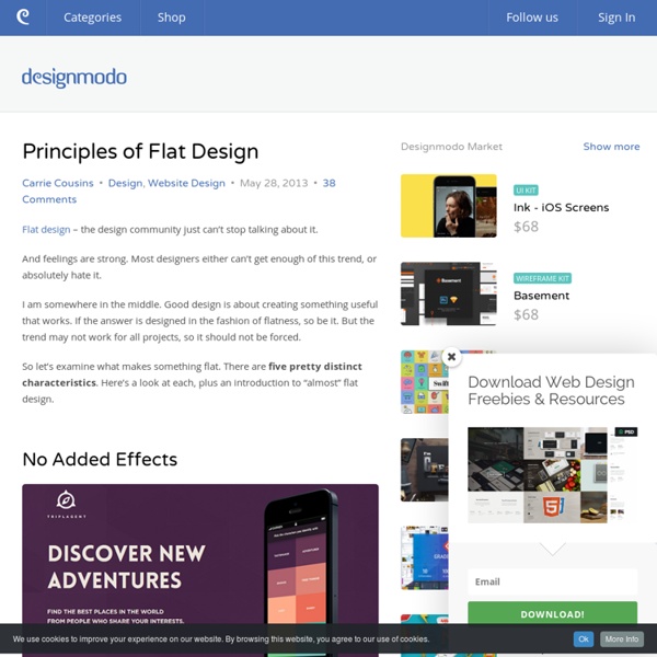
7 Design Trends that are taking 2013 by Storm We are well into 2013, and are already looking at certain emerging design trends that have the potential to become change agents as far as website designing is concerned. These design trends have literally taken 2013 by storm and can leaving a huge impact on how web designers create web experiences in the future. It’s always a good idea to understand what the latest trends are about as it tells you in which direction is web design headed. As a designer, you will also want to get your bearings right and that is why you must know about the latest trends kicking up a storm. Whether to follow them or not, is completely your call and you will need to take a decision based on your estimation of the trend’s importance in your scheme of things. Let’s take a look at 7 design trends of 2013 that I believe will leave their imprints on the way we design our websites: 1. Is the time of Flat Design, upon us? 2.Content is King – Once Again Remember that age old jungle saying, “Content is King”.