
Google lance DataBoard, un nouvel outil vous permettant de créer des infographies personnalisées Google vient de dévoiler un joli petit outil de partage des données pour les entreprises dont le but est de suivre les dernières données disponibles provenant d’études que Google choisit d’inclure. Celui-ci vous permet de facilement insérer vos données que vous recherchez, et de les partager avec d’autres de façons visuellement attrayantes. L’outil nommé Databoard for Research Insights, récupère les données depuis les recherches de la société. Bien qu’il ne comporte qu’une poignée d’études en ce moment, Google a l’intention de mettre à jour fréquemment celui-ci avec de nouvelles recherches. « Il est important pour les entreprises de rester à jour sur les recherches les plus récentes et des perspectives liées à leur secteur d’activité. Ce serait bien si Google avait eu la bonne idée de s’associer avec quelques-unes des entreprises de recherche de pointe pour développer cet outil, mais même avec en tirant profit de son propre moteur recherche, c’est assez cool.
Create Infographics With Piktochart It seems like every day I find a new infographic on at least one of the blogs that I follow. This is because a good infographic can deliver a lot of information in an easy-to-understand format. If you would like to have your students try their hands at creating infographics, Piktochart is a good tool to use. Piktochart provides seven free infographic templates. Each template can be customized by changing the colors, fonts, icons, and charts on each template. If you need more space on the template, you can add more fields at the bottom of the templates.
Social Analytics Reports and Infographics Top 10 Online Tools to Create Infographics Infographics have become extremely popular online tools to create a compelling visualization. Imagine the difference in conveying the beauty of Irises by telling someone about them vs showing them the Iris painting by Van Gogh. There is a world of difference in an image and how much information it can pass through to the viewer. Infographics convey a message much more effectively than a stand alone written article or photo. It is easy to absorb the information and much more fun than reading through a written article and much more likely to be shared. Most people create infographics so that they will be shared with others and so that they can quickly condense a theme or idea into one image. Infographics are often very colorful and appealing to the eye, but don’t worry if you are not artistic. Vizualize.me Vizualize.me is a site that allows you to redo your resume to get rid of all the lengthy, boring text. Visual.ly Visual.ly allows you to create and customize all kinds of infographics.
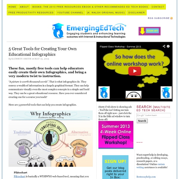
20+ Tools to Create Your Own Infographics A picture is worth a thousand words – based on this, infographics would carry hundreds of thousands of words, yet if you let a reader choose between a full-length 1000-word article and an infographic that needs a few scroll-downs, they’d probably prefer absorbing information straight from the infographic. What’s not to like? Colored charts and illustrations deliver connections better than tables and figures and as users spend time looking back and forth the full infographic, they stay on the site longer. Plus, readers who like what they see are more likely to share visual guides more than articles. While not everyone can make infographics from scratch, there are tools available on the Web that will help you create your very own infographics. In this article, we’re listing more than 20 such options to help you get your messages across to your readers, visually. Read Also: The Infographic Revolution: Where Do We Go From Here? What About Me? “What About Me?” Vizualize.me Piktochart easel.ly
A history teacher uses the oil spill for a student design project Devon ThomasStudents in Diana Laufenberg’s 11th grade history class discuss the infographics they created in a three-week project on environmental disasters. From left to right, the students are Ryan Francis, Luna Frank-Fischer, and Kern Clarke. To close Infographics Week here on The Learning Network, I invited a classroom teacher (and self-described “fanatic” about the use of infographics in education) to detail a project I first heard her talk about on a National Writing Project-affiliated podcast called “Teachers Teaching Teachers.” Diana Laufenberg has been a public school social studies teacher for the last thirteen years, eight at the middle school level and five in high school. Diana acknowledges that though the ready access to technology at a school like hers is a clear advantage, she spent eleven years in schools where access was limited — and she believes that “effective project-based, inquiry-driven learning is not dependent on technology.” So here’s Diana. 1. 2. 3. 4. 5. 6.
Using Animoto in the Classroom It’s unusual for me to write a blog post extolling the virtues of a single edtech tool – I usually prefer a rundown of several resource that can be used for any given subject, because there are so many brilliant tools out there to feature and usually so many advantages and disadvantages to using each one. But Animoto is a special case! It is incredibly easy to use, which is a huge plus for the classroom, but also presents a really wide and flexible range of possible uses, which isn’t always the case with the simpler end of edtech tools. If you’re not already familiar with Animoto, it’s a website that allows you to make your own videos by choosing a background template from a wide range of options, adding a piece of music, and then creating a completely unique compilation of photographs, video clips and text, which is then all magically pulled together into an incredibly professional finished product. The real beauty of Animoto is its sheer, joyful flexibility.
46 Tools To Make Infographics In The Classroom Infographics are interesting–a mash of (hopefully) easily-consumed visuals (so, symbols, shapes, and images) and added relevant character-based data (so, numbers, words, and brief sentences). The learning application for them is clear, with many academic standards–including the Common Core standards–requiring teachers to use a variety of media forms, charts, and other data for both information reading as well as general fluency. It’s curious they haven’t really “caught on” in schools considering how well they bridge both the old-form textbook habit of cramming tons of information into a small space, while also neatly overlapping with the dynamic and digital world. So if you want to try to make infographics–or better yet have students make them–where do you start? The 46 tools below, curated by Faisal Khan, are a good place to start.
10 sites pour créer une infographie Les infographies permettent de visualiser plus facilement un ensemble de données parfois complexe. Une image est parfois plus parlante qu’un long discours ! Elles permettent de comprendre en un coup d’œil les principaux enseignements d’une étude quantitative par exemple. Certains utilisent également ce type de visualisation pour présenter leurs compétences au sein d’un CV original. De nombreux services existent pour réaliser facilement une infographie : nous en avons sélectionné dix. Réaliser une infographie en ligne Infogr.am Une référence, puisque l’outil a déjà permis de créer plus de 340 000 infographies ! Piktochart Ici aussi, il s’agit d’une référence : plus de 100 000 comptes ont été créés sur le site, vous pouvez donc utiliser le service les yeux fermés ! Easel.ly Il s’agit d’un outil très facile à prendre en main, qui permet de réaliser une infographie facilement. Une infographie représentant l’activité sur les réseaux sociaux What About Me Visual.ly Vizify Get About Me CV Gram Kinzaa
Infographics for the Art Challenged I've been interested in infographics for a couple years now. The best ones do a fantastic job organizing complex ideas, sharing information through a mix of visuals and text. In fact they provide a unique opportunity to study (or practice!) the relationship between text and image for conveying ideas. Infographics are an excellent alternative to research papers when teachers want students to practice the skills of research, organiziation and analysis without taking the time to write (or grade!) I've never had students do them, though, because they always required a) artistic ability or b) hard-core Adobe Illustrator skills. No longer. As someone severely art-challenged (as many of my students, who have laughed themselves silly over my stick figures, will tell you), I especially appreciate the opportunity these apps provide for students to think in visual terms. I also think I'll use them to do my annual report.
Tagxedo - Word Cloud with Styles Five Free Infographic Templates Infographics are a powerful tool for capturing the attention of your target audiences. In fact, businesses that publish infographics grow their traffic an average of 12% more than those that don’t. The hard part, of course, is finding the time and resources to create these infographics. That’s why we’ve created five fully customizable infographic templates that will give you the inspiration and foundation you need to build your own infographics right in PowerPoint. The infographics created in this customizable PowerPoint template highlight how you can: Create a color schemeUse fonts for designDesign icons and shapesWork with a theme Start customizing your own infographics -- grab these free templates over to the right! How to make an infographic online: five essential free tools Given the popularity of infographics, you’d be wise to consider using them to help achieve your content marketing goals. They can be great for social sharing, blog fodder and inbound links. The last time I created an infographic I used – wait for it - Microsoft Excel. Thankfully there are now some far better options, and they're surprisingly easy to use. I have compiled five of online tools that will help you to create infographics. Hold on a moment! Before you begin, consider that many infographics are often – to quote Econsultancy Research Director Linus Gregoriadis – “high on graphics and low on information”. As such it is important to map out your story / message / goals before starting to work on the design itself. There’s a great post on the LEWIS PR blog that explains how to optimise an infographic, based around three key questions, which are: 1. 2. 3. Sound advice, and it's worth remembering that old proverb about "he who fails to plan, plans to fail". Easelly Piktochart Infogram