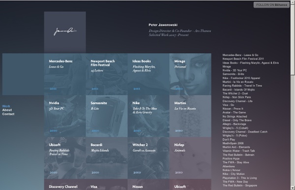
background preloader

Peter Jaworowski's Portfolio

Peter Jaworowski's Portfolio

Robert Montgomery: Poet & Bilbord hijacker London poet/artist Robert Montgomery has been at work since 2005, hijacking city billboards and public areas of interest guerilla style to display his poetic works of art. Montgomery’s series of billboards that appear in big cities here and across the pond showcase his poems, that border on melancholy yet thought provoking themes. These works have won that artist numerous accolades and inspire us all to reassess what we find important in life. Take a look at Robert Montgomery’s inspiring words below and let us know your stance on what he has to say and see all of his artwork and accomplishments.

100 Best Illustrator Tutorials of All Time (From Newbie to Pro) Adobe Illustrator is the most powerful vector software on the planet, and whether you’re using it alone, or in a workflow with other tools such as a 3D program, Photoshop, InDesign, or something else, it can be a great asset to any designer’s arsenal. However, Illustrator is also one of the most daunting programs to learn how to use, with a vast array of tools and features at your fingertips. Some high quality tutorials will go a long way to easing the process, and get you up and going on your own vector creations. In our sequel to the Best Photoshop tutorials of all time, today we have the best Illustrator tutorials ever created and showcased on the web. Here is a post on Tips for Integrating Photoshop and Illustrator into a Seamless Workflow Also, let us know which your favorite illustrator tutorial is in the comments. Hope you enjoy our selection of the best Illustrator tutorials. Learn Illustrator CS3 In 30 Days Create a Gorgeous Landscape Wallpaper for your Desktop in Illustrator

Fashion Zoo Animals Basé à Barcelone, le graphiste Yago Partal nous propose des photo-manipulations afin de découvrir des animaux variées sous différentes tenues fashions, du costume le plus chic à la chemise hawaïenne. Un rendu drôle pour des visuels réunis sous le nom de Zoo Portraits à découvrir dans la suite en images. Carved Book Landscapes by Guy Laramee (click images for detail) For the better part of three decades multidisciplinary artist Guy Laramee has worked as a stage writer, director, composer, a fabricator of musical instruments, a singer, sculptor, painter and writer. Among his sculptural works are two incredible series of carved book landscapes and structures entitled Biblios and The Great Wall, where the dense pages of old books are excavated to reveal serene mountains, plateaus, and ancient structures. Of these works he says: So I carve landscapes out of books and I paint Romantic landscapes. Laramee’s next show will be in April of 2012 at the Galerie d’Art d’Outremont in Montreal.

Diseño gráfico y diseño de páginas web en Bilbao - Vudumedia 30 Interesting 404 Pages - Web Design Blog – DesignM.ag Get the FlatPix UI Kit for only $7 - Learn More or Buy Now A 404 error page shows up when user tries to browse to a web page that doesn’t exist anymore. The link may be broken, moved, or never existed. In this roundup we are featuring 30 interesting 404 pages for your inspiration. brandstack hugsformonsters inflicted ipolecat stereosuper ngenworks pixiapps wireframeplus pieoneers jeandelbrel dailymile gdzl cascadebreweryco themanyfacesof marketingvirtuel dmcloud irrationalgames carolrivello creashit leegustin apadeloup sohtanaka mailchimp upthemes davidhellmann agens 4mots criticalzero playr denisechandler About Brant Wilson Brant Wilson is a staff writer for the DesignMag network.

"What Font Should I Use?": Five Principles for Choosing and Using Typefaces Advertisement For many beginners, the task of picking fonts is a mystifying process. There seem to be endless choices — from normal, conventional-looking fonts to novelty candy cane fonts and bunny fonts — with no way of understanding the options, only never-ending lists of categories and recommendations. Selecting the right typeface is a mixture of firm rules and loose intuition, and takes years of experience to develop a feeling for. Here are five guidelines for picking and using fonts that I’ve developed in the course of using and teaching typography. 1. Many of my beginning students go about picking a font as though they were searching for new music to listen to: they assess the personality of each face and look for something unique and distinctive that expresses their particular aesthetic taste, perspective and personal history. The most appropriate analogy for picking type. For better or for worse, picking a typeface is more like getting dressed in the morning. 2. 1. 2. 3. 4. 5.

Nikola Arežina graphic and web designer/developer | Portfolio | beRGB.com

Related: