
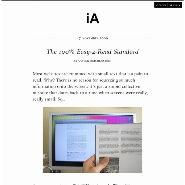
16 Pixels: For Body Copy. Anything Less Is A Costly Mistake - Smashing Magazine 16 Pixels: For Body Copy. Anything Less Is A Costly Mistake Advertisement I know what you’re thinking. “Did he just say 16 pixels? For body copy? I’d like to persuade you otherwise. As usability expert Oliver Reichenstein says in “The 100% Easy-2-Read Standard1”: [16 pixels] is not big. In this article, I’ll explain why 16 pixels should generally be the minimum size for body copy in modern Web design. You see, in most cases, if you’re building websites with the font size set between 10 and 15 pixels, you are costing your clients money. Readership = Revenue If you’re building a website for someone — even yourself — chances are its purpose is to make money. Perhaps it’s to sell a product directly, or to offer a service, or just to generate leads. So, every element should be designed to achieve that goal. Think about it. Important Facts About Reading At age 40, only half the light gets through to the retina as it did at age 20. Fact: Most Web Users Hate The “Normal” Font Size “But Users Can Zoom”
The Whys And The Hows Of Textures In Web Design - Smashing Magazine Advertisement Texture is becoming integral to design. It’s gone beyond being a trend — it’s now a simple and effective way to add depth to a website. Wielding the power of texture is a great responsibility. It increases the effectiveness of websites and is a quality tool in the arsenal of designers. However, texture has long been synonymous with “dirty” or “grungy” design. Textures vs. Before we get into textures in depth, let’s distinguish between patterns and textures. The Function Of Textures We love texture on the Web for a multitude of reasons. Grabbing Attention With a Call to Action Texture can highlight elements such as titles, headings, icons and buttons. When used minimally, texture separates the content from the rest of the website. You can grab attention in different ways, but two common ways can be easily demonstrated with branding: a textured logo against a clean background, and a clean logo against a textured background. Enhancing Information Architecture Maintain Legibility
Detect and Set the iPhone & iPad's Viewport Orientation Using JavaScript, CSS and Meta Tags Last week we showed you how to use Safari for iPhone and iPad website testing. This week we'll show you how to detect and set the devices' viewport orientation to Landscape or Portrait using JavaScript, CSS and meta tags. Developing websites for the iPhone and iPad is a bit different than developing a website for a standard, desktop web browser. When you are viewing a site using an iPhone, for instance, if you are holding the device upright, you will see the page in portrait view. If, however, you turn the device sideways, the view of the web page changes to landscape view. Using Meta Tags for iPhone and iPad Orientation The best way to detect the orientation of the device is by using meta tags. The initial-scale is the one that renders when the page initially loads. To keep users from expanding the window size beyond the size it needs to display properly, you can set the maximum-scale to 1.0. Using JavaScript for iPhone and iPad Orientation Using CSS for iPhone and iPad Orientation
Free E-Commerce WordPress Theme: Balita - Smashing Magazine Advertisement In this post we release yet another freebie: the Balita WordPress theme, a theme dedicated to shops that sell products for children. The theme was designed by Tokokoo and released exclusively for Smashing Magazine and its readers. As usual, the theme is absolutely free to use for both private and commerical projects. Not many theme providers have produced e-commerce themes for baby and toddler products. Download the Theme for Free! The theme is released under GPL. Large Preview Live DemoLarge Preview (.jpg, 0,17 Mb)Download the .zip-package (zip, 16 Mb, including instructions) Balita Theme: Features WordPress E-Commerce Plugin: It will help you generate your e-commerce store on a WordPress platform. Large Preview Large Preview Capture Left Side (Large Preview) Footer Left (Large Preview) Footer Widget (Large Preview) Logo Nav (Large Preview) Right Nav Cart (Large Preview) Single Add to Cart (Large Preview) Single Full (Large Preview) Single Preview (Large Preview) Behind the Design
UIFont - iPhone Development Wiki Languages: English • français UIFont is a class representing a font face and the font size. This class is built on top of GSFont. Default font families Default font sizes There are 4 font sizes that can be obtained using +[UIFont someSize]. Undocumented methods +fontWithFamilyName:traits:size: Returns a font with specific family name, traits (bold/italic) and font size. // Equivalent to [UIFont fontWithName:@"Arial-BoldMT" size:24]UIFont* font = [UIFont fontWithFamilyName:@"Arial" traits:GSBoldFontMask size:24]; +fontWithMarkupDescription: Create a font using a CSS font description, e.g. // Equivalent to [UIFont fontWithName:@"Arial-BoldMT" size:24]UIFont* font = [UIFont fontWithMarkupDescription:@"font-family: Arial; font-size: 24px; font-weight: bold;"]; Unlike real CSS rules there are heavy restrictions on the "markup description": The font-family rule must be exact. -traits Returns the traits (bold/italic) of the font. -isFixedPitch Returns whether the font is monospaced or not. References
How to Create Tabs in WordPress Settings Pages Advertisement Using tabs in a user interface can help you better organize content, so it’s only natural that WordPress themes that have a lot of options would benefit from tabs on their settings page. In this tutorial, you will learn how to create a tabbed settings page, and you’ll get to download a WordPress theme that implements the code. Overview To get a quick grasp of the tabs we’ll be creating, go to Appearance/Themes in the WordPress admin area. The process is actually fairly simple: we set and send a tab variable when a tab is clicked. In our approach, there are three times when we will need to know which tab the user is currently on: When we initially display the tabs and the form fields for the settings (in order to display the correct set of fields);When the user saves their settings (in order to save the correct fields);When redirecting the user after they have saved their settings (in order to redirect the user to the correct tab). Creating The Tabs Displaying The Tabbed Content
On Web Usability: Mouse Cursors and Actionable Page Elements | engfer(s) Whether we realize it or not, the displayed cursor image tells us about the area of the screen below our mouse cursor; it tells us whether or not we need to click, drag, move, resize, or even wait. Now, I know that we all know this, but I believe that sometimes as developers (especially web developers) we forget that not all items in an application have the correct default cursor for the action that is assigned for that item. The Web Standard For years we lived without JavaScript in our browsers; it wasn’t used by developers, or it was turned off or disabled by the user because there were so many security flaws with the JavaScript engine; however, as those security flaws are fixed and JavaScript’s functionality increases, the age of no-script is quickly coming to a close. One of the side-effects from living without JavaScript for so long is that users are now used to relying on the mouse pointer to signal whether or not something on the page is clickable or actionable. Taken For Granted
Create Perfect Emails For Your WordPress Website - Smashing WordPress Designing With Audio: What Is Sound Good For? Advertisement Our world is getting louder. Consider all the beeps and bops from your smartphone that alert you that something is happening, and all the feedback from your appliances when your toast is ready or your oven is heated, and when Siri responds to a question you’ve posed. Today our technology is expressing itself with sound, and, as interaction designers, we need to consider how to deliberately design with audio to create harmony rather than cacophony. In this article, we’ll explore some of the uses of audio, where we might find it and when it is useful. Audio is a form of feedback that can be used either in combination with other forms, such as haptics, visual displays and LEDs, or on its own. For every action of the user, a good experience will include feedback that the action has been registered; for example, pressing a number key on a mobile phone would play a sound and show the number being pressed. Audio is not always warranted. Where We Find Audio (Image credit: Fey Ilyas)
10 jQuery Plugins to Enhance your User Interfaces With a recently estimated over 20 million websites currently using jQuery it is essential to know what jQuery plugins there are out there in order to stay with the web design trend. Today, we’ll put some focus on some popular jQuery user interface plugins to help you enhance your current website to stay ahead of the crowd! jQuery Image Parallax Ever wanted an animated header but refused to put Flash on your website? jQuery News Ticker Ever wanted to display the latest news on your website in a sort of “headline news” way. jQuery Letterings This awesome little jQuery plugin creates eye catching fonts, typical called web typography! jQuery Stylesheet Switcher Designing a web page and can’t decide what styles to choose for a client? jQuery Page Peel This little jQuery plugin which does exactly what it says on the tin – creates a page peel! jQuery Simple Modal Lets face it, alert boxes which display things like “Wrong password” or “Saved.” are outdated! jQuery Scroll Slider jQuery Easy UI shares
Take away - Benchmark
Font Color #333
Page Color #fff by hfernety Feb 13