
70 Typographic, Clean And Minimalist Color Scheme Web Designs Hello there! It’s time for little inspiration and this time I wanted to showcase something different. You may know that very popular designer slogan – “More is Less”, and yes it’s often so true – unexperienced people tend to overcrowd, use too much colors in their designs. I just love these designs – they are very light, clean and usually uses only monochrome color scheme and just one or two bright colors for links or headers. You may also notice for such designs it’s more about grid, harmonic distribution through whole page and very silent, elegant accents. 1. One of the best clean, light and elegant websites I came across in this research. 2. 3. 4. 5. Very clean, yet professional web design. 6 .Made By On 7. Hot Meteor specializes in web, print, and branding. 8. Excellent accents leading your eye through whole page in the way author wants it. 10. 11. Visit his homepage – starting from index page you’ll get amazed how effectively Vitor Lourenco uses white space. 12. 13. 14. 15. 16. 17.
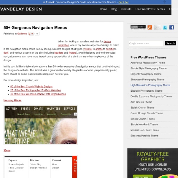
50 Stylish Navigation Menus for Design Inspiration Six Revisions Skip site navigation 50 Stylish Navigation Menus for Design Inspiration Apr 10 2009 by Jacob Gube | 39 Comments A site’s navigation menu is one of the most prominent things that users see when they first visit. In this article, you’ll find a showcase of beautiful, creative, and stylish navigation menus for your inspiration. 1. netdreams.co.uk 2. 3. 4. 5. 6. 7. 8. 9. 10. 11. 12. 13. 15. 16. rzepak.pure.pl 17. 18. 19. 20. 21. 22. 23. 24. 25. 26. 27. 28. 29. 30. 31. 32. 33. 34. 35. csharpdesign.co.uk 36. 37. okb 38. 39. 40. 41. 42. 43. 44. toby-powell.co.uk 45. 46. 47. 48. 49. 50. Related content 39 Comments Alex April 10th, 2009 Here is another one: (top navigation) Kayla April 10th, 2009 Very cool menus. Jamiel Sharief April 10th, 2009 Nice collection. David April 10th, 2009 thx for sharing! Danny Hinde April 10th, 2009 Caroline April 10th, 2009 Great list – one missing – using tag clouds as part of navigation kayintveen April 10th, 2009 Tony Creamy CSS
5 outils en ligne pour webdesigner Utiles et rapides, les outils en ligne donne un véritable coup de pouce aux webdesigners dans les moments de stress. Pour toujours avoir les bonnes ressources sous le coude, je vous invite à lire suite. Sprite Cow Pourquoi s’embêter avec les repères et des sélections dans Photoshop lorsque Sprite Cow vous permet de générer du CSS directement avec vos images ? Testez c’est plutôt pratique ! Subtle Patterns Le site une galerie de motifs à télécharger pour vos designs web. Patternify Le site est un générateur de motifs, simple à utiliser. PrefixMyCSS Avec l’utilisation massive des CSS3, nous autres webdesigners perdons un temps précieux à préfixer nos déclarations pour qu’elles soit utilisables sous Webkit / Firefox et Internet Explorer. CSS3 Generator Très connu, celui-ci est un générateur de code CSS3 comme son nom l’indique. Cette entrée a été publiée dans Ressources, avec comme mot(s)-clef(s) generateur css, outils, Webdesign.
Web-Based Tools for Optimizing, Formatting and Checking CSS Stylesheets can get large real quickly, both in terms of length and file size. To ensure that your web pages render correctly and quickly, here’s a compilation of some of the best free, web-based CSS optimizers/compressors, code formatters, and validation services. Check them out and pick the ones that work best for you. Optimizing and Compression CSS Optimizer CSS Optimizer is a simple online optimizer that processes your current CSS and outputs the compressed version. Clean CSS Clean CSS is based on the popular CSS minifier, CSSTidy. CSS Drive Gallery- CSS Compressor CSS Drive’s CSS compressor has two modes, Regular mode and Advanced mode (which has a few more options that you can set). Online CSS Optimizer Online CSS Optimizer is another simple CSS optimization tool based on the CSS optimizer command-line application for OS X and Linux. CSS Compressor Another popular web-based CSS compression tool is Robson’s open-source CSS Compressor, (check out the CSS Compressor PHP source code).
40 Beautiful Examples of Minimalism in Web Design Minimalism is a design style that emphasizes simplicity and the removal of superfluous elements in one’s own work. It’s applied in art, architecture, print work, and in web design. There is something extraordinary about making something magnificent with limited resources, and in this showcase, you’ll find the work of talented designers that exhibit exemplary use of Minimalism theories applied to web design. 1. 2. 3. 4. 6. 7. 8. monty lounge industries 9. 10. 11. el Candor 12. 13. design by silnt 14. 15. 17. 18. 19. 20. cabedge.com 21. 22. siteInspire 23. 24. 25. 26. 27. 29. dConstruct 30. 31. 32. 34. 36. 37. tictoc 38. 39. 40. What do you think at Minimalism? Minimalism in web design is something that can be tricky to pull off (ironic isn’t it?). Related content
50 Graphic tributes to Steve Jobs With the passing of Steve Jobs this month, designers around the world are creating tributes. Considering the impact Jobs had on the technology and design fields, it’s not surprising to see the number of creative designs created to pay homage to his legacy. A great collection of these tributes have been recently posted to Behance.net. Below, we’ve collected fifty of these designs, all inspired by the life of Jobs and the impact he had on the world. Feel free to share other designs that we may have missed and let us know which ones you like best in the comments…. Dan Malarkey Aakreit Sachdeva Mohammed Al-Humran Moanungsang Lemtur Henk Nyenhuis Nuno Queiros G. Francois Hoang Jessica Menda Dado Lo Emer Jimmy Landaburu Alvaro Rojas Simona Marino Pascal Cataye Paul Gomes Mahmoud Alkhawaja Zuka Daniel Zuleta Shadman Ahmed Cody Small Gregbo Watson Dennis Pfeil Ryan Rachmanto Gary Chew Orighomisan Ogbebor Jermaine Ryan Ford Marco Salvador Mauricio Navas Izumi Yeh-Ling Prince Pal Singh Patricia Villanueva Joost van der Ree Bocr
12 ressources Jquery et CSS3 pour vos photos Les outils modernes du web permettent de sublimer plus que jamais vos photos sur votre site web. Zooms, filtres, sliders, mise en page adaptative…bref autant de ressources pour présenter vos photos en ligne de manière originale. Vintage.js On commence avec Vintage.js, qui permet comme son nom l’indique de donner un effet vintage à vos photos. Une bonne idée qui s’inscrit totalement dans la tendance du vintage moderne actuel avec des applications comme Instagram par exemple. Il s’agit d’un site avec upload de photo, mais vous pouvez réutiliser le code qui est partagé sur GitHub. Effet miniature 3D au survol Une excellente ressource basée sur la propriété CSS3 3D Transform. iView Slider Un slider Jquery certes lourd mais très complet. CSS3 Tilt Shif Effect Ultra à la mode il y a quelques années, l’effet Tilt Shift (miniature) est désormais décliné dans un plug-in Jquery utilisant du CSS3. iPicture Permet d’ajouter dans infobulles dans une image. Effet de survol originaux avec les filtres CSS3
CSS Menu Builder | Free online navigation generator 14 Helpful Cheat Sheets for Front-end Web Development For web developers and designers, it can be difficult to memorize the syntax for multiple programming languages and frameworks, especially since they are always evolving and growing. This is where cheat sheets come in handy. Most cheat sheets are designed to be printer friendly, so you can have them laying around on your desk as quick reference cards. Here is a collection of useful cheat sheets specifically for front end web development that will help you with HTML, JavaScript, and CSS. HTML 5 Cheat Sheet HTML 5 Visual Cheat Sheet (X)HTML Elements and Attributes HTML Cheat Sheet HTML5 Canvas Cheat Sheet CSS Level 2 Visual Cheat Sheet CSS 3 Cheat Sheet CSS Cheat Sheet (V2) CSS Cheat Sheet JavaScript jQuery 1.4 API Cheat Sheet jQuery 1.4 Cheat Sheet jQuery 1.4 Cheat Sheet mootools 1.2 cheat sheet JavaScript Cheat Sheet About the Author Henry Jones is a web developer, designer, and entrepreneur with over 14 years of experience. Related Posts 1139 shares 20 Fresh CSS3 Tutorials Read More 559 shares