
Responsive Multi-Level Menu A responsive multi-level menu that shows its submenus in their own context, allowing for a space-saving presentation and usage. View demo Download source Today we want to share an experimental drop-down menu with you. The main idea is to save space for menus that have a lot of content and sub-levels. Each sub-level in this menu will be shown in its own context, making the “parent” level disappear. This is done with subtle animations that are defined in separate animation classes. Please note: this only works as intended in browsers that support the respective CSS properties. The structure of the menu contains an unordered list that can have an arbitrary number of sub-lists: Animations are defined in animation classes: And the plugin is called as following: We hope you like this little experiment and find it inspiring!
Hide the Address Bar within Mobile Safari With both iOS and Android-driven devices using WebKit as their browser's rendering engine, web developers have many advantages: A rendering engine with capable of flawless CSS animationsA rendering engine that's fast...very fastA rendering engine that's modern and forward-thinking These advantages allow us to create web apps within that browser that look as good as native applications. You may think hiding the address bar within the mobile browser is difficult but you'd be surprised how simple it is. The JavaScript window.addEventListener("load",function() { setTimeout(function(){ window.scrollTo(0, 1); }, 0);}); The window.scrollTo method is the key to hiding the address bar. Bonus: META Tag for Bookmarked Sites If a user has added your web application to their springboard, the following meta tag can remove the top bar from the browser: And that's all! Be Heard Tip: Wrap your code in <pre> tags or link to a GitHub Gist! Older Create a Spinning, Zooming Effect with CSS3 Newer
BookBlock: A Content Flip Plugin - Demo 2 January 2013 Monday Tuesday Wednesday Thursday Friday Saturday Sunday 7Mon 8Tue 9Wed 10Thu 11Fri 12Sat 13Sun 14Mon 15Tue 16Wed 17Thu 18Fri 19Sat 20Sun 21Mon 22Tue 23Wed 24Thu 25Fri 26Sat 27Sun February 2013 4Mon 5Tue 6Wed 7Thu 8Fri 9Sat 10Sun 11Mon 12Tue 13Wed 14Thu 15Fri 16Sat 17Sun 18Mon 19Tue 20Wed 21Thu 22Fri 23Sat 24Sun March 2013 25Mon 26Tue 27Wed 28Thu 29Fri 30Sat 31Sun April 2013 1Mon 2Tue 3Wed 4Thu 5Fri 6Sat 7Sun 8Mon 9Tue 10Wed 11Thu 12Fri 13Sat 14Sun 15Mon 16Tue 17Wed 18Thu 19Fri 20Sat 21Sun 22Mon 23Tue 24Wed 25Thu 26Fri 27Sat 28Sun May 2013 6Mon 7Tue 8Wed 9Thu 10Fri 11Sat 12Sun 13Mon 14Tue 15Wed 16Thu 17Fri 18Sat 19Sun 20Mon 21Tue 22Wed 23Thu 24Fri 25Sat 26Sun 27Mon 28Tue 29Wed 30Thu 31Fri June 2013 3Mon 4Tue 5Wed 6Thu 7Fri 8Sat 9Sun 10Mon 11Tue 12Wed 13Thu 14Fri 15Sat 16Sun 17Mon 18Tue 19Wed 20Thu 21Fri 22Sat 23Sun 24Mon 25Tue 26Wed 27Thu 28Fri 29Sat 30Sun July 2013 August 2013 5Mon 6Tue 7Wed 8Thu 9Fri 10Sat 11Sun 12Mon 13Tue 14Wed 15Thu 16Fri 17Sat 18Sun 19Mon 20Tue 21Wed 22Thu 23Fri 24Sat 25Sun 26Mon 27Tue 28Wed 29Thu 30Fri 31Sat September 2013 2Mon 3Tue 4Wed 5Thu 6Fri 7Sat 8Sun 9Mon 10Tue 11Wed 12Thu 13Fri 14Sat 15Sun 16Mon 17Tue 18Wed 19Thu 20Fri 21Sat 22Sun
14 DIY mobile app development resources for small businesses This post was updated April 8, 2014, to reflect the ever-changing mobile application development landscape. Many small businesses sill shrug off the idea of creating a mobile app but the case for doing so continues to become stronger, not just when it comes to engaging more effectively with customers but for empowering employees. I wrote about one example of the latter scenario last month: ski and board shop Mount Everest in Westwood, N.J., created a mobile app to extend its LightSpeed point-of-sale (POS) solution so that the sales team is alerted when priority orders arrive. Its app helps the retailer boost credibility with certain search engines by responding more quickly. I mentioned two similar examples involving FileMaker late last year. According to one of its findings, as of mid-to-late 2013, more than 50 percent of those surveyed by Pew Research had downloaded at least one mobile app.
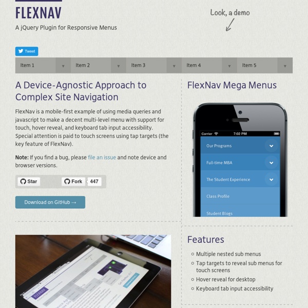
Responsive Nav — Responsive Navigation Plugin jquery-ui-map - Google map v3 plugin for jQuery and jQuery Mobile The Google Map version 3 plugin for jQuery and jQM takes away some of the head aches from working with the Google Map API. Instead of having to use Google event listeners for simple events like click, you can use jQuery click events on the map and markers. It is also very flexible, highly customizable, lightweight (3.2kB or 3.9kB for the full) and works out of the box with jQuery mobile. But one of its best features (atleast for SEO people) is that you can populate a map from microformats, RDFa or microdata on your site, which can be used as a fallback when a user doesn't have javascript enabled. Download the plugin with examples or get the minified file here Donate Entities which have donated jQuery mobile demo jQuery Mobile example Demo Documentation Tutorial sample code. Demos and tutorials using jquery-ui-map Help? Post in the forum If you need professional help with any implementation please email me directly Links
Organizing Mobile When it comes to organizing the content and actions on mobile, solid information architecture principles like clear labeling, balanced breadth and depth, and appropriate mental models remain important. But the organization of mobile web experiences also needs to: Align with how people use their mobile devices and why.Emphasize content over navigation.Provide relevant options for exploration and pivoting.Maintain clarity and focus.Align with mobile behaviors Article Continues Below In the previous part, we talked about the constraints and capabilities that make designing for mobile unique. Looking at this intersection at a high level can illuminate how people are typically using their mobile devices and why. Because they directly align with why people pull out their mobile devices, these behaviors often determine how your mobile experience can be structured and organized to meet people’s needs. Aligning with mobile behaviors also naturally aligns your website with real-world needs. Yahoo!
Add to home screen Support Development Add To Homescreen is a free, open source javascript software. It is released under the MIT License which basically grants you complete freedom in usage for open source and commercial applications. That being said the only way for me to subtract hours from my day work and keep implementing this script is through donations. If you find this widget useful and wish to support future development, please consider a donation. Overview The script opens an always-on-top message inviting the user to add the application to the home screen. ATH by default looks something like this But appearance is customizable with plain old CSS. The script is compatible with iOS 6+ and Chrome 31+. Languages The message changed in v3 so unfortunately all the languages supported in v2 are not available anymore. Basic Usage v3 API changed drastically (sorry about that) and it’s not a drop in replacement for v2. <head><title>Add To Home</title> ... That’s all you need. Options Detect the homescreen
Adaptive Images in HTML How To Build A Mobile Website Advertisement Over the past few years, mobile web usage has considerably increased to the point that web developers and designers can no longer afford to ignore it. In wealthy countries, the shift is being fueled by faster mobile broadband connections and cheaper data service. However, a large increase has also been seen in developing nations where people have skipped over buying PCs and gone straight to mobile. Unfortunately, the mobile arena introduces a layer of complexity that can be difficult for developers to accommodate. In addition to supporting different platforms, each device may use any number of mobile web browsers. Source: Nielsen Study, Image credit The mobile web reintroduces several issues that have been largely ignored in recent years. How To Implement Mobile Stylesheets The first step to adding mobile support to a website is including a special stylesheet to adjust the CSS for mobile devices: Server-side Methods & The UA String Large image “It’s an arms race. Other Changes