
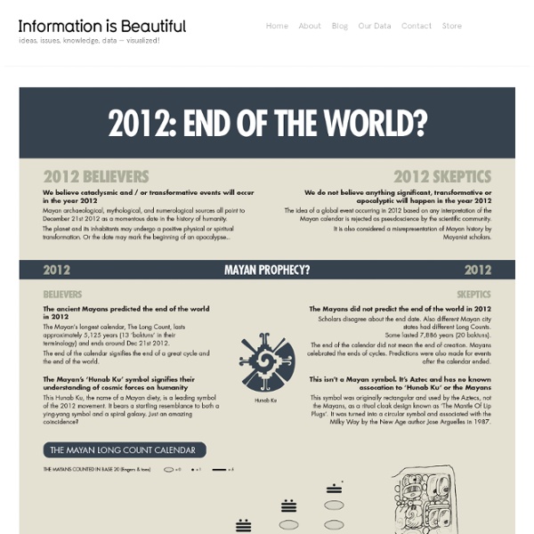
http://www.informationisbeautiful.net/visualizations/2012-the-end-of-the-world/
Cool Infographics - Blog PBS Frontline has published the interactive data visualization, NFL Concussion Watch 2013 to summarize all of the player concussions reported in the NFL. Every week in the National Football League, a player is sidelined by a head injury. In some cases, their symptoms are clearly visible and they exit the game. How I Learnt To Stop Worrying And Love The Bomb (Kinda) I felt alienated from The Guardian’s graphic about stockpiles of nuclear weapons . Was there a better way to depict the data? UPDATE: Aug – I’m in the process of revising this diagram in light of all the comments (and flames!). Thanks all. If you can help me research the data, please email I felt the use of abstract figures made most of the data meaningless.
Interaction Design 101: Create an Interactive Guide with InDesign CS5 Share this Episode Autoplay End of Video Show End Screen 7 billion people and you: What's your number? Sources: All population data are based on estimates by the UN Population Division and all calculations provided by the UN Population Fund. The remaining data are from other sections of the UN, the Global Footprint Network and the International Telecommunications Union. Want to find out more? Who Runs The World? » Purchase: Amazon US or Barnes & Noble | UK or Waterstones » Download: Apple iBook | Kindle (UK & US) » See inside For more graphics, visualisations and data-journalism:
Interaction Design 101: Create a simple web application with Flash Catalyst CS5 Community Translation Your transcript request has been submitted. Adobe TV does its best to acommodate transcript requests. It can take a few weeks for the transcript to become available in the Community Translation Project, so keep checking back. Join the Community Translation Project Thanks for your interest in translating this episode!
Affording Health Care Even with health insurance, health care can cost an arm and a leg. The infographic below shows across geographies, income and education levels, between 1997 and 2006, a growing number of Americans avoided health care due to cost. About this data Health, United States, 2009 is the 33rd annual report on the health status of the Nation, prepared by the Secretary of the Department of Health and Human Services for the President and the Congress.
This copy of Windows is not genuine – how to fix Microsoft, in a rather brilliant move, has released an update that checks your OS serial against a list of known leaked serials (corporate edition keys, etc). If your serial matches one of them then it puts a darling little message on the bottom right hand of your login screen, and also a system tray icon that nags you to buy a genuine copy of windows. It will also pop up a dialog that says “This copy of Windows is not Genuine” “This copy of Windows is not genuine and you have not yet resolved this issue.
eBook Document Design with CS5 Design Premium Community Translation Your transcript request has been submitted. Adobe TV does its best to accommodate transcript requests. Bomb Sight - Mapping the World War 2 London Blitz Bomb Census With Bomb Sight you can discover what it was like in London, during WW2 Luftwaffe Blitz bombing raids, exploring maps, images and memories. The Bomb Sight web map and mobile app reveals WW2 bomb census maps between 7/10/1940 and 06/06/1941, previously available only by viewing them in the Reading Room of The National Archives. How to use the Map Use the search box to find a street or postcode of interest You can move around the map by clicking on the pan controls Use the zoom controls to change the detail on the map: Click the plus (+) to see more detail and click the minus (-) to see less map detail Use the layer button in the top left to explore the different types of map information that is available Click on individual bomb icons to find out more information Click on the to have a look at the map legend (this button is not available when viewing the website on a small screen) What information is available?
Ámuñegü (In Times to Come) by Galen Brown Our project, Ámuñegü, a full length documentary film, is a story told through the eyes of two communities, Placencia and Seine Bight, trying to defend a balance they have maintained for generations. The Placencia Lagoon is home to many species and is the nursery for local fish stocks, manatees, rays and dolphins, and is also the livelihood of several regional communities including people of Garifuna, Creole and Mayan desent. In recent years, a rise in unregulated development has damaged much of the Lagoon. Our documentary will follow community leaders and fishermen who are trying to protect what makes Placencia unique, culturally rich and self-sustainable. We will share their story at film festivals internationally because we believe that their struggle is echoed in other communities around the world. The villages of Placencia and Seine Bight, Belize, are not alone in defending sustainability and community autonomy, but they are unique.
GLOBAL COMMUNICATIONS CONSULTANCY Semiotics is the best way to make sense of the relationship between consumers, brands, and the cultures they live in. It is a straightforward yet powerful research tool that puts brands and companies in control of the cultural meanings they’re making. Space Doctors combines the best of today’s semiotic thinking with peerless client-side expertise and business understanding. We know the right partnership of insight and actionability is what makes semiotics meaningful to our clients. We’re experts at managing that partnership. By mapping the evolution of brand and cultural meaning, we are able to anticipate shifts in consumer values and expectations. Virtual Water - Discover how much WATER we EAT everyday The good news is that each one of us can also make the world a little more water secure, ready to face the needs of our peak population future. How? The answer lies in our shopping baskets. The amount of meat in our diet is crucial!
vizbox/startup-universe/ The Startup Universe displays and explores the relationships between startup companies and their founders and investors (Venture Capitalists) since 1990. Startups are grouped into 19 categories, based on the type of products or services they deliver. Each category is represented by an unique color.