
How to Build a Simple Mobile Website with CSS3 In this article we're going to look at a variety of options for building simple mobile websites with CSS3. Note that these techniques won't work with all phones but if you only need a mobile site for a few devices, these tips could to the trick. Before we get started, be aware that due to the restricted viewing space, a mobile website is generally one column of data, with the exception of simple tables and small buttons side by side. It's not a good idea to try and cram a lot of data into that space. If you use PDF documents as part of your layout, I recommend reformatting them into a single column of data, no more than 480pixels wides. For the sake of simplicity you could build an icons based layout, a windows based layout or a combination. there are some other choices, though these would result in a simple site that's effective. Here are some layout examples: Here's an example of an icons based layout.
Flexible, Mobile-First Layouts with CSS3 Some experts are projecting mobile devices to become the dominant medium for web browsing within five years, overtaking browsing on desktop computers. Regardless of how accurate this projection turns out to be, it is clear that formatting websites for mobile-friendly viewing needs to become a staple of web design and development. There are many ways to accomplish this, of course. Step 1. There are a few issues that should be thought about before diving right into styling a layout. Mobile Web Browsing First, what should one keep in minds when designing for mobile browsers? Limit HTTP requests: data transfer over 3G can be quite taxing. "The overall point is to know ahead of time what your site is likely to look like in various browsers before seeing it." Browser Support (on Desktops) Secondly, keep browser support in mind. Step 2. The Body "Keep the markup simple and clean." Not only do we want to produce valid HTML, we also want to simplify it as much as possible. Viewport Metadata Step 3.
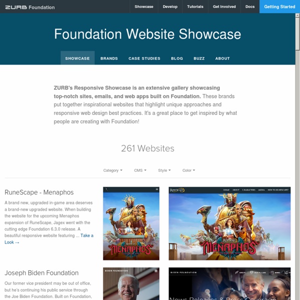
Off Canvas Layouts CSS - Foundation 3 - ZURB Playground - ZURB.com Off Canvas What Now? If you've used Facebook's iPhone app (or Path, or any number of apps that now follow this convention) then you've seen an off canvas panel in a native app. You hit a button and a panel slides in from the left (or depending on how you look at it, the main panel slides out of the way). Luke Wroblewski, author of Mobile First, mentioned this style of layout in his roundup of mobile layout patterns. He and Jason Weaver then worked to create a batch of layouts, which they published to demonstrate how layouts like this could work on the Web. We were so impressed that we wanted to make that style of layout available for Foundation users, and the four layouts below are a few different examples of off-canvas layouts created specifically for Foundation. Four Layouts, No Waiting We've put together four different layouts, each with specific functionality and code for you to check out and download. How to Use These Layouts Foundation 3.2, the release version of Foundation 3.
Multi-Device Layout Patterns Through fluid grids and media query adjustments, responsive design enables Web page layouts to adapt to a variety of screen sizes. As more designers embrace this technique, we're not only seeing a lot of innovation but the emergence of clear patterns as well. I cataloged what seem to be the most popular of these patterns for adaptable multi-device layouts. To get a sense of emerging responsive design layout patterns, I combed through all the examples curated on the Media Queries gallery site several times. I looked for what high-level patterns showed up most frequently and tried to avoid defining separate patterns where there were only small differences. Mostly Fluid The most popular pattern was perhaps surprisingly simple: a multi-column layout that introduces larger margins on big screens, relies on fluid grids and images to scale from large screens down to small screen sizes, and stacks columns vertically in its narrowest incarnations (illustrated below). Column Drop Layout Shifter
Wirefy | The Responsive Wireframe Boilerplate Wirefy was created as a tool to help web designers and developers create fast, manageable wireframes. It helps to speed up the journey between sketches and final deliverables. Like the web, it is in constant iteration. It is our belief that we aren't building pages but rather systems of components. Our goal is to help you make smarter UX decisions by focusing on the content first rather than the subjective design decisions. Creating static wireframes can be great but sometimes clients just don't understand how they function or change based on various devices. Use Wirefy to build prototypes quickly, then without starting from scratch implement your Wirefy foundation into any additional framework or CMS system for a fully designed deliverable. Getting started To get started with Wirefy quickly, you can either clone or download the git repository To clone the repository on a Mac, Open terminal and run $ git clone $ npm install $ grunt Adding Elements
Web Design How-To: Get Started with Responsive Web Design With the introduction and proliferation of smart phones and tablets, the way websites are designed is changing. As more websites are visited by users of tablets and phones, your design has to accommodate a myriad of screen sizes. In more traditional web design workflows, designers and developers target a specific screen width, then let smaller devices invoke pinch-and-zoom actions to change the size of the page and in so doing allow visitors to explore your page more extensively. While the capability to pinch-and-zoom to expose more content is a great feature of modern mobile devices, your content will benefit greatly if it can adapt to multiple screen sizes. This can, however, be a daunting task when you consider the growing number of devices available. Responsive web design is a principle that makes extensive use of CSS3 media queries. Figure 1: Today's websites need to accommodate a variety of screen sizes, not just that of your computer screen. Adding Imagery With CSS