
Web Design — Div Problems, CSS positioning of div tags, height tweaks Tables or Div? The <div> tag can be very useful, but it's important to keep in mind what div stands for: division. The div tag is supposed to divide the page into parts, and it does this extremely well. See for instance the right column, or the lower left hand tech data box, of the index page to see how the div element can be very effectively used. Of course, you can go all the way, like we did, but we don't recommend that, for one main reason: Div tags only expand to fill their container blocks horizontally, unless they are being sized against another absolutely sized element. However, since that required the use of iframes, which we've since abandonned, the redesign of the site required a new method. This method does not require the ugly hacks most others you'll see out there do, like using background images to make fake columns and borders. We have tried using the CSS overflow:auto; property on div elements to see if we could make them function like frames or iframes.
Web Creme | Web design inspiration CSS Three Column Liquid Layout by Mani Sheriar This is a three-column layout where the side columns are fixed-width and the center column is liquid. The background, header, main column, left column, right column, and footer are all capable of being different colors (or backgrounds), and it does NOT matter which column is longest. This is an example of the center column being the longest. This is an example of the center column being the longest. This is an example of the center column being the longest. This is an example of the center column being the longest. This is an example of the center column being the longest. Design Choices Can Cripple a Website I admit, it’s a provocative headline. But it’s true. However compelling the message, however great the copy, however strong the sales argument… the way a page is designed will have a dramatic impact on conversion rates, for better or for worse. Before I go any further, I want you to look at three versions of the same offer page: I know, they won’t win any design awards. They weren’t intended to. Version A is the original. Version B follows the same basic layout, but we made some minor copy changes. In version C, we changed from a one-column format to two-column format. Be honest with yourself and decide now whether B or C beat A, and by what percentage#section1 Don’t scroll down and look for the answer. Write down a percentage by which B did better or worse than A. The design choices you make have a profound impact on results#section2 I imagine you have some way of measuring the success of your site. And yes, I’m sure you do some usability testing. But do you test different page designs?
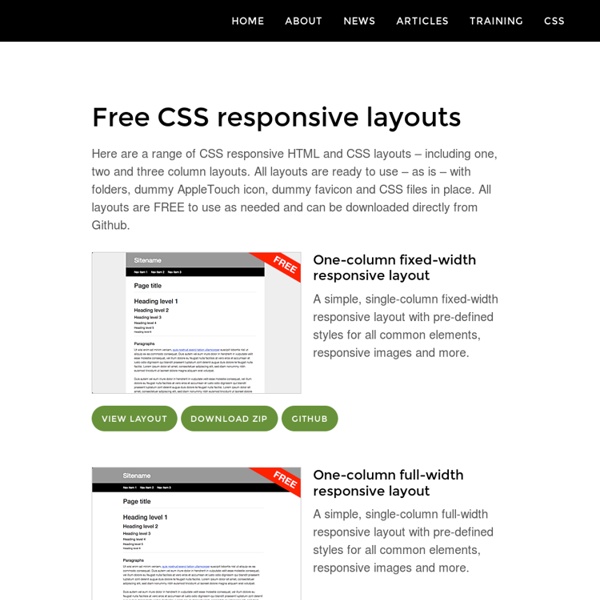
CSS Layout Starting Points I build a lot of CSS layouts, some incredibly simple, others that cause sleepless nights and remind me of the torturous puzzle books that were given to me at Christmas by aunties concerned for my education. However, most of the time these layouts fit quite comfortably into one of a very few standard formats. For example: Liquid, multiple column with no footer Liquid, multiple column with footer Fixed width, centred Rather than starting out with blank CSS and (X)HTML documents every time you need to build a layout, you can fairly quickly create a bunch of layout starting points, that will give you a solid basis for creating the rest of the design and mean that you don’t have to remember how a three column layout with a footer is best achieved every time you come across one! These starting points can be really basic, in fact that’s exactly what you want as the final design, the fonts, the colours and so on will be different every time. <!
stu nicholls | CSS PLaY | image map for detailed information Information A further stage in the use of a css image map. Just hover your mouse over the painting to reveal three areas of interest. Then hover over each area to reveal an enlarged detail with text. This method could be used on an educational site to give information and enhanced details of images in general. The idea is based on my previous image maps but takes it a step further in functionality. Works in IE5.5 and almost works in IE5.01 Copyright You may use this method on your personal 'non-profit' web site without seeking my permission. Commercial usage is also permitted without seeking approval, but I would ask that a donation is considered to support my work on CSSPlay. If you are having problems integrating any of my demonstrations into your website then I now offer a service to fault find and correct any errors that you may have introduced.
Never Get Involved in a Land War in Asia (or Build a Website for No Reason) At the head of the conference table paced a well-dressed man with a loosened tie, rolled-up sleeves, and an air of frustration. Sitting across the table from me was the web design team the man had hired to create a website about his pair of rare and identical 1964 muscle cars. And then there was me. After a lengthy monologue from the client on the history of the Ford Mustang, the color mint, and the travel history of the two cars, the meeting turned into a flurry of to-do items: hire a photographer, scout locations for photography, scan logos, research the design style of the 1960s. Meanwhile, designers furiously sketched layouts to give the client an idea of how the website might look. The web design team on the other side of the table were actually friendly competitors, and they’d asked me to tag along in the hope that my advertising education and experience would provide another “expert” opinion. “I’m sorry,” I said, and put down the sandwich. The high-fives stopped. Why strategy?
Good Designers Redesign, Great Designers Realign Halfway through 2004, I openly predicted incessant redesigning would become somewhat cessant by the same year’s end: Forward thinkers understand content is still king and focus on such while deploying minimal upgrades, rather than relying on skillful makeovers that gain short-lived traffic spurts following award listings but offer downright weak content. How wrong I was. Apparently the Incessant Redesign is far from extinction. Like a kid in a candy store, we creatives redesign like it’s the new black. Why do we possess such an insatiable desire to refresh and remake? While this article won’t analyze the psychological ambitions of right-brained elites and their innate desire to recreate, it will attempt to describe the difference between redesigning and realigning, as well the advantages of one over the other. If iLife Falls in the Forest…#section1 In January 2005, Apple’s iLife ’05 was announced from Macworld Expo in San Francisco. Redesigners vs. The “redesigners”#section3 31three#section7
CSS Shortcuts Sunday Oct 23 2005 Ok. Let's set the record straight. There is no official guide for each and every CSS shorthand property value. So let's work together and put one together shall we? Background Backgrounds can be tricky. background properties Believe it or not, all these properties can be combined into one single background property as follows: the background shorthand property The Unknown Often times developers find themselves wondering What if I leave out this value or that one? default background property values Lesson learned: be careful on what you don't declare. background shorthand example (unexplicit) This would be the same as declaring the following values: background shorthand example (explicit) Font Font is perhaps the trickiest. font properties The default values for the font shorthand property are as follows: default font property values And of course without any further ado. the font shorthand property Here is where it gets tricky. or and . strong element styled with font Border Outline