
Using CSS gradients - Web developer guide CSS gradients are new types of <image> added in the CSS3 Image Module. Using CSS gradients lets you display smooth transitions between two or more specified colors. This lets you avoid using images for these effects, thereby reducing download time and bandwidth usage. In addition, because the gradient is generated by the browser, objects with gradients look better when zoomed, and you can adjust your layout much more flexibly. Browsers support two types of gradients: linear, defined with the linear-gradient() function, and radial, defined with radial-gradient(). Linear gradients To create a linear gradient, you set a starting point and a direction (specified as an angle) along which the gradient effect is applied. Simple linear gradients Here's a linear gradient that starts at the center (horizontally) and top (vertically), and starts blue, transitioning to white. background: -prefix-linear-gradient(top, blue, white); background: linear-gradient(to bottom, blue, white); Using angles Size
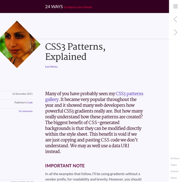
CSS Gradients This article was originally published on March 2, 2010. It was updated April 1, 2011, July 20, 2011, and again March 3, 2014, each time to clarify and correct browser prefixes and best practices. Just as you can declare the background of an element to be a solid color in CSS, you can also declare that background to be a gradient. Using gradients declared in CSS, rather using an actual image file, is better for control and performance. Gradients are typically one color that fades into another, but in CSS you can control every aspect of how that happens, from the direction to the colors (as many as you want) to where those color changes happen. Let's go through it all. Gradients are background-image While declaring the a solid color uses background-color property in CSS, gradients use background-image. Linear Gradient Perhaps the most common and useful type of gradient is the linear-gradient(). Not declaring an angle will assume top-to-bottom: This "to" syntax works for corners as well. like:
Stripes in CSS Stripes are pretty easy to do in CSS these days. CSS gradients via the background-image property really got our back. I thought I'd document some variations in one easy to reference place. Normal Colored Diagonal Stripes Diagonal stripes are easy to pull off thanks to repeating-linear-gradient(): background: repeating-linear-gradient( 45deg, #606dbc, #606dbc 10px, #465298 10px, #465298 20px ); Rather than the very last color-stop being 100% (or nothing, which means 100%) it's a fixed value. Gradient Diagonal Stripes If you make the background a regular linear-gradient(), and then make half the stripes totally transparent using repeating-linear-gradient(), it can appear as if the stripes have gradients. background: /* On "top" */ repeating-linear-gradient( 45deg, transparent, transparent 10px, #ccc 10px, #ccc 20px ), /* on "bottom" */ linear-gradient( to bottom, #eee, #999 ); Stripes Over Image Perhaps a texture? Any Direction, Any Angle It doesn't have to be exactly 45degrees. Vertical Stripes
Quick Tip: Understanding CSS3 Gradients Creating an image only for the purpose of displaying a gradient is inflexible, and is quickly becoming a bad practice. Unfortunately, at the time of this writing, they very well might still be required, but hopefully not for much longer. Thanks to Firefox and Safari/Chrome, we can now create powerful gradients with minimal effort. In this video quick tip, we'll examine some of the differences in syntax when working with the -moz and -webkit vendor prefixes. While Mozilla and Webkit generally adopt the same syntax for CSS3 properties, they unfortunately don't quite agree when it comes to gradients. Don't worry if your eyes gloss over at that syntax; mine did too! What type of gradient? Firefox, which implemented gradient support with version 3.6, prefers a slightly different syntax. Note how we've placed the type of gradient, linear, within the vendor extension. What if you don't need a 100% gradient from one color to another? Note the subtle off-white to white gradient at the top.
gotoandlearn.com - Free video tutorials on interactive development CSS Tutorials - CSS Repeating Backgrounds | Jacorre Are you looking for a repeating background using CSS? This tutorial will teach you how to create 3 different css repeating backgrounds: horizontal, vertical and tiled. Let’s start with a horizontal repeating background. This would be a background image that repeats itself left to right. In Photoshop, create a new file with a width of 1 pixel and a height of 150 pixels. Since this will be a repeating background image on the body of the webpage, we need to add CSS to the body tag as follows: Of course, make sure you define the correct path and name for your background image. Let’s move onto a vertical repeating background. In Photoshop, create a new file with a width of 2000 pixels and a height of 1 pixel. Of course, make sure you define the correct path and name for your background image. Let’s finish with a tiled repeating background. The type of pattern you use is up to you, but you want to make sure you’re using a seamless pattern. Share This:
CSS3 Linear Gradients [CSS3 Tips] Gradient is a great color feature addition in CSS3. Rather than only add a single color, we can now add multiple color combinations in one declaration block without relying on images, which could decrease the HTTP request in our website allowing the website load faster. If you have played around with gradients in CSS3 you are probably familiar with the two methods: radial and linear gradient. Today’s post will be about the latter. Creating Gradients As the spec says gradients in CSS3 is an image, it has no special property like other new feature addition, so it is declared using the background-image property instead. If we take a look at the complete syntax for gradient, it looks a little overstuffed, which could lead to confusion for some people. So let’s dig into each part of the syntax one by one to make things clearer. First of all, linear gradient is declared with the linear-gradient() function. The snippet above is the official version from W3C to create gradients. Start Position Demo
Master CSS gradients | CSS3 | Creative Bloq Knowledge needed: Intermediate HTML, good CSS Requires: Text editor, recent browser version Project time: 4-6 hours Download source files This is an edited excerpt of Chapter 11 of The Book of CSS3: A Developer’s Guide to the Future of Web Design by Peter Gasston. The word gradient has many different meanings, but in CSS, a gradient is strictly defined as a gradual transition between a range of (at least two) colours. CSS gradients are a fairly recent development but have already been through a number of changes. The W3C’s CSS Working Group later proposed a modified syntax, and this syntax is in the latest revisions of the Image Values Module. Full support is also provided in the Internet Explorer 10 Platform Previews (and will no doubt be in the final release), and Opera 11.10 has support for linear gradients – which I shall explain right now. Linear gradients A linear gradient is one that gradually transitions between colours over the distance between two points in a straight line.
Display Loading Image While Page Loads Published April 15, 2013 by Brad Knutson Often times as web developers, we build websites that are fairly media intensive. Lots of graphics, slideshows, large Javascript files, large CSS files, etc, etc. It’s not uncommon for page load times to suffer on some really visually appealing and well designed pages. There has to be a better way to display these pages, rather than watch the awesome background image that we created load literally line by line. This topic got me thinking. In cases where we do not want to sacrifice style and design for page load time, perhaps we should consider another alternative? View Demo Find a page loading graphic If your a talented designer and want to make one yourself, by all means go right ahead. Add the Page Loader Div Add the below div right below the opening <body> tag. Add some CSS This ensures that the page loading image is centered on a near white background (change color as desired) and covers the entire screen. Add jQuery and a line of code
30 Pure CSS3 Tutorials & Examples CSS3 contains several new important features to enhance your designes, it has completly opened new posibilities for designers. With CSS3 and HTML5, one can now create extremely modern and very stylish web designes, loaded with effects and animations. But CSS3 selectors are relatevily new and are not supported in older browser, especially the older Internet Explorer versions. Click here to see visual display of HTML5 and CSS3 support. But this shouldn’t stop you from using it at all, because all modern browsers supports css3 and they will continue to improve this technology. Many designers have already started using CSS3 and within few year CSS3 and HTML5 will completely change the way websites are designed. Here in this article, I have compiled 30 excellent CSS3 tutorial and examples (Basic to Advance) for you to bookmark and learn, enjoy! CSS3 ShapesImportant tutorial, Learn to create basic shapes only using CSS3. Tutorial Demo
Show Loading Image while the website loads | Dzyngiri Instead of showing a blank white page is it not a great idea that of showing a loading image while your website is loading? Ofcourse it is a great idea because it will improve the user experience of your website. If your website is containing some heavy content like images and some jQuery plugin and all then it may take some long time to load. It may also happen that the user is accessing your website on slower connection. Then in this situation it will be good idea to show a loading image or show some message to the user. So let’s start with the simple jQuery function which will show the loading image while the website loads Let’s add some CSS to give it a beautiful look and show the image in the middle of the screen And in the last, add this html right below the opening body tag <body> In this way we can show the loading image while your webpage is loading. See Example
11 Background & CSS Pattern Generators A good pattern can make all of the difference for some designs. I myself just upgraded my web design, and started using a wooden background pattern, which I think has made a huge difference on the overall experience of the site, and in a positive way, of course. My most recent post – prior to this – that involves colors was the post about color scheme and palette generators, which for more experienced users can be the same as a pattern generator. It only requires a different approach in the implementation process. Most modern WordPress themes come integrated with the ability to select and/or upload your own background patterns. Remember, these are all free background generators, and there is no need to wonder whether they are. Click on the images to learn more about each of these tools! Background Image Generator – SiteOrigin You are given 300 patterns to choose from, unlimited colors and several blend modes. ZenBG – Background Generator Ultimate CSS Gradient Generator – ColorZilla.com