19 top fonts in 19 top combinations
Sign up and download immediately to take your typography to the next level! This classic contains some great stuff: An exceptional glossary of typography terms Killer tips on establishing typographic color Choosing and using the right typefaces 20 Action-packed info-dense pages!
Modularscale
How do I use this? Use a scale like you would use a ruler. Many people set heading type sizes with numbers from a scale, but that's just one possibility. You can use a scale to measure or set the size of any element or negative space in a composition — including grids, and the overall dimensions of the composition itself. What’s a good base? Body text type size is a good place to start. What’s a good ratio? Ratios can be chosen carefully and meaningfully, drawing inspiration from the history and character of a typeface or other elements in a project. Can I use more than one ratio? Sure! Why can't I use multiple bases and ratios? Because that would really dilute the scale. Should I use the Sass / JS plugins? They are amazing, but they do require setup. Both plugins work the same way: First, you need to install them in your project. When you have things all set up, use the function ms(0) in your Sass or JS. About this website
Typography Deconstructed | A comprehensive guide to the anatomy of type.
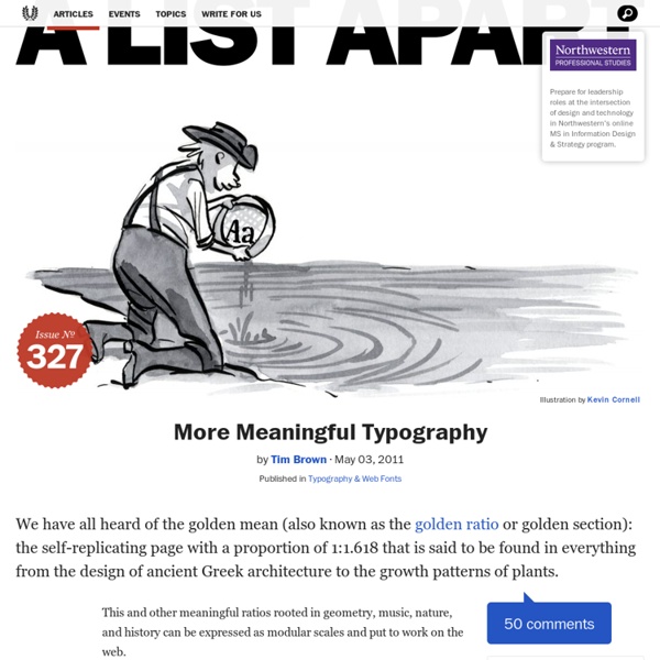
Typographer’s typefaces The 25 most admired... | Type Worship
The 25 most admired typefaces by typographers, type designers and letterers. Selecting the right typeface makes all the difference to effective design and communication. But with over 100,000 font families to pick from it can be a daunting task. Wouldn’t it be great to start with a short list of typefaces, hand-picked by designers in the type industry? Over four years and across eight issues we interviewed 64 world-renowned designers1, including; Erik Spiekermann, Jessica Hische, Michael Bierut, Nina Stössinger, Mark Simonson & Seb Lester, plus owners of respected type foundries such as, Font Smith, Type Together and Process Type. We’ve counted the number of times each typeface was selected and found consensus with the top 25. 1. Matthew Carter, 1993. “A gorgeous technical achievement.” 2. Tobias Frere-Jones, 2000. “Each character just feels ‘normal’ and ‘right’”. 3. Martin Majoor, 1990. “Scala and Scala San are just about perfect.” 4. Paul Renner, 1927. 5. Eric Gill, 1926. 6. 7. 8. H.
50 Free Wireframe Templates for Mobile, Web and UX Design
In the initial stages of a project, when ideas aren’t quite fully formed, it’s good practice to wireframe the layout of your mobile app or web project by stripping away all design elements and flourishes to help define and better communicate the information hierarchy of the layout and plan for functionality and user flow. Whether you create them using a whiteboard, pencil and paper, web-based tools, or using a graphic application, effective wireframing and planning play a critical role in the success of your product. While most wireframing tools are readily and freely available (pen, paper, markers…), you may have to pay to use some web-based tools, and if you know where to look, you can also grab some free, templates for graphic applications like Photoshop, Illustrator or Sketch. Material Design Wireframe Kits Material Design Wireframe Kit (Sketch). Material Design Mobile Wireframe Templates (PSD). iOS Wireframe Kits iPhone 6 Vector Wireframing Toolkit (AI). iPhone Wireframes (Sketch).
A Crash Course in Typography: Principles for Combining Typefaces
Apr 11 2011 When combining typefaces, there are a couple of important principles you’ll need to keep in mind, namely contrast and mood. Effectively combining typefaces is a skill best learned through practice, and trial-and-error. Once you’ve mastered the principles covered here, you’ll have the tools you need to try out combinations while making educated guesses about what will and won’t work together. Here, we’re mostly covering combining two typefaces, as you would for body copy and headlines. Contrast Contrast is one of the most important concepts to understand when it comes to combining typefaces. But first, what exactly is contrast? Weight The weight of a typeface plays a huge role in its appearance. You’ll want to look for typefaces that have noticeable difference in weight, without being too extreme. Style and Decoration The style of a typeface has a huge impact on how it’s received. Style and decoration can also be used to create contrast within a type family or typeface. Structure
6 secrets to creating outstanding infographics
In the Instagram and Snapchat era, audiences are increasingly visually oriented. But sometimes an image alone isn’t enough: you need a clever combination of words and graphics to tell a detailed story in a way that can be grasped quickly and easily. Cue the infographic. But while they may look easy to create, in practice they can be darned difficult to get right. There are, however, some basic principles you can follow to make sure your design is as effective as possible. (And here's a bonus content tip: always run a spellcheck before sending your infographics out into the world.) Here, we share six secrets to creating outstanding infographics... 01. The first thing to consider when setting out to design an infographic is whether or not you actually need one. Your client may have heard at a marketing seminar that infographics are “big right now” and “a great way to go viral”. 02. So don’t put the cart before the horse. 03. This isn't always easy. 04. 05. 06. Related articles:
Establishing a Hierarchy of Goals for Everything You Design
What one thing above all else makes for a great design? Where should your focus lie? More importantly, is it possible or even desirable to focus on a single goal at the expense of others? Today we’ll take a look at why goal-oriented design is good design and discuss how being a designer means weighing several competing factors. We’ll also discuss how to decide which goals are the most important and how establishing a hierarchy for each project will make for a better experience for the client, the user and the designer. The Magic Formula There’s constant debate in the design community over what the primary idea, principle or tactic is for creating “great” designs. I don’t possess such a formula, nor do I believe one even exists. Accepting this premise still doesn’t get us very far. Design is Like Golf This problem is a lot like that of hitting a golf ball and having it land anywhere near where you want it to (which I’m incapable of doing). Design is the same way. Stakeholders Lead to Goals

De belles proportions
For better proportions by mebae Oct 28