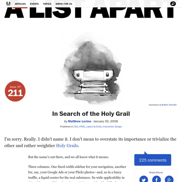
A List Apart: Articles: In Search of the Holy Grail
Design and Build Email Newsletters Without Losing Your Mind (and Soul) - Smashing Magazine
Advertisement “We really love this new website you’ve built! Now we’d like to send out an email to all of our customers, friends and anyone, and it should look exactly like the website except with a spinning mailbox at the bottom, and have my photo, and my cat’s photo…” Ever had that conversation with a client? You’ve built plenty of websites in your time and could knock off a blog template in your sleep, but HTML email? The mere mention of it sends some designers into physical shock (try it if you ever get stuck in a tedious conversation about XHTML vs. This article gives you the information you need to plan, design and build an HTML newsletter that renders well and is actually useful to recipients. If you’d like to get started right now, here are the cheat notes to get you on the right track. Respect your reader. 1. The email inbox is a noisy busy place for a newsletter to land. So when your email does arrive, make sure it doesn’t waste their time. 2. 3. 4. 5. 6. 7. 8. 9. 10. (al)
Local Storage And How To Use It On Websites - Smashing Magazine
Advertisement Storing information locally on a user’s computer is a powerful strategy for a developer who is creating something for the Web. In this article, we’ll look at how easy it is to store information on a computer to read later and explain what you can use that for. Adding State To The Web: The “Why” Of Local Storage The main problem with HTTP as the main transport layer of the Web is that it is stateless. This is why, as a developer, you need to store the state of your interface somewhere. This is where local storage comes in. C Is For Cookie. The classic way to do this is by using a cookie. They add to the load of every document accessed on the domain.They allow up to only 4 KB of data storage.Because cookies have been used to spy on people’s surfing behavior, security-conscious people and companies turn them off or request to be asked every time whether a cookie should be set. Using Local Storage In HTML5-Capable Browsers localStorage.setItem('favoriteflavor','vanilla'); (al)
Presentazione e contenuti
Nozioni di base su struttura e presentazione dei documenti per il web, come introduzione ad una progettazione rispettosa degli standard promossi dal World Wide Web Consortium (W3C). Sommario Prefazione Con questo articolo voglio rivolgermi a tutti coloro che hanno sentito parlare almeno qualche volta di standard web , accessibilità , (X)HTML , CSS , separazione tra struttura e presentazione o, in breve, di nuova filosofia di progettazione web , ma non sono ancora riusciti ad intrecciare i vari concetti e a farsi così un'idea chiara in proposito. La mia intenzione è quindi fornire una panoramica generale su questi argomenti e cercare di avvicinare ad essi i progettisti che ancora nutrono scetticismo o paura nei loro confronti oppure semplicemente li ignorano. Spero inoltre che questo articolo possa rivelarsi utile per coloro che sono appena approdati all'apprendimento dei linguaggi standard per il Web. Introduzione Separazione tra informazioni e loro rappresentazione Processo di sviluppo
Progettare la struttura dei siti: ampiezza o profondità? | Usabile.it
home » Articoli » Progettare la struttura dei siti: ampiezza o profondità? anteprima stampa | stampa [di Maurizio Boscarol] La struttura ipertestuale di un sito è la forma che assumono i suoi collegamenti gerarchici a partire dalla home page. È dunque meglio avere menu di poche voci, ciascuna delle quali porta ad altre pagine con altri menu di poche voci, e così via, in molti passaggi (siti poco ampi, ma profondi), o è meglio avere molte voci nei menu fin da subito con un minor numero di passaggi (siti larghi e piatti)? Un esempio di struttura ampia e poco profonda: 11 pagine al primo livello, ognuna delle quali ha 5 pagine figlio. In questo secondo esempio vediamo la rappresentazione ad albero di una struttura profonda e stretta, con 3 pagine al primo livello, ognuna delle quali ha due pagine figlio, ognuna delle quali ha ancora due pagine figlio, ognuna delle quali ha altre due pagine figlio. Privilegiare siti piatti L’influenza del tipo di compito Oltre l’efficienza Alcune conclusioni
Related:
Related:
