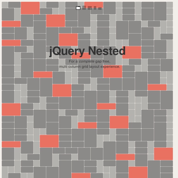
jQuery Nested
Responsive Img - a jQuery Plugin for Responsive Images
Mobiscroll - The customizable HTML5 spinner control for touch devices like smartphones and tablets
Media Queries / Dynamic resolution dependent layouts
Media Queries
Abstract HTML4 and CSS2 currently support media-dependent style sheets tailored for different media types. For example, a document may use sans-serif fonts when displayed on a screen and serif fonts when printed. A media query consists of a media type and zero or more expressions that check for the conditions of particular media features. Status of This Document This section describes the status of this document at the time of its publication. A W3C Recommendation is a mature document that has been widely reviewed and has been shown to be implementable. This document has been reviewed by W3C Members, by software developers, and by other W3C groups and interested parties, and is endorsed by the Director as a W3C Recommendation. Please see the Working Group's implementation report and the Media Queries Test Suite. Also see the Disposition of comments and a list of changes relative to the previous Proposed Recommendation. Table of Contents 1. (This section is not normative.) As are these: 3. 5.
Related:
Related:
