
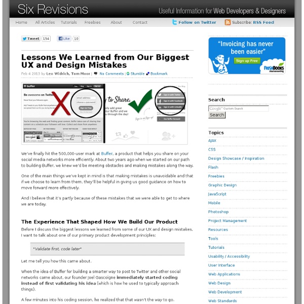
Transitional Interfaces Designers love to sweat the details. Much time is spent pixel-fucking buttons, form styles, setting type, & getting those icons as sharp as a tack. A+, great job, don't stop you guys. ...but there's little consideration about how it all fits together outside of a static comp. Oh, ok sweet. How? Folks keep throwing around the word “delight” when referring to animation and cute interactions. Animation leverages an overlooked dimension — time! Let's take a look at some simple ideas: Easing/cushioning In traditional animation, a breakdown determines how a mass moves from Point A to Point B.
80 Creative Logo Designs For Your Inspiration They say a picture speaks a thousand words, and that is definitely true when it come logo design. A well-thought logo design can effectively use a simple icon to leave a deep enough impression for the public. Most logos communicate ideas to people, for instance the kind of quality services a company can provide for its customers. A memorable logo is always a plus if one wants to ensure first-time visitors to their websites will return in future. While there’s no easy answer as to what kind of logo design is the most effective and impressionable, it is probably intuitive to assume that creatively designed logos are more likely to stand out. However, that does not necessary mean that a logo has to be very elaborated. Here is a compilation of 80 creative logos of different variety, all categorized under these groups: Wordmark, Symbolic, and Combined mark. Wordmarks Symbolic, Iconic & Combine Mark
Invisible animation There’s no doubt that animating user interfaces is a rising trend. Risen enough that the emphasis is often put on the animation itself, rather than on improving the user experience through subtle and functional animation. Pasquale D’Silva gave some good advice in his talk at Web Direction South in 2013, including: Good animation is invisible.You shouldn’t notice that you’re looking at animation. It’s great advice that we — the team behind Campaign Monitor’s email builder — have been trying to apply with a few principles in mind: animation must improve the usability, feel natural and subtle, and give feedback to the user. Having spent the last year working on the email builder, I’ve learned that animation on the web — as opposed to native apps — comes with many challenges that go beyond finding the right timing, spacing, poses or easing. Add layout drop-down When users press the “Add layout” button, the layout drop-down fades in and comes from the button itself. Sidebar accordion
This Summer's Best Logo Designs - 40 Logos Normally, summer is a time for vacation but somebody still has to work and that’s an opinion that some designers share with me. The proof for that lies in this article with 40 great logos, probably the best that appeared in these last months. Creation Rubens Nuts Jaguar Pale Ale enigma Nacho Macho Starr Gardens Macho grill Parallax Effects Soverinn Vital Imaging By Award Logohype Aqua Style Lion Bird Tort Silfver Creations Serenity Stingmaster Baby Online Ypsilon Royal theater 5R Construction hoo giraffeo Blue Mountain Electric DesignTent Lyric omniscient Northridge Homes Guitarshop Airtistic Bones Type Fetcher Browsera Xavier Fence artlovers Zerowork Daily Jazz You must check these past articles if you haven’t seen them already:
The anatomy of a credit card form — User Experience Design (UX) Paying for something online with a credit card is simple, right? Yes and no. Yes, because we’ve been doing it since the early days of the Internet (e.g. Amazon), and no, because no two credit card forms are alike. Over the past 20 years, we’ve built a mental model of paying online: I pull out a credit card from my wallet, enter the card details into a web form, and click a submit button. Paying for something online is still 2–3x clunkier than paying in-person. Online, we’re getting closer. But before credit card forms become a thing of the past, we still have the present-day task of adding clarity, simplicity, and security to the credit card form. At Wave, our Invoice product enables business owners to create and send invoices to their customers, and to have those invoices paid via credit card. Our goal was to make sense of all the various inputs and questions a user may have, including: What payment cards are accepted? But, where do you place the logos on a web form? Nuts, right?
Planning And Implementing Website Navigation Advertisement The thing that makes navigation difficult to work with in Web design is that it can be so versatile. Navigation can be simple or complex: a few main pages or a multi-level architecture; one set of content for logged-in users and another for logged-out users; and so on. Because navigation can vary so much between websites, there are no set guidelines or how-to’s for organizing navigation. Designing navigation is an art in itself, and designers become better at it with experience. It’s all about using good information architecture: “the art of expressing a model or concept of information used in activities that require explicit details of complex systems.” Organizing Navigation Structure Perhaps the most difficult part about navigation on the Web is organizing and designing it. Primary vs. Most websites, especially those with a lot of content or functionality, need navigation menus. 1SpeckyBoy2 Primary navigation stands for the content that most users are interested in.
Responsive Design: Why and how we ditched the good old select element How rethinking the way users make complex selections across devices completely changed our design. We’ve all seen this and know what it does: It’s the HTML select element. The invention of select dates back to 1995 with the introduction of the HTML 2.0 specification. Good things first By using the select element it’s a no-brainer to create a list of selectable options. So why not just use it? At Tradeshift we’ve been working a few months on some soon-to-be-released updates for our user interface. Presenting option lists to users is most easily done by using checkboxes, radio buttons and by using select. The number of selectable options we have is often counted in hundreds which makes the standard select element hard to navigate.Example: When specifying the unit type on an invoice line, the complete list contains hundreds of possible units. So what can we do now that the cookie cutter solution does not make the cut? The solution
Best 20 webfonts from Google Web Fonts and @font-face embedding At the moment there are several ways to use non-system fonts on a website. We will focus on the two least complicated, least expensive systems, Google Web Fonts and the @font-face rule. Fear not, we have not ruled out other paid methods such as Typekit, Fonts.com Web Fonts, Fontdeck, Webtype, WebINK or Fontspring for future posts as they certainly offer high quality typefaces and deserve to be considered. Basically, there are two implementation models: 1. 2. Web font embedding services Google Web Fonts (GWF) or Typekit are systems which allow the use of fonts hosted on their servers. Implementation It really is quick and simple: 1. 2. 3. Here you can consult a extended manual for styles, script subsets, and using multiple fonts. Top recommended fonts from Google Web Fonts You will find many unfavorable reviews about the quality of GWF’s fonts and the amateur nature of many typefaces. Open Sans Josefin Slab Arvo Lato Vollkorn Abril Fatface Ubuntu PT Sans + PT Serif Old Standard TT Droid Sans
Table Toolbar Sort, filter and group can appear in all possible combinations and also as single actions. Make sure to use the proposed order if you use more than one of these actions. The dialog that opens when such an action is chosen is called view settings dialog. This dialog can provide any combination of these three settings, including only one setting (e.g. just sort). If sorting, filtering and/ or grouping is a common use case in your app, offer one, two or all of the corresponding features within one or several view settings dialogs. There are two ways for triggering the view settings dialog: Trigger the view settings dialog with a button on the table toolbar. Use one of these versions according to the following guidelines: In any case, only use the view settings you really need. Using the view settings dialog allows you do define several sort, filter, and/ or group settings per column. Support a consistent experience.
Developing an Effective Logo Design Brief This post was written with the client in mind, however may also prove to be a useful resource for other designers. To develop an effective brand identity for your business it is essential that you are proactively involved in the process from the start. A designer can’t possibly hope to design an effective logo without your input, which is why the very first step in a logo design process should always be the development of a detailed design brief. The risk of not completing a detailed brief is the possibility that your organisation ends up with a half-baked identity, that is not representative of who you are. While the brief does not completely mitigate that risk – it at least provides a solid platform to work from, and ensures that both you and the designer are on the same page. Inside the Design Brief Below I have outlined some of the questions you can expect to be included in a typical design brief, along with some advice to help you get prepared. Company Profile Related Sample Questions:
logo design Packages Our packages are specially designed, based on our client feedback. Please select from the packages below that best fits your needs. 6 logo design concepts 2 logo designers working on the project 48 hours turnaround. Full copyright ownership Unlimited redraws & revisions. 100% satisfaction guarantee. 100% money back guarantee. Full support for both web and print 9 logo design concepts 3 business card designs 3 logo designers working on the project 12 logo design concepts 3 letterheads designs 4 logo designers working on the project Below is a comparision of our logo design prices for you to compare between the features included in each packages and choose the package that best fits your needs. Click here for a comparision of our package features and prices with other various logo design firms in the web.
Pro tips: 20 steps to the perfect website layout | Web design When designing a website layout there are some common mistakes that often pop up, especially with interns and new designers. In this list of steps to the perfect website layout, we cover what every new website builder working within a digital agency should know and do before starting a new project, and what they should pay attention to during the process to avoid making these mistakes. These principles cover not only design aspects but also general workflow tips that will get the job done nicely. 01. Before starting the work you need to know what is it you are designing for. Good redesigns are not necessarily the most flashy ones but the ones that improve performance over time. 02. This seems very obvious but I've found too often that designers jump straight into their work before giving any thought to the problem they are trying to solve. Think about the content, the layout and the functionality before starting to drop shadows. 03. 04. It's as simple as it sounds. 05. 06. 07. 08. 09.
The Noun Project