

Thighs Wide Shut FlowingData | Data Visualization and Statistics Steak Drop I'm Learning To Share! Edward Tufte Edward Tufte is a statistician and artist, and Professor Emeritus of Political Science, Statistics, and Computer Science at Yale University. He wrote, designed, and self-published 4 classic books on data visualization. The New York Times described ET as the "Leonardo da Vinci of data," and Business Week as the "Galileo of graphics." He is now writing a book/film The Thinking Eye and constructing a 234-acre tree farm and sculpture park in northwest Connecticut, which will show his artworks and remain open space in perpetuity. Visual Display of Quantitative Information 200 pages Envisioning Information 128 pages Visual Explanations 160 pages Beautiful Evidence 214 pages Same paper and printing as in original clothbound editions. All 4 clothbound books, autographed by author $150 Available directly from Graphics Press. Die visuelle Darstellung quantitativer Informationen, (200 Seiten), $12 数量情報の視覚的表示, (200 ページ)、$12 A exibição visual das informações quantitativas, (200 paginas) $12
Map for xkcd No:1110 Three times a week, Randall Munroe draws a new comic entry on xkcd.com. This Wednesday, the comic was quite unusual and pretty awesome: xkcd #1110. Basically, it's a giant map browsable with a limited field of view. This article is pretty accessible from a technical point of view, and I know a lot of other people did that as well, but I was willing to share the method I used anyway. Download the images First, we need to grab all the images to process them locally. We're going to use several scripts, so we need a place for some common code, let's say in a xkcdcommon.py script: class XKCD1110: def __init__(self): self.size = [14, 48, 25, 33] self.w = self.size[1] + self.size[3] self.h = self.size[0] + self.size[2] def tile_name(self, x, y): x -= self.size[3] y -= self.size[0] return (('%d%c' % (y + 1, 's')) if y >= 0 else ('%d%c' % (-y, 'n'))) + \ (('%d%c' % (x + 1, 'e')) if x >= 0 else ('%d%c' % (-x, 'w'))) This is a direct mapping of the code in 1110.js. #! #! Make the small tiles #! #! .
The Mad Vortex Information Visualization Manifesto Posted: August 30th, 2009 | Author: Manuel Lima | Filed under: Uncategorized | – “The purpose of visualization is insight, not pictures” Ben Shneiderman (1999) – Over the past few months I’ve been talking with many people passionate about Information Visualization who share a sense of saturation over a growing number of frivolous projects. When Martin Wattenberg and Fernanda Viégas wrote about Vernacular Visualization, in their excellent article on the July-August 2008 edition of interactions magazine, they observed how the last couple of years have witnessed the tipping point of a field that used to be locked away in its academic vault, far from the public eye. I don’t tend to be harshly censorial of many of the projects that over-glorify aesthetics over functionality, because I believe they’re part of our continuous growth and maturity as a discipline. Even though a clear divide is necessary, it doesn’t mean that Information Visualization and Information Art cannot coexist.
Pictures from a developer's life | martinvalasek.com Yesterday I stumbled upon this collection on a Spanish blog and almost cried with laughter... So I translated it and posted here. Do you find yourself in any of these situations? :) EDIT: As I later found out, the pictures are originally from blogs The coding love (en) and Les joies du code (fr). When I show the boss that I have finally fixed this bug When the project manager enters the office When I'm deploying code to production When I try to fix a bug at 3 in the morning When my regex returned exactly what I expected When a friend of mine asks me to fix his website built with Joomla When I'm told that the module on which I have worked all the week will never be used When the code that I have not tested on dev works perfectly in production When the sales people announce they have sold our product to the customer When I apply a new CSS for the first time When sysadmin finally gives us the root access When I launch my script for the first time after several hours of development
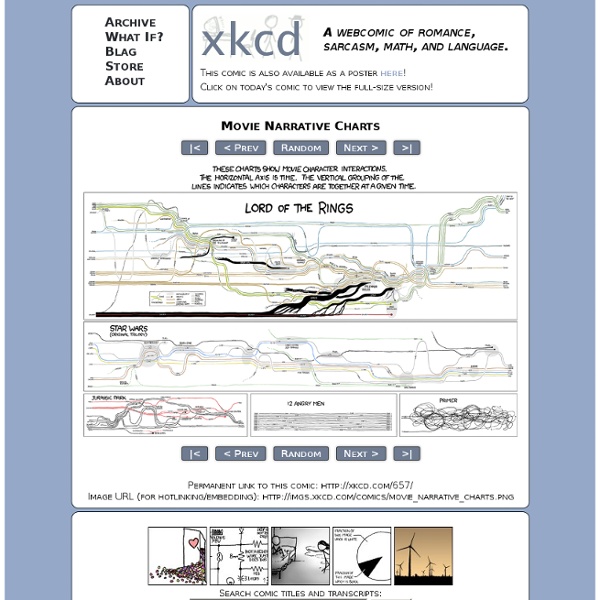
Criggo 50 Great Examples of Data Visualization Wrapping your brain around data online can be challenging, especially when dealing with huge volumes of information. And trying to find related content can also be difficult, depending on what data you’re looking for. But data visualizations can make all of that much easier, allowing you to see the concepts that you’re learning about in a more interesting, and often more useful manner. Below are 50 of the best data visualizations and tools for creating your own visualizations out there, covering everything from Digg activity to network connectivity to what’s currently happening on Twitter. Music, Movies and Other Media Narratives 2.0 visualizes music. Liveplasma is a music and movie visualization app that aims to help you discover other musicians or movies you might enjoy. Tuneglue is another music visualization service. MusicMap is similar to TuneGlue in its interface, but seems slightly more intuitive. Digg, Twitter, Delicious, and Flickr Internet Visualizations
TEMPLE OF SCHLOCK