
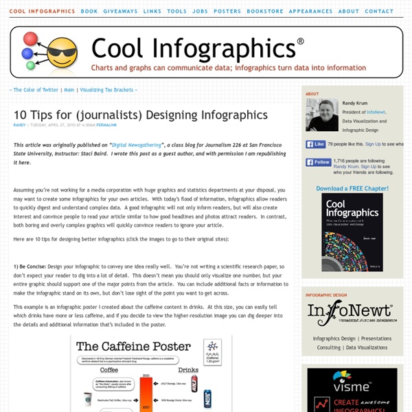
The Anatomy Of An Infographic: 5 Steps To Create A Powerful Visual Information is very powerful but for the most bit it is bland and unimaginative. Infographics channel information in a visually pleasing, instantly understandable manner, making it not only powerful, but extremely beautiful. Once used predominantly to make maps more approachable, scientific charts less daunting and as key learning tools for children, inforgraphics have now permeated all aspects of the modern world. I designed a couple of infographics back in college, the need arising especially around the time Soccer World Cup fever spiked. Infographics can appear daunting to some with the sheer amount of data they present, but designed in the right manner and step by step, they can actually be one of the most fun things you will ever create. Today I am going to walk you through the anatomy of an infographic, its different levels and sub-levels and a 5-step process to ensure that your infographic is not only conceptually sound, but accurate and easily understood. Anatomy Of An Infographic
20+ Tools to Create Your Own Infographics A picture is worth a thousand words – based on this, infographics would carry hundreds of thousands of words, yet if you let a reader choose between a full-length 1000-word article and an infographic that needs a few scroll-downs, they’d probably prefer absorbing information straight from the infographic. What’s not to like? Colored charts and illustrations deliver connections better than tables and figures and as users spend time looking back and forth the full infographic, they stay on the site longer. Plus, readers who like what they see are more likely to share visual guides more than articles. While not everyone can make infographics from scratch, there are tools available on the Web that will help you create your very own infographics. Read Also: The Infographic Revolution: Where Do We Go From Here? What About Me? “What About Me?” Vizualize.me Vizualize.me allows you to create an online resume format that is beautiful, relevant and fun, all with just one click. Piktochart easel.ly
The 7 ½ Steps to Successful Infographics You know when you’ve been doing something for a long time and it gets ingrained? For me, that’s infographics. I’ve created a lot of chartage over the last 20 years Take a look: Here’s me when I started at the New York Times, where I was a graphics editor. I worked there for 15 years, on all the news desks, with the investigative team, and ran the biz section graphics desk. The middle i.d. is my stint at Fortune Magazine, where I was the Infographics director and got to work with the awesome folks at CNNMoney.com (I’m fading!). Anyway, when Nishant from MIX asked me to write about what I do, it was kind of arresting, like the time that Montana patrolman intercepted my husband doing 94 on a long stretch of highway. So here I am, pulling over. 1. Where does one procure an idea? Usually they’re found in the shower. Don’t wake up with an idea? Our stories are driven by the news, so our graphics are framed by ‘what’s new’ and sometimes ‘what’s different’ and hopefully, ‘what’s relevant.’ 2. 3.
9 Ways You Can Improve Your Infographic Pitches to Blogs & Websites Over the past year, I’ve worked on approximately 20 different infographics for a single client. One of the most frustrating things about the process has been the unevenness of the response. Even if we do everything seemingly right, an infographic might not take off. After a string of disappointing infographics, I decided to go back over every step and figure out what we had missed. After fixing the way we work with our design firm (hint: for best results, compile your own research and craft your infographic’s storyline before handing it off), we revamped our outreach process. Infographics are a unique type of content. But the bottom line is that standards are going to be different. Is it correct? Once all this sunk in, we started debugging our outreach process. The following checklist is based on my experience and their advice, and designed to improve your outreach messages. What Works Personalize. What Doesn’t Work? Image Credit: Ivan Cash
40 Useful and Creative Infographics Six Revisions Menu Main Categories CSS HTML JavaScript Web Design WordPress Web Development Design Inspiration UX Design UI Design Freebies Tutorials Tools Links About Contact Advertise RSS Twitter Facebook 40 Useful and Creative Infographics By Jacob Gube Information graphics (or infographics) are graphical depictions of data and information. In this collection, you’ll find forty beautiful and educational infographics, displaying the uncommon spectacle of "art meets science". 1. The proportion of ingredients for popular coffee drinks and their pronunciation keys. 2. This infographic showcases the history of the Swine Flu, starting from 1976. 3. 4. 5. The top breweries and beers in the U.S. 6. 7. 389 Years Ago A rundown of the historic events in African-American culture. 8. 9. 10. 11. An illustrated guide at how the Global Warming phenomenon works. 13. A packed visual piece on tobacco chemicals and tobacco trade worldwide. 14. 15. 16. A graphical representation of consumer spending across the globe. 17.
The 18 Best Free Web Tools Chosen By You It’s the start of a new year and that means there’s infinite possibilities that lay before you. But you can’t move forward without arming yourself with the best free web tools and apps. I was perusing some of my favorite education blogs, social networks, and other time-sucking online spots when I came back to the Edublog Awards . I’m proud that Edudemic was nominated for a bunch of awards (didn’t win but what can ya do) but more importantly I’m impressed with the amount of effort put forward by the Edublogs team. They’ve rounded up some of the best education and technology resources on the planet. Then they even orchestrated a worldwide vote! Below is the list of finalists for the best free web tools. Claco Find, build and share resources with teachers across the hall or across the world — aligned with Common Core ClassDojo Improve specific student behaviors and engagement by awarding and recording real-time feedback.
10 of My Favorite Infographics Infographics also know as information graphics are visual representations of knowledge or data. The infogrpahics can give small or complex amounts of information quickly for a reader to look at. Examples of these graphics can be seen on signs, maps, electrical schematics and almost anything you want to use a infographic. In the past mostly scientists, mathematicians, and technical users created symbols and put them together so people could easily and quickly read these graphic maps of knowledge. Today we see information graphics everywhere. To communicate the complex information quickly, infographic designers use charts, diagrams, graphics, tables, maps and illustrated grapics to relate to the data. What’s Needed to Make an Infographic? To make a good infographic, the creator will need knowledge of the topic, data, and the tools to create it. Are Infographics the Best Way To Represent Data? My Favorite Infographics 2. 3. 4. 5. This is a large infogrpahic, but I had to share this one. 7. 9.
Tips - Dealing with Difficult Parents Taken from the article "14 Steps to Teacher Assertiveness: How to cope with difficult parents, principals and staff members" by Mike Moore Remember that you can't change toxic parents, principals or fellow staff members, but you can learn to cope with them and neutralize their impact on your life. Here are some effective strategies to try. Always stand at eye level with the person you are confronting. This tips sheet is but a brief excerpt from Mike Moore's one hour audio program Coping with Toxic Parents which also includes material on how to deal with difficult principals and fellow staff members. AUTHOR INFORMATION Mike Moore is an international speaker on humor and human potential. Read our article entitled "Doing The Diplomacy Dance".