Grille typographique: La théorie
Après la découverte de LESS, et de SASS, ma première idée pour exploiter ce langage, concernait la typographie. Même si les frameworks CSS proposent des styles pour la typographie, il est fréquent de devoir les modifier, pour changer la police, modifier la taille de base et/ou la taille des titres. Utiliser SASS pour se construire une feuille de styles typographique paramétrables est donc une idée assez logique. Avant de rentrer dans le codage, il m’a semblé utile de faire un point sur les éléments clés de la typographie. Pour écrire cet article, je me suis principalement basé sur deux articles de Smashing Magazine: Le premier Technical Web Typography: Guidelines and Techniques (2011), nous donne les principales règles à suivre, le second, plus ancien (2009), Typographic Design Patterns and Best Practices, compile les données typographiques d’un certain nombre de sites. La construction d’une feuille de styles typographiques comporte globalement 6 étapes: Choix de la police de caractères
Responsive Typography: The Basics
by Oliver Reichenstein When we built websites we usually started by defining the body text. The body text definition dictates how wide your main column is, the rest used to follow almost by itself. Used to. Until recently, screen resolution was more or less homogenous. In the heat of the relaunch I wrote a quick blog post on responsive typography, focussing solely on the aspect of our latest experiment: responsive typefaces. To avoid designing different layouts for every possible screen size, many web designers have adopted the concept of Responsive Web Design. Adaptive layouts: adjusting the layout in steps to a limited number of sizes Liquid layouts: adjusting the layout continuously to every possible width While both have advantages and disadvantages, we believe that adaptive with as few as possible break points is the way to go, because readability is more important than having a layout that is always as wide as the viewport. Choosing a typeface The right tone Serif or sans serif?
Information Architects Japan » Blog Archive » The 100% Easy-2-Read Standard
by Oliver Reichenstein Most websites are crammed with small text that’s a pain to read. Why? There is no reason for squeezing so much information onto the screen. It’s just a stupid collective mistake that dates back to a time when screens were really, really small. So… Screen vs. magazine: 100% is NOT big; image by Wilson Miner. Don’t tell us to adjust the font size We don’t want to change our browser settings every time we visit a website! Don’t tell us busy pages look better Crowded websites don’t look good: they look nasty. Don’t tell us scrolling is bad Because then all websites are bad. Don’t tell us text is not important 95% of what is commonly referred to as web design is typography. Don’t tell us to get glasses Rather, stop licking your screen, lean back (!) Five Simple Rules 1. The font size you are reading right now is not big. We don’t want to click bigger or smaller buttons and we don’t want to change our preferences. 2. Let your text breathe. Good Nielsen – bad Nielsen. 3. 4. 5.
Free Fonts Generator - Make Your Own Handwriting Font With Your Fonts
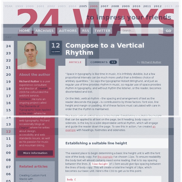
Modular Scale
Free fonts download for Windows and Mac - FontPalace.com
The Creative Way To Maximize Design Ideas With Type
Advertisement As with most designers, being sure that we explore and select the most successful, memorable and stimulating designs is a vital aspect that underpins every project we undertake. For us, the beginning of a new challenge has never been as simple as asking ourselves what might be the best avenue to take and then sitting down at a computer and attempting to fulfill that idea. After researching the subject matter, we will almost always begin with a sheet of paper and pencil and draw out a variety of design options to help bring together and develop the breadth of ideas that are maturing in our minds. An example of mark-making that helps to formulate design ideas for working with type and image. Why Textural And Tonal Qualities Of Type Should Be Addressed In Drawing Working with art direction from Liudas Parulskis and Vilmas Narecionis, Jacek Utko has designed some captivating pages for the weekend section of Lithuanias Verslo Zinios. Finding The Right Marking Tools And Paper (al)
Primer Print, Medium
Normal - Sans Macromedia Fontographer 4.1 9/18/97 Freeware by Ray Larabie 1997 Contains 99 characters in Character Map
50 Essential Photoshop Text Tutorials
Last month I published a collection of 45 Photoshop Tutorials for Better Navigation, which quickly became one of the most popular posts on this blog. Due to the response, I spent some time finding more great Photoshop tutorials. Here are 50 of the best tutorials for working with text. If you are interested in inspiration for typography and text effects, you’ll love our new gallery site TypeInspire. Looking for hosting?
47 Top Typography Tools and Resources
Typography is the foundation of design on the web. Back in 2006, designer and founder of iA Oliver Reichenstein even went so far as to proclaim "web design is 95% typography." It's imperative, then, to have a thorough, grounded education in optimizing and utilizing typography to create a balanced, harmonious, accessible hierarchy of content, when working on the web. To help you improve and learn more about typography, we have compiled 25 useful tools and resources, from fundamentals to modular scales. Have we left out your favorite typography tool or resource? 1. Founded in 2008, Typekit offers a library of fonts, from old classics to new favorites, which can be used on the web. The browsing interface is well organized. 2. Recently acquired by Monotype, Typecast provides a platform to quickly style type in the browser and check for readability, rendering and beauty as you work. 3. Typetester was launched back in 2005, and is still a useful tool today. 4. 5. 7. 8. 9. 10. 11. 12. 13. 14.
Droid Fonts from Ascender Corporation
75 top typography tutorials
The web is brimming with typography tutorials, but many are low quality and others are very out of date. So we’ve trawled the internet to uncover the diamonds in the rough, in the form of 50 top-quality typography tutorials, to bring your knowledge and skills up to speed. Get Creative Cloud Perhaps you’re looking for a good introduction to the fundamentals of typography? Or perhaps you want to develop and push your type abilities further? Either way, you’re sure to find just what you’re looking for on this list, which includes typography lessons in the form of traditional text-and-image tutorials, animations and video, and even games. We’ll be adding to this list as time moves on, so make sure you bookmark this fantastic resource, and come back from time to time to see what’s new in the world of typography tutorials. We'll start by looking at tutorials to help you with mastering the fundamentals of typography – skip through to another page if you're after something more advanced. 01. 02.
