background preloader

Great tools for data visualization

Great tools for data visualization
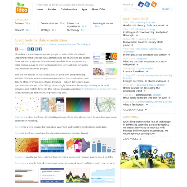
Most data is meaningless to most people — unless it is visualized. Stepping beyond familiar visualizations like bar charts and pie charts, there are many approaches to visualizing data, from mapping (e.g., color coding a map to show voting patterns) to visualizing networks (e.g., the links between people). You are not limited to Microsoft Excel, or your own programming abilities. Arbor.js is a library of force-directed layout algorithms plus abstractions for graph organization and refresh handling. CartoDB is a web service for mapping, analyzing and building applications with data. Circos is a software package for visualizing data in a circular layout. Cubism.js is a library for creating interactive time series and horizon graphs based on D3.js Dance.js is a simple data-driven visualization framework based on Data.js and Underscore.js DataWrangler is an interactive web application for data cleaning and transformation. Mr.

10 Tools for Creating Infographics and Visualizations The author's posts are entirely his or her own (excluding the unlikely event of hypnosis) and may not always reflect the views of Moz. Hello there! I'm Miranda Rensch, Product Manager at SEOmoz and lover of visual communication. Communicating visually is one of the most effective ways to explain complex concepts and relationships, and can be a great way to explain your services/products and create valuable site content. I've compiled a list of tools you can use to create visualizations, or simply use to communicate visually with your teammates. Tools for creating simple infographics and data visualizations 1. Piktochart is a web-based tool that has six decent free themes (and a whole bunch more for the paid version) for creating simple visualizations. 2. Easel.ly is another free web-based tool for creating infographics. 3. Infogr.am is another free, web-based tool with some really nice themes and a great interface for creating simple infographics. 4. 5. [Bonus!] 6. 7. 8. 9. 10. 1. 2.

Idea Couture Inc. | strategic innovation & experience design firm The Internet map Un trabajo en equipo - Manual de Periodismo de Datos Un trabajo en equipo Figure 1. Cómo empezó todo El Manual de Periodismo de Datos nació en un taller de 48 horas encabezado por European Journalism Centre y la Open Knowledge Foundation en la MozFest 2011 en Londres. Luego se amplió, convirtiéndose en un esfuerzo internacional en colaboración, que contó con la participación de docenas de los principales representantes del periodismo de datos y sus mejores exponentes. En los 6 meses siguientes que pasaron entre el comienzo del libro y su primera presentación, cientos de personas contribuyeron de diversas maneras. A todos los que aportaron y no aparecen en la lista, les decimos dos cosas.

How Pop Chart Lab Turned Trendy Infographics Into A Serious Business Halfway into 2014, Pop Chart Lab has released more than a dozen new posters. We’ve covered many of them here on Co.Design: a compendium of sentence diagrams, a guide to the world of whiskey, maps of wineries in Napa, and cocktail bars in New York City, to name a few. The studio's latest project, released yesterday, is a series of city maps available in laser-cut hardboard, oak, walnut, or cherry. For a tiny operation tucked away in Brooklyn, Pop Chart Lab is remarkably industrious--a veritable infographics factory. How did Patrick Mulligan and Ben Gibson get here? In 2010, Gibson and Mulligan both worked at Penguin Books, as a designer and editor, respectively. The two started collaborating on creating charts for the book. With more ideas than they had pages for the book, the duo decided to make infographics on the side, after work. Then came The Today Show’s special on Black Friday. The company’s order of operations has, naturally, changed over the years. Check out the store here.

?What If! 10 Awesome Free Tools To Make Infographics Advertisement Who can resist a colourful, thoughtful venn diagram anyway? In terms of blogging success, infographics are far more likely to be shared than your average blog post. This means more eyeballs on your important information, more people rallying for your cause, more backlinks and more visits to your blog. In short, a quality infographic done well could be what your blog needs right now. Designing An Infographic Some great tips for designing infographics: Keep it simple! Ideas for infographic formats include: Timelines;Flow charts;Annotated maps;Graphs;Venn diagrams;Size comparisons;Showing familiar objects or similar size or value. Here are some great tutorials on infographic creation: Creating Your Infographic Plan and research.If required, use free software to create simple graphs and visualisations of data.Use vector graphic software to bring these visualisations into the one graphic. Free Online Tools For Creating Infographics Stat Planet Hohli Creately New York Times Many Eyes Wordle

Datos públicos para emprendedores cívicos Empecemos por revisar algunos antecedentes acerca de los datos abiertos… ¿para qué deben de servir? La transparencia y la rendición de cuentas a través de los datos abiertos es la evolución de la transparencia tradicional: escaneo de documentos, PDFs, etc. Abrir los procesos de transparencia significa que la información, además de hacerse pública, se hace reutilizable, accesible, analizable. Además de esto, los datos abiertos pueden ser utilizados para que las agencias de gobierno operen entre sí; compartir información, reutilizarla y evitar, en la medida de lo posible, la duplicidad de información y, por lo tanto, de esfuerzos. Así mismo, se puede fortalecer la accesibilidad a trámites e información del gobierno, abrir también los procesos de generación de datos (es decir, ofreciendo formularios como APIs). Otro punto muy importante es la creación de un ecosistema de consumo de datos, tanto de emprendedores cívicos, como de ONGs, periodistas y público en general.

Invent Your Future InfoVis Toolkit JavaScript InfoVis Toolkit Create Interactive Data Visualizations for the Web Home ● Download ● Builder ● Donate Area, Bar and Pie Charts Sunburst Icicle ForceDirected TreeMap SpaceTree RGraph HyperTree Advanced/Other copyright © 2013 SenchaLabs - Author: Nicolas Garcia Belmonte El dato como materia: Visualización | postmedial geometry/geometría postmedial Señala Manovich: ¿Qué clase de imágenes resultan adecuadas para las necesidades de una sociedad de la información global e interconectada? Una sociedad que en todos sus ámbitos necesita representar más datos, más capas, niveles con más conexiones que la sociedad industrial que la precedió. En la que los sistemas complejos se han vuelto supercomplejos ; con una amplia disponibilidad de información en tiempo real procedente de servicios de noticias, redes de sensores, cámaras de vigilancia. Todo esto plantea nuevas exigencias a las imágenes que la cultura humana ha desarrollado hasta ahora, y en última instancia requiere la creación de un nuevo tipo de imágenes.[1] Las masas de datos son estructuras tan complejas y vastas que quizás la mejor manera de hacer comprender a todo el mundo las relaciones entre sus elementos y de revelar los patrones de significado que ocultan no sea con palabras. Así ha nacido el arte y la ciencia de la visualización de datos. Algunas obras: Me gusta:

Continuum | The future. Made real. d.school: Institute of Design at Stanford

Related: