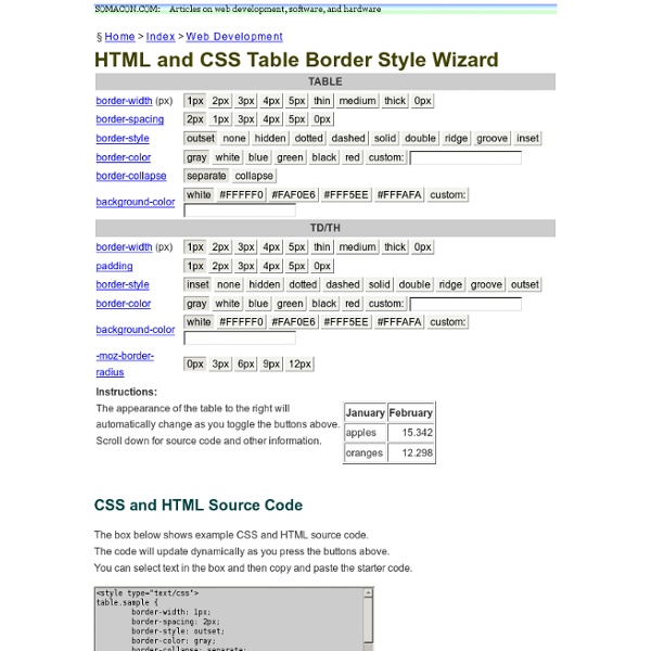
HTML and CSS Table Border Style Wizard
Style Master CSS Editor for Windows and Mac OS X
Cool Tools and Toys for Web Developers John, the lead developer (ok, pretty much the only developer) of Style Master is an avowed hacker. He loves exploring and experimenting with the latest features in browsers. Here's a collection of tools for web developers he's put together to help you analyse and debug your sites (and other people's sites as well), play with CSS3 features (bleeding edge browsers recommended) and more. XRAY works in Safari, Firefox and Internet Explorer. XRAY uses lots of cool CSS3 features like border-radius, opacity, box and text shadow, as well as the HTML5 canvas. MRI helps you create the best possible selectors for your CSS. MRI also uses lots of cool CSS3 features like border-radius, opacity, box and text shadow, as well as the HTML5 canvas. CSS3 Sandbox Gradients Explore CSS gradients (both linear and radial) (an experimental feature in Safari 4, and a proposed addition to CSS3). Shadows CSS now lets you create drop shadows on text, and on the box of an element.
CSS Table Generator | CSS Table
CSS Layout Generator
About the CSS Layout Generator The CSS Layout Generator was first released by Tony Aslett in October 2003, since then over 871,000 layouts have been generated. Updated in November 2010, HTML5 doctype can now be selected and a simple HTML5 template with appropriate tags will be created. Other HTML and XHTML doctypes are still available. The generator helps you create the structure of your website template using valid HTML and CSS. You can create a fluid or fixed width floated column layout, with up to 3 columns and with header and footer. The generator requires a modern DOM capable browser with JavaScript enabled. Instructions To create your layout select the structural elements your site requires (header, footer, columns). Info popups are available where you see InfoMore info example :) icon, just hover over it for more information. Join the CSS Forum to suggest changes or ask for help where needed. Author: Tony Aslett
CSS Sprite Generator | Project Fondue
HOW TO: Get Started with Less Framework
The Web Development Series is supported by Rackspace, the better way to do hosting. Learn more about Rackspace's hosting solutions here. For the past few years, CSS grid systems have become increasingly popular with web designers. Thanks to efforts like Nathan Smith's 960.gs, designing with a grid is less complicated, and better looking sites can be crafted with ease. One of my favorite CSS grid systems of late is Less Framework. In May 2010, Ethan Marcotte's "Responsive Web Design" helped spur a movement of building websites designed to fluidly adapt to various platforms and device sizes — think mobile optimized sites and tablet-specific layouts — without the need for an entirely different design or special URL. Less Framework is, in my opinion, one of the best ways for web developers without lots of experience in designing responsive websites (or media queries in general) to take advantage of this new trend. Knowing the Basics Guides and Templates Less-Ready Themes
Best CSS Button Generator: Create CSS-only Buttons
Formalize CSS - Teach your forms some manners!
Learn CSS Positioning in Ten Steps: position static relative absolute float
1. position:static The default positioning for all elements is position:static, which means the element is not positioned and occurs where it normally would in the document. Normally you wouldn't specify this unless you needed to override a positioning that had been previously set. 2. position:relative If you specify position:relative, then you can use top or bottom, and left or right to move the element relative to where it would normally occur in the document. Let's move div-1 down 20 pixels, and to the left 40 pixels: Notice the space where div-1 normally would have been if we had not moved it: now it is an empty space. It appears that position:relative is not very useful, but it will perform an important task later in this tutorial. 3. position:absolute When you specify position:absolute, the element is removed from the document and placed exactly where you tell it to go. Let's move div-1a to the top right of the page: What I really want is to position div-1a relative to div-1. Footnotes 10.
Related:
Related:

good tool to build table in html css by uglycharly Oct 23