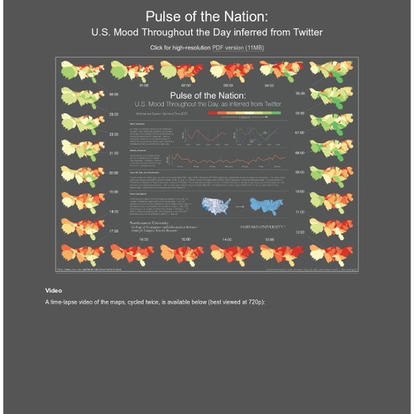
Pulse of the Nation: U.S. Mood Throughout the Day inferred from Twitter
The geography of Tweets
Give every Twitter user a brush and they will paint you the world — if they geotag their Tweets. Those of us on the Visual Insights team are obsessed with the patterns that emerge from aggregated Tweets over time. A continuing curiosity is about the geographical shapes that surface in geotagged Tweets. I’m especially fond of this view of Europe, because it shows all the maritime traffic from different cities and countries. Seeing the clarity of the regional images led me to work up images for cities, too. Istanbul: Tokyo: New York:
Every death on every road in Great Britain 1999-2010
2 December 2011Last updated at 17:52 The image below shows the location of 2,396,750 road crashes in Great Britain from 1999 to 2010. Each light point is an individual collision which resulted in a casualty. The video below animates 12 years of road crash data.
Tweetree - Birds in a tree.
Tell-all telephone | Data Protection | Digital
Betrayed by our own dataMobile phones are tracking devices that reveal much about our lives. One look at our interactive map of data provided by the Green party politician Malte Spitz shows why. Nuclear plants in your neighbourhoodHow many people live near a nuclear power plant in Germany? How many people lives within a radius of 20 kilometres? PISA based Wealth ComparisonHow do families live these days? ZEIT ONLINE analyzed and visualized the data OECD's comprehensive world education ranking report, PISA 2009. A United States of Europe?
Twitter StreamGraphs
A StreamGraph is shown for the latest 1000 tweets which contain the search word. The default search query is 'data visualization' but a new one can be typed into the text box at the top of the application. You can also enter a Twitter ID preceded by the '@' symbol to see the latest tweets from that user.
submap
twistori
Urban Population Map
Close Source United Nations, Department of Economic and Social Affairs (UNDESA), Population Division special updated estimates of urban population as of October 2011, consistent with World Population Prospects: The 2010 revision and World Urbanization Prospects: The 2009 revision. This map is stylized and based on an approximate scale. Notes Because of the cession in July 2011 of the Republic of South Sudan by the Republic of the Sudan, and its subsequent admission to the United Nations on 14 July 2011, data for the Sudan and South Sudan as separate States are not yet available. Data for China do not include Hong Kong and Macao, Special Administrative Regions of China. Data for France do not include French Guiana, Guadeloupe, Martinique, Mayotte and Reunion. Data for the Netherlands do not include the Netherlands Antilles. Data for the United States of America do not include Puerto Rico and United States Virgin Islands. This visualization was created by Periscopic - do good with data.
Related:
Related:
