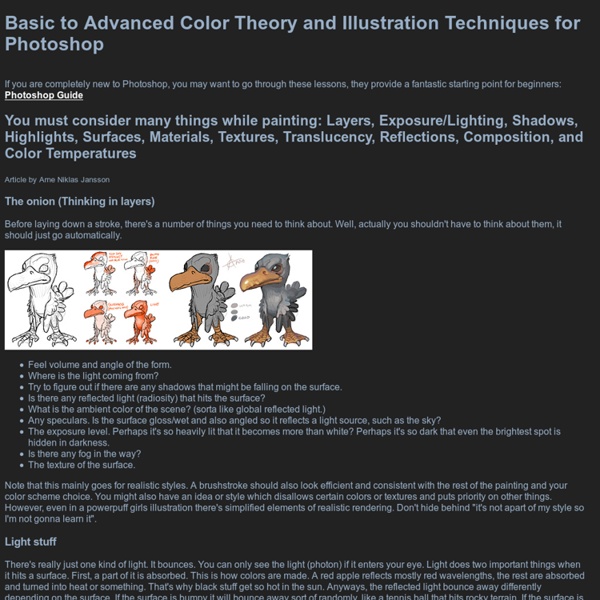
itchy animation - quirky illustration and characters by Richard Yot
LIGHT - a detailed tutorial Throughout this article I will be using a diagram of a white ball on white card to demonstrate how light behaves in different everyday situations: Here it illustrates a sunny afternoon. The main source of light is the sun, whilst the blue sky supplies a second source of light with very different characteristics. Some light is also bouncing between the white base and the ball and supplies a third source of light. The brightest light is coming from the sun and is white light emanating from a small source, which causes it to cast sharp edged shadows. The light coming from the blue sky has a very strong colour cast which affects everything in this scene. Finally the light that is reflected between the card and the ball is also predominantly blue (even though the card and ball are white) since it is blue skylight that is being reflected by the white objects. Why is the terminator the darkest area on the ball? Why is the light from the sky blue? Light bounces High key
5 Fundamental Skills Every Artist Should Master
As an artist, your job is to immerse your viewers into a world that you have built and guide them safely through it. Artists have much in common with storytellers. Storytellers have several tricks that they use to keep their readers coming back for more. Like storytellers, artists can use similar tricks to help them produce more compelling artwork. The most important aspect of art to me personally is the composition. This is the simplest and most used composition technique, one that I use a lot myself. The main idea behind this is to place your most important element/object on one of the intersections where the lines converge (the +'s), as well as along or near the vertical line of wherever your focal may lie. It is believed that when this is used and your subject/focal sits on one of these spots, it creates more interest in your picture rather than having it centered. You can use these basic guides either as a starting point for more complex compositions or to create an entire piece.
How to Pick the Right Color Palette for Your Designs
Color is very important especially to designers. A design would certainly look dull without the element of colors. No doubt, colors are indeed very important. It has a great impact on a business, on marketing and even in one’s emotions. To help you with that, we will give you ten tips that can be your guide in creating your own color palettes. 1. Image: shutterstock This is the first thing you need to know so that the colors you will choose will be suitable for the project. 2. Image: shutterstock Before you start creating and choosing a palette, review the basics of colors. 3. Image: shutterstock When we say custom, you will do away with the usual, traditional schemes and make your own. 4. Image: shutterstock Even if we have mentioned to do away with the traditional color scheme, this does not include monochromatic. 5. Image: shutterstock Try colors that have the same chroma and saturation levels. 6. Image: shutterstock These three would add a different life to your color palette. 7. 8. Ads
Concept Art Theory – Understanding Composition | Leanne Reed
In order to create the best composition of a piece, several several rules should be adhered to. Many professionals work by a series of tried and tested rules that work for the best aesthetics and outcome for a piece of concept art. Without a good understanding of composition any piece created, no matter how great the skill involved, will always be lacking a certain something. One of the oldest rules is the Golden Ratio - a 1:1.618 rectangle which is then divided into squares, by doing this it reveals the location of the strongest focal point. Further from the golden ration is the rule of thirds, this is achieved by dividing a frame by three on each side to create a grid. The diagonal and S-line rule are great for adding movement and speed to a piece. Another powerful rule is the use of framing. Things to Avoid Clutter - clutter can be distracting in a composition, it draws the eye away from focal points.
Coloring in PSD-Orange is what you are
Photoshop is your friend. Certainly, you'll say, the camera doesn't see as we do, it alters colors, etc. That is besides the point. Once you are looking at the colors on the screen, if they make up a good tromp l'oeil to you (and my gosh, isn't a photo almost as realistic as, say, a photo?) The color prejudices of the XIXth century have been substituted by the color prejudices of the more recent years. Note: on the picture I have also placed patches of maximum value at constant chroma and null-chroma patches.
Untitled Page
Useful Photoshop Layer Styles Tips and Tricks
Layer Styles are special effects that can be applied to Layers in Photoshop, and change the appearance of whatever contents that layer has. You can use them to get awesome results easily and quickly. This tutorial will show you some really useful, and time saving, tips and tricks for dealing with Layer Styles. Tip 1: Adding and Modifying Effects You can double click the layer to open the “Layer Style” dialog box, then click whatever effects you want to add, and modify the settings. Alternatively, you can click the Add a layer style icon down the Layers panel (Window -> Layers) to go directly to the effect you want to apply. Once a Layer Style is applied, a small “fx” icon and an arrow will appear to the right side of the layer. To modify an effect, you can double click it from the expanded list, or click the Add a layer style icon then choose the effect you want to modify. Tip 2: Disable Auto-Expanding the Effects List Tip 3: Hiding and Showing Effects Tip 4: Removing an Effect
SPARTH
GW: Tell us about yourself. S: Well, to sum it up, I have been an artist since I was five. I lived abroad for many years as a kid, went back to France at the end of the eighties until 2003 when we decided to leave for Canada. In 2005, we had to solve a dilemma: leave Montréal where people are great, but where the weather was so hard to endure. GW: Looking back, who or what had the biggest impact on you? S: I’d say my parents for having made the choices they did and having lived abroad for several years. GW: How much of a role has networking on internet forums and having a website had on your career? S: I suppose art sites and art blogs did have a lot of impact on my art and creativity, since it's always extremely inspiring to discover a new artist every day. GW: Why leave Ubisoft with so many prestigious projects lined up? S: I felt I had done my time in UBISOFT. GW: What was the original attraction to working at ID? S: Being a bit more stable. S: There are some issues. S: Thank you.
sparth - depot - custom shapes
i haven't posted for ages. and i guess it would be wise to open a new sketchbook on CA, where i'll be able to gather some of the latest stuff, as well as having a new spot to 2011.the initial reason why i want to open that new sketchbook is because of several techniques i've found out and started using within photoshop, and that some of you could benefit in various ways. if i can use that sketchbook as a repository for all the findings, it will be all good, and i'll be able to come back to it easily.we've been talking a lot with thom scholes about it, and we're still experimenting and pushing this thing forward. also, kekai, as well as other artists and friends, have started messing with the technique. it's super exciting seeing stuff pop up that way.
lines and colors :: a blog about drawing, painting, illustration, comics, concept art and other visual arts