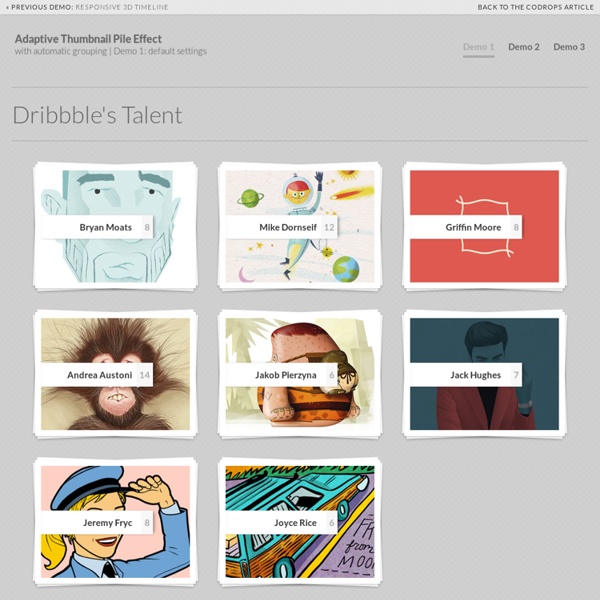
Adaptive Thumbnail Pile Effect with Automatic Grouping
Caption Hover Effects - Demo 1
Previous Demo Back to the Codrops Article
SlipHover | Apply direction aware hover effect to images
SlipHover apply direction aware hover animation for the caption of an image. Download download zip from GitHub Quick start include the files call the the plugin on a container as your wish $("#container").sliphover(); All done! Options you can custom the caption by passing options when call the plugin, all available options are listed below. call the the plugin on a container wish you wish Demo Besides examples in the option table above, there are a few nice demos shows sliphover can work well with other image gallery plugins such as Wookmark , freewall and isotope . Compatibility Requirs jQuery 1.7+. Works well with all modern browsers and IE9+. License Licensed under the MIT License
Related:
Related:
