
70 Beautiful Free PSD UI Kits of 2013! Best Graphic Items In this collection, we are introduction some beautiful and useful free PSD UI Kits that you can download for free. So, you can design visually interactive and appealing user interfaces with our awesome free kits. All these kits are available in PSD format for easy modification. With these mobile user interface kits, designers can enhance their creations and make their mobile user interfaces look more interesting and appealing. Click on the “get this kits” links to go from where the UI kits has been taken. These UI kits suitable for mobile applications, custom website designs, software programs. UI KIT remake Get this Kits Fabric UI Kit Get this Kits Web GUI Kit Get this Kits Layered Facebook GUI PSD Kit Get this Kits Classic Grey Web UI Get this Kits Dark Grey iTunes UI Get this Kits Yellow Web UI Elements Kit Get this Kits Solid UI Kit Get this Kits Shiny UI Kit Get this Kits Lion OSX UI Kit Get this Kits iPad GUI PSD Get this Kits Tron UI Set Get this Kits Android Get this Kits Midnight UI Kit PSD Get this Kits
Customize checkboxes and radio buttons with iCheck (jQuery and Zepto) plugin - Iceweasel iCheck plugin works with checkboxes and radio buttons like a constructor. It wraps each input with a div, which may be customized by you or using one of the available skins. You may also place inside that div some HTML code or text using insert option. For this HTML: <label><input type="checkbox" name="quux[1]" disabled> Foo </label><label for="baz[1]">Bar</label><input type="radio" name="quux[2]" id="baz[1]" checked><label for="baz[2]">Bar</label><input type="radio" name="quux[2]" id="baz[2]"> With default options you'll get nearly this: <label><div class="icheckbox disabled"><input type="checkbox" name="quux[1]" disabled></div> Foo </label><label for="baz[1]">Bar</label><div class="iradio checked"><input type="radio" name="quux[2]" id="baz[1]" checked></div><label for="baz[2]">Bar</label><div class="iradio"><input type="radio" name="quux[2]" id="baz[2]"></div> By default, iCheck doesn't provide any CSS styles for wrapper divs (if you don't use skins). Options These options are default:
A Free Web & Mobile App for Reading Comfortably — Readability Select2 3.3.2 - Iceweasel Gets or sets the selection. If the value parameter is not specified, the id attribute of the currently selected element is returned. If the value parameter is specified it will become the current selection. val method invoked on a single-select with an unset value will return "", while a val method invoked on an empty multi-select will return []. Example: alert("Selected value is: "+$("#e8").select2("val")); $("#e8").select2("val", "CA"); Notice that in order to use this method you must define the initSelection function in the options so Select2 knows how to transform the id of the object you pass in val() to the full object it needs to render selection. Gets or sets the selection. data method invoked on a single-select with an unset value will return null, while a data method invoked on an empty multi-select will return []. Reverts changes to DOM done by Select2. Opens the dropdown. Closes the dropdown. Notifies Select2 that a drag and drop sorting operation has started. change val added object
Aloha Editor - HTML5 WYSIWYG Editor Creating Different CSS3 Box Shadows Effects - Iceweasel In this tutorial we are going to be creating box shadow effects with just CSS. Below is an image created in photoshop of different box shadows effects. These used to be the only way of creating this effect but thanks to CSS3 we can now do all this with just CSS. View Demo page to see what we are going to create CSS Box Shadow Effects Demo CSS Box Shadow We are going to be using the CSS box shadow property which is one my favourite CSS properties which you will see in this tutorial how easy you can use it. The box-shadow property allows you to easily create multiple drop shadows on box elements by specifying values for colour, size, blur and offset. The box-shadow property accepts 2-6 options, the required options are horizontal offset and vertical offset, the two optional options are spread distance and colour. box-shadow: inset horizontal vertical blur spread colour; Examples Browser Support All of the major newest browsers support box-shadow property. The box-shadow property is no different.
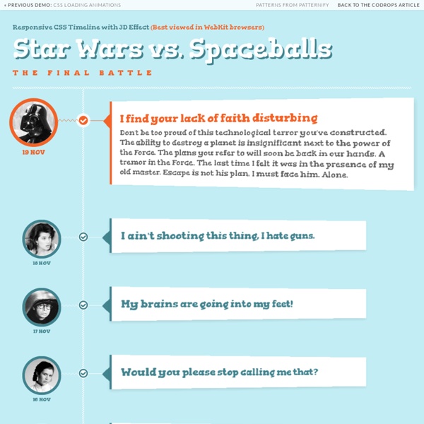
Trends in interactive design 2013 KNACSS Text Opening Sequence with CSS Animations A simple and fun text opening sequence effect with blurry letters using CSS animations. View demo Download source Today I want to show you how to create a fun little typography effect with CSS animations and text shadows. Maybe you know those eerie opening sequences of movie trailers where some text is being faded in on a dark background. After seeing Introducting Briefs (which is not a terror movie trailer but a preview for an interesting app) I got inspired for recreating the effect using CSS. The idea is to blur text and make it appear with a rotation while animating the space between the letters. So, let’s do it. Please note: this is highly experimental and only works as intended in browsers that support the respective CSS properties. The idea is to have a couple of sentences fade in with the aforementioned effect, so we’ll want to wrap every appearing bit into an h2: Remember, this is just a experimental effect; let’s not be too strict with markup best practices :) And the last one?
Flippant Heading Donec id elit non mi porta gravida at eget metus. Fusce dapibus, tellus ac cursus commodo, tortor mauris condimentum nibh, ut fermentum massa justo sit amet risus. Etiam porta sem malesuada magna mollis euismod. Modal » Card » Donec sed odio dui. Whys and hows: Flippant is tiny. Flippant is easily customized. Flippant exports a single function: flip. var front = document.getElementByID('flipthis') , back_content = "<h1>I'm the back! Two modes: card (the default), and modal. back = flippant.flip(front, back_content, 'modal') The back gets the default class of flippant-modal-dark for modal flips and flippant-modal-light for cards. back = flippant.flip(front, back_content, 'modal', 'my-modal-classname') The full API: flip(element_to_flip, content_for_back, type(modal/card), classname_for_back) -> back_element 74.3% of the magic is in the css file.