background preloader

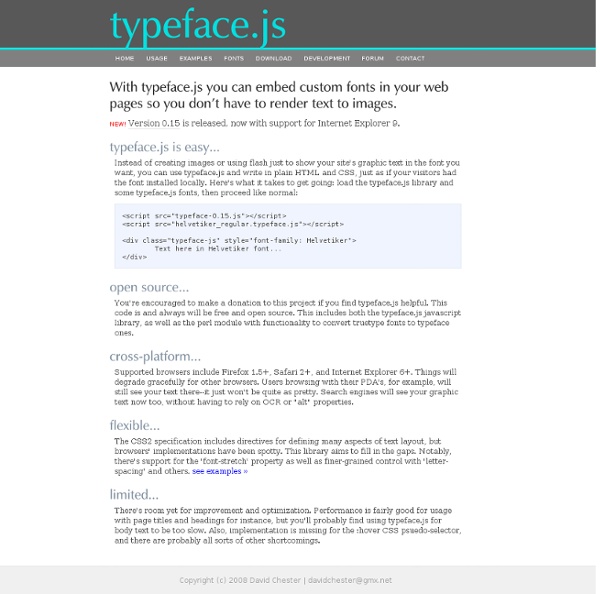
Rendering text with Javascript, <canvas>, and VML

Rendering text with Javascript, <canvas>, and VML

Create a font from your own handwriting - fontcapture.com Fonts and the Web Guest Post By: Juul Coolen The web, and consequently its visual appearance, is dynamic by nature. For one, browsers interpret pages and show them accordingly. In a standards-compliant world every browser would adhere to the standards as set out by the W3C so pages look the same in any browser, but we all know the actual state of affairs. Granted, things have significantly changed over the last couple of years. ‘Bad’ browsers are phasing out (albeit slowly), handing over control to the designers by means of CSS. "The less sophisticated lament on our behalf that we are stuck with ugly fonts." Image Replacement Web typography is different from printing typography in that a CSS font rule is merely a request to the browser and therefore open to interpretation. Image replacement is probably the most straightforward way of realising (some of) this control. Fahrner Image Replacement (FIR) The original image replacement technique by Todd Fahrner. As easy as image replacement gets. The Big Noob J.R.

FontStruct | Build, Share, Download Fonts 50 Extremely Useful And Powerful CSS Tools | CSS Advertisement We love useful stuff. For months, we have been bookmarking interesting, useful and creative CSS tools and related resources. Below, we present 50 extremely useful CSS tools, generators, templates and resources. We strongly encourage you to develop these tools further, build on the ideas presented here, release new tools for the public and let us know about them. Please take a look at the following related posts: CSS and Typography Hyphenator8Hyphenator.js brings client-side hyphenation of HTML documents to every browser by inserting soft hyphens using hyphenation patterns and Frank M. 20typeface.js21Instead of just creating images or using Flash to show your website’s graphic text in the font you want, you can use typeface.js and write in plain HTML and CSS, just as if your visitors had the font installed locally. CSS Online Tools

Top 100 Best, Cool, Most Popular Professional Fonts (In English) Posted on 04'09 Mar Posted on March 4, 2009 along with 182 JUST™ Creative Comments Based on a variety of factors listed below, these are the top 100 best fonts of all time. To say the least, ranking fonts is an obviously hard task… how does one measure aesthetic quality, the benefit of an item, its value to humanity and so fourth? Well, in this particular German publication, the judges ranked the fonts by their objective and various other weighted measurements: FontShop Sales Figures: 40%Historical Value/Meaning: 30%Aesthetic Qualities: 30% It is also worth noting that this evaluation consisted exclusively of licensed or commercial fonts only. Below is a preview of the top 33 fonts and beneath this image you can find the full list of the 100 best fonts. Top 100 Best Fonts Of All Time Below you will find the full list of the best 100 fonts along with the designer & the year in which they were designed. 1. 2. 3. 4. 5. 6. 7. 8. 9. 10. 11. 12. 13. 14. 15. 16. 17. 18. 19. 20. 21. 22. 23. 24. 25.

10 of the Best Programming Fonts This article was written in 2009 and remains one of our most popular posts. If you’re keen to learn more about fonts, you may find this recent article on IcoMoon of great interest. Many programmers are passionate about their text editor. bitmap/raster fonts tend to render better on screenmonospace fonts normally offer better character identification, butproportional fonts take less screen space and can be a little easier on the eye. (Tip for SciTE users: press Ctrl+F11 to toggle between a proportional and monospace font. Here is a list of great programmer fonts for those of you who steadfastly refuse to believe in anything beyond Courier New. 1. One of core Windows fonts, Arial is often overlooked, but it is a clear and readable typeface. 2. Bitstream Vera is a free font developed for the GNOME project but is available on other platforms (download Bitstream Vera). It is a great-looking typeface and, personally, I prefer it to… 3. 4. 5. 6. 7. 8. 9. 10. Comments on this article are closed.

Primer Print, Medium Normal - Sans Macromedia Fontographer 4.1 9/18/97 Freeware by Ray Larabie 1997 Contains 99 characters in Character Map 40 Free High Quality Hand-drawn Fonts | Graphics Unlike the serif font family, these hand drawn fonts looked less serious but they tend to give and convey strong human touch wherever they are applied. Hand-drawn fonts are hard to stand on it’s own, but they are utmost perfect for these following situations: Hand drawn websitesIf you are inspired to give your new web design a sketchy or hand-drawn look and feel, these fonts are without a doubt the perfect math to the layout. Click here for more examples of Hand-drawn style websites. via bootbGuides and instructions Whether its a storyboard, an online guide & tutorial or merely an attempt to help user understand an illustration better, arrow, pointer and text guide gets the job done seamlessly. In terms of text, typography that mimics human writing tend to make reading and understanding things easier. Free Hand-drawn Fonts Here are 40 high quality hand-drawn fonts you can download and apply on your design. Alpha Mack Analgesics Bubbly Frog Christopher Hand Dali Fabulous 50s Fail FFF Tusj Daniel

Compose to a Vertical Rhythm “Space in typography is like time in music. It is infinitely divisible, but a few proportional intervals can be much more useful than a limitless choice of arbitrary quantities.” So says the typographer Robert Bringhurst, and just as regular use of time provides rhythm in music, so regular use of space provides rhythm in typography, and without rhythm the listener, or the reader, becomes disorientated and lost. On the Web, vertical rhythm – the spacing and arrangement of text as the reader descends the page – is contributed to by three factors: font size, line height and margin or padding. The basic unit of vertical space is line height. Establishing a suitable line height The easiest place to begin determining a basic line height unit is with the font size of the body copy. There are many ways to size text in CSS and the above approach provides and accessible method of achieving the pixel-precision solid typography requires. Spacing between paragraphs Variations in text size Headings

Information Architects Japan » Blog Archive » The 100% Easy-2-Read Standard by Oliver Reichenstein Most websites are crammed with small text that’s a pain to read. Why? There is no reason for squeezing so much information onto the screen. It’s just a stupid collective mistake that dates back to a time when screens were really, really small. So… Screen vs. magazine: 100% is NOT big; image by Wilson Miner. Don’t tell us to adjust the font size We don’t want to change our browser settings every time we visit a website! Don’t tell us busy pages look better Crowded websites don’t look good: they look nasty. Don’t tell us scrolling is bad Because then all websites are bad. Don’t tell us text is not important 95% of what is commonly referred to as web design is typography. Don’t tell us to get glasses Rather, stop licking your screen, lean back (!) Five Simple Rules 1. The font size you are reading right now is not big. We don’t want to click bigger or smaller buttons and we don’t want to change our preferences. 2. Let your text breathe. Good Nielsen – bad Nielsen. 3. 4. 5.

The Best Free Fonts of 2009 | Web Design Ledger As this year comes to a close, we can look back and see that 2009 was a big year for typography. We saw more web designs with a focus on type, and there were some pretty amazing fonts released. Here are some of the best free fonts from this past year. A few of the fonts below were released at the end of 2008, but since they didn’t see much action until this year, I included them in the list. Chunk Chunk is an ultra-bold slab serif typeface that is reminiscent of old American Western woodcuts, broadsides, and newspaper headlines. Calluna Calluna supports a very wide range in languages and is a very complete OpenType typeface. Vegur League Gothic League Gothic is a revival of an old classic, and one of our favorite typefaces, Alternate Gothic No.1. Sansation Quicksand Mentone Mentone is a new general purpose typeface, an attempt at extending the line of the great sans-serifs of the previous century, Frutiger – Stone Sans – Myriad. Serif Beta Goudy Bookletter 1911 Titilium Junction Sovba Related Posts

Typography Crash Course Roundup You can spend your whole life obsessing over type. It’s a craft with an awesome history and practicing it well often takes designers on a sort of quest that never seems to end. The strategies are both infinitely complex and sometimes irreducibly simple. Web Typography Tutorial - Oldie but goodie from the Webmonkey era. Web Developer&#039;s Handbook: developing web-sites, exploring own imagination | CSS, Color Tools, SEO, Usability etc. Vitaly Friedman's The Web Developer's Handbook creativity | css galleries & showcases | color tools | color schemes, palettes | color patterns | fashion: colors selection | color theory | royalty free photos | css daily reading | web design daily reading | css layouts | css navigation menus | css techniques | css: software & Firefox Extensions | css-web-tools & services | html-web-tools & services | accessibility checkers | miscellaneous tools | ajax | javascript | DOM | fonts | typography | RSS | CMS | blogging | specifications | usability & accessibility | add a link (free) | seo tools | seo references | howtogetthingsdone | freelancers resources | web2.0 | 2read Advertise here! creativity css: selected showcases css galleries & showcases color tools color schemes, palettes color patterns fashion: colors selection color theory royalty free photos specifications usability & accessibility add a link (free) seo tools seo references howtogetthingsdone freelancers web 2.0 2read: this week

Polices à télécharger

Related: