
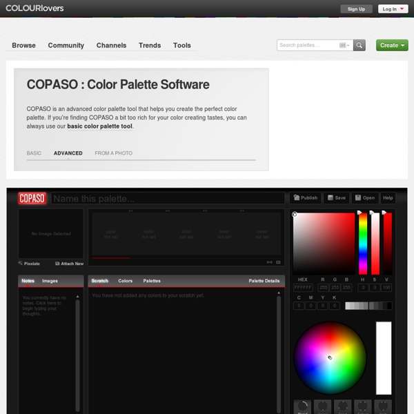
http://www.colourlovers.com/copaso/ColorPaletteSoftware
color palette creator v1.6.1 This tool was inspired directly by the excellent Creating Color Palettes article by Andy Clarke. It will create 10 shades of the base color, located top-left, at varying degrees of opacity. The top row emulates opacity over a white background, the bottom over black (or colors of your choosing as of v1.4). The opacity values are 100% opaque, 75%, 50%, 25% and 10% on the top row. The bottom row begins at 85% rather than 100% and continues on as the first. How to use it: Combining Colors - Analog, Complementary, Triad - Colors on the Web Color combination is really the most important part of color theory and designing with colors, and also the hardest-- It always comes down to your personal judgement and how you look at colors. There are, however, some guidelines that can be used to make a color combination that is interesting and pleasing to the eye. How many colors? It is hard to give an exact answer to this question, but in general one can say that the risk of using too many colors is greater than the risk of using too few. Too many colors will make the page feel too busy and it usually makes it harder for the viewer to find the information he or she wants.
Free tools for working with digital colors 50 Best Free Tools To Create Perfect Color Combinations A good color combination has the tendency to communicate with the users and let them perceive the design in the correct way. That is the basic reason why you need to pick the right color for your design. So, here we are bringing 50 varieties of useful and valuable color tools that would help you choosing the right color palettes for your designs. You are welcome to share more color tools and resources which our readers/viewers may like.
Pink Color - Instant Color Schemes List of Color Schemes: [More] View more schemes Most Popular: How are the colors chosen? Browse Palettes Log In Sign Up COLOURlovers Color Contrast for Better Readability When you create color palettes for your web design projects, are you testing the color combinations for contrast? If you're not, you might not be considering the eventual readability of the design and thus losing potential audience. I’ve been working on a process to help me ensure good color contrast and readability in my projects. Thanks to some helpful color contrast accessibility tools, I think I have something that is working and wanted to share with others in the event that you find it helpful, too.
Color Palette Generator Color Palette Generator URL of image: Make color schemes. Warm Hex Color Codes: Hexadecimal codes for named colors used in HTML page features The Hex Hub Warms: red orange brown yellow yellowgreen Need mobile? There is a mobile-friendly version of these color charts. Warms: red orange brown yellow yellowgreenYou are here The chart below shows the hexadecimal color codes for shades of blue, teal, cyan, and similar colors.
Quick Tip: Remove a Person From a Photo With Photoshop CS5’s Content Aware Feature With the launch of the new Adobe Suite of programs comes the long awaited Adobe Photoshop CS5. Packed with new features to speed up your workflow it truly is the most advanced edition of Photoshop to date. One of the new features we will be looking at today is called Content Aware. This feature allows you to quickly fill in a selection with surrounding content making it look like a part of the original image. In this case we will choose to remove a person from a photo, this can be done in less than five minutes.
10 Great Google Font Combinations You Can Copy The average man considers which flavor of Doritos will taste good with his Heineken. The sophisticated man considers which cheese will pair well with his choice of wine. The designer of course considers which two fonts will look great on the same page. Free textures for your next web project Nothing like a field of beautiful flowers. Download Download These lovely water-colorful dots will make your designs pop.
The Whys And The Hows Of Textures In Web Design Advertisement Texture is becoming integral to design. It’s gone beyond being a trend — it’s now a simple and effective way to add depth to a website. Wielding the power of texture is a great responsibility. It increases the effectiveness of websites and is a quality tool in the arsenal of designers. It can guide the user’s eye and emphasize the importance of key elements.
How To Learn Photoshop In 24 Hrs » Design Reviver Quite a bold statement, Learn Photoshop in 24 hours. Its simple and you can. Stepping into Photoshop at first can be quite daunting, were do you start? With these 20 tutorials we have given you some direction, you will start of with some very basic techniques and build towards the more advanced. By the end of it you will be an expert. Tutorial 1:Combining Two Photos for New Effect – Basic