Fiona Banner
Gapminder: Unveiling the beauty of statistics for a fact based world view.
Cartographie des réseaux : L'art de représenter la complexité - Manuel Lima, Lev Manovich, Jérôme Cukier
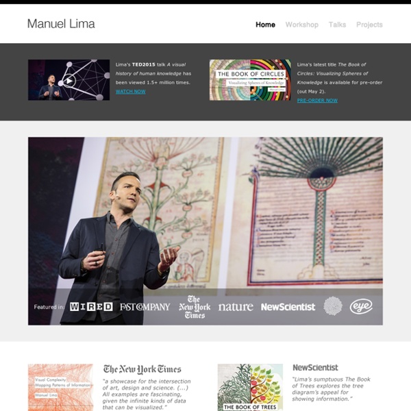
Manuel Lima
Background[edit] Lima has a BFA degree in Industrial Design from the Faculty of Architecture at Technical University of Lisbon and a MFA in Design and Technology from Parsons School of Design.[7] During his MFA program Lima worked for Siemens Corporate Research Center, the American Museum of Moving Image and Parsons Institute for Information Mapping. Public speaking[edit] Recognition[edit] Lima was nominated by Creativity magazine as "one of the 50 most creative and influential minds of 2009"[2] and was elected Fellow of the Royal Society of Arts (FRSA) in 2010.[9] Bibliography[edit] The Book of Circles: Visualizing Spheres of Knowledge (2017), Princeton Architectural Press, ISBN 978-1-61689-528-0The Book of Trees: Visualizing Branches of Knowledge (2014), Princeton Architectural Press, ISBN 978-1-616-89218-0Visual Complexity: Mapping Patterns of Information (2011), Princeton Architectural Press, ISBN 978-1-568-98936-5Blogviz (2009) ISBN 978-3-639-20902-0 References[edit] External links[edit]
artforum 2004
Techniques of Today - Bennett Simpson on Bernadette Corporation (Artforum, September 2004) It is the summer of 2001, and the New York--and Paris-based collective known as Bernadette Corporation has temporarily merged with Le Parti Imaginaire, a faction of post-Situationist militants and intellectuals with links to the burgeoning antiglobalization movement. The two groups have their own distinct practices and motivations, but, for the moment, they are united by the idea of making a film, which is to be set in the seaside Italian city of Genoa, amid the protests and stultifying inconclusiveness that will engulf the G8 Summit that July. The film resists knowing what it is or wants to be. And so its makers improvise, exploring what they call the "potential of community based on a radical refusal of political identity." What results is Get Rid of Yourself, an hourlong cine-tract-cum-documentary centering on the experiences and reflections of the so-called Black Bloc. Am I possible?
[Review] The Book of Trees, Manuel Lima | the scottbot irregular
Tree of Consanguinity, ca. 1450-1510. Page 52. Lima’s book is a history of hierarchical visualizations, most frequently as trees, and often representing branches of knowledge. Biblical Genealogy, ca. 1060. Of course, any project with such a wide scope is bound to gloss over or inaccurately portray some of its historical content. The Blog Tree, 2012. Where the book shines is in its clear, well-cited, contextualized illustrations, which comprise the majority of its contents.
Brief Epigrams
MANUEL LIMA
Visual Complexity website © Manuel Lima Iker Gil and Andrew Clark interview Manuel Lima Manuel Lima is a leading voice on information visualization. In 2005 he founded Visualcomplexity.com, a website that has become the public resource for anyone interested in information visualization, particularly in the mapping of networks. IG: Trained as an industrial designer, you are currently a senior user experience design lead at Microsoft and a leading voice on information visualization. ML: Even though my background is industrial design I was always interested in the multi-disciplinary nature of design and its various practices, such as graphic design, interface design, motion design, or 3D animation. IG: In October of 2005, you founded Visual Complexity. ML: I started VisualComplexity.com in 2005, in the aftermath of my MFA thesis research, primarily as a personal bookmarking mechanism, to keep track of various topics I was interested in. AC: What visualization recently caught your eye? Notes
www.garlandfielder.com | 2007 portfolio
Untitled (Yellow Contortion) wood & paint, 12"x12" sliced 2007 Untitled (Aqua Contortion) wood & paint, 12"x12" sliced 2007 Untitled (Blue Contortion) wood & paint, 12"x12" sliced 2007 Untitled (Blue & Red Contortions) wood & paint, each 12"x12" sliced 2007 Untitled (Red Contortion) wood & paint, 12"x12" sliced 2007 Untitled (Aqua & Blue Contortions) wood & paint, each 12"x12" sliced 2007 Untitled (Yellow Contortion) wood & paint, each 12"x12" sliced 2007 Spindle 1 Acetate on Mylar & magnets, 18"x18"x1" 2007 Spindle 2 Acetate on Mylar & magnets, 18"x18"x1" 2007 Spindle 3 Acetate on Mylar & magnets, 18"x18"x1" 2007 Untitled wood & paint, 50 "x47" 2007 Untitled wood & paint , 15"x13" 2007 Untitled wood & paint, 17"x17" 2007 Untitled wood & paint, 17"x12" 2007 Untitled wood & paint, 11"x18"x9" 2007 Untitled wood, Vinyl & paint, 50"x66"x24" 2007 Untitled (two pieces) wood, Vinyl & paint, 21"x18"x5" 2007 Untitled (Black Contortion 01) Acrylic on canvas, mounted on wood, 42" x 42" 2007
Manuel Lima. Mapping The Information Space
Manuel Lima. Mapping The Information Space Data Visualization Generative Art Interviews Software Art In the contemporary media scenario always more information is produced, managed and shared through digital channels, with the consequent production of a huge quantity of data which end up piling up and stratifying in the enormous container which is the Net. He now is a User Experience Senior Designer at Microsoft Bing. Its main characteristic is to explore with an analytical approach different methods of visualization, comparing different disciplines and giving an evolutionary prospective in terms of techniques and aesthetics. On this colossal project Manuel Lima recently based an interesting book entitled “Visual Complexity – Mapping Patterns of Information” ( in which he preserves the usual comparative point of view, starting from the experiences of the website to stretch them in a both diachronic and synchronical point of view.
Taryn Simon
Visual complexity - Manuel Lima