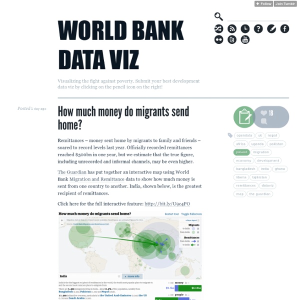
World Bank Dataviz
DataVis.ca Gallery of Data Visualization
This Gallery of Data Visualization displays some examples of the Best and Worst of Statistical Graphics, with the view that the contrast may be useful, inform current practice, and provide some pointers to both historical and current work. We go from what is arguably the best statistical graphic ever drawn, to the current record-holder for the worst. Like good writing, good graphical displays of data communicate ideas with clarity, precision, and efficiency. [See the Bad Writing Contest for examples of The Best of Bad Writing. Do you know of other examples of the Best or Worst in Statistical Graphics on the Web? These pages are organized as a collection of images, along with a few of the 1000 words each may be worth and some links to original sources.
Co.Design
Datavisualization.ch
Related:
Related: