
Le nombre d’or, la règle des tiers dopée Bienvenue sur Apprendre la Photo !Si vous êtes nouveau ici, vous voudrez sans doute lire mon guide qui répond aux 5 problèmes courants des débutants : Cliquez ici pour télécharger le guide gratuitement !Merci de votre visite, et à bientôt sur Apprendre la Photo ! :) Si vous avez un peu exploré le blog et vous êtes intéressé à la composition de vos photos, vous avez forcément entendu parler de la règle des tiers. En général, quand on découvre la règle des tiers en débutant la photographie, ça révolutionne un peu notre vision du monde, des images et on finit par découvrir qu’on a passé sa vie à centrer le sujet, et que c’est ce qui donnait des images moches pas top. Et bien aujourd’hui, je vais vous parler d’une règle de composition qui y ressemble un peu, mais qui a encore plus de force. Ah non, tu déconnes ? Pas d’inquiétude, je ne ferai pas dans le compliqué Spirale de phi Ça ressemble à la règle des tiers, ça a l’odeur de la règle des tiers… mais ce n’est pas la règle des tiers !
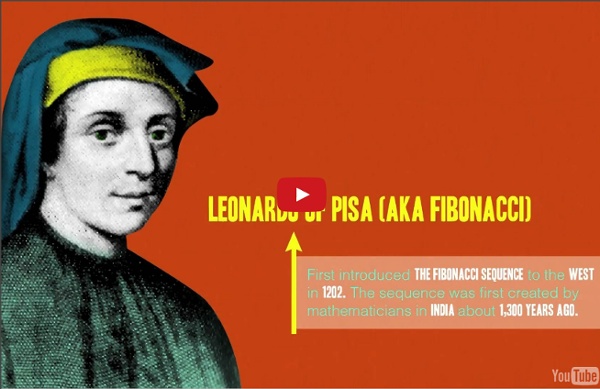
L’Art et la manière de composer Aujourd’hui, éclairons-nous avec un angle nouveau le B.A BA de la Photo: la Composition. Pour travailler la composition et la gestion de la lumière dans nos œuvres photographiques, on pense souvent travail d’autres photographes en référence. Mais je trouve qu’il y a bien d’autres sources d’inspirations pour nous, photographe en herbe: la peinture ou le cinéma par exemple, par extension à tout type d’art. Le but ici n’est pas de vous réapprendre à composer (vous pouvez revoir l’article de Jerka sur la composition pour rappel) mais de voir qu’on peut apprendre en dehors du carcan de la photographie. Voyons ensemble le décryptage de quelques “classiques”… Niveau : Tous niveaux - La peinture ou l’art qui a inspiré la photo – Ce qui faut savoir, c’est que nombres de règles de composition sont issues du nombre d’or, dont je vous épargnerais les détails mathématiques. Une application du nombre d’or Mais la photographie n’emprunte pas que des règles à la peinture.
Street Photography Composition Lesson #13: Multiple-Subjects I think one of the most difficult compositional techniques in street photography is to incorporate multiple subjects in the frame — without it becoming too cluttered or overwhelming. Generally the problem is that most photographers that try to incorporate multiple subjects have some of the following problems: Overlapping subjectsDistracting backgroundsNo central subjectNot enough points of interest In this article I will share some of who I think are the finest photographers to have used multiple-subjects in their photos. I will analyze the images, and hopefully provide practical tips to anyone trying to incorporate more multiple subjects in the frame. Why multiple subjects? As a disclaimer, I don’t personally have much multiple-subject work in my portfolio. However I think it is still possible to create complex multiple-subject photographs that aren’t complicated. What is the difference between a complex and a complicated photo? Tony Ray Jones / Beauty Contest Southport, 1967 Conclusion 1.
Street Photography Composition Lesson #12: Color Theory Eric Kim, Downtown LA 2012. For today’s compositional lesson– I want to talk about color theory— and how you can better utilize colors when it comes to your street photography. Personally around 2 years ago, I made the switch from shooting fully black and white — to just shooting color film (Kodak Portra 400). Since then, I have learned to see the world in a totally different way. However at the same time– shooting in color presented a new bag of worms. So for this lesson we will talk about some color theory — in terms of how we can make colors better work for us. Complementary colors Isaac Newton’s Color Wheel The first theory we will tackle is “Complementary colors.” Complementary colors are colors which cancel each other’s hue to produce an achromatic (white, gray or black) light mixture. Complementary colors tend to work really well together– and create a nice harmony that feel balanced. A modern RGB color-wheel (or star). Sports Teams Often sports teams use complementary colors. Beer
Street Photography Composition Lesson #10: Urban Landscapes For today’s lesson I want to talk about “urban landscapes.” Urban landscapes aren’t really compositions in the specific sense (compared to lines, curves, etc)– but I still feel they are relevant when creating our street photographs. If you guys have read my prior lessons on composition– I have thought a lot about what a “composition” really is. Composition: The combining of distinct parts or elements to form a whole. So when it comes to street photography, whatever elements we capture in the background make an image. I am not exactly sure what direction these “composition lessons” are heading– but thank you for your support. Urban Landscapes So to start off, let us first contemplate the question: What exactly is an “urban landscape?” For me, an “urban landscape” is a photo primarily focusing on the urban environment (a man-made environment) which puts more emphasis on the background than the subject. Enter Robert Frank’s Urban Landscapes “Save Gas” © Robert Frank St. © Robert Frank. Car Frame
Street Photography Composition Lesson #8: Curves All photos in this article are copyrighted by their respective photographers. For today’s compositional lesson– I want to talk about curves. To start off, why curves? Well– curves are some of the most dynamic lines that exist. Have you ever seen a river that is completely straight? With composition, everything starts at nature. RiversA woman’s bodySolar systemsSand at the beachSeashellsHillsLeaves As my friend Adam Marelli (a much more knowledgeable teacher on composition) has taught me– very few lines exist in nature which are straight lines. As we discussed, curves are natural — and when I think of curves, they are elegant, have energy, movement, and force. Curved roads give a sense of energy–movement, and motion. Let us think of some other curves that are man-made. Highways (and speedways)StairwellsGraphsArchesSnakesMuch much more… Before we had a compositional lesson on diagonal lines. Curves are everywhere (natural or man-made) — and you can see them if you look close enough. Conclusion
Street Photography Composition Lesson #7: Perspective All photographs in this article are copyrighted by their respective photographers. For today’s compositional lesson I want to talk about perspective. Google defines “perspective” as the following: The art of drawing solid objects on a two-dimensional surface so as to give the right impression of their height, width, depth, and position in relation to each other when viewed from a particular point. In street photography utilizing unique perspectives or vantage points make images have different impressions and feelings. To make more edgy and interesting photos, try embracing more unique perspectives (shooting from a really low angle, or getting on top of a roof and shooting from a high vantage point). I wanted to show some great examples of how some master street photographers used low and high perspectives to make more interesting photographs. Low Perspectives To start off, ask yourself the question: how tall is Tom Cruise? So how can we apply this “superman effect” to street photography?
Street Photography Composition Lesson #6: Framing All photos included in this article are copyrighted by their respective photographers. For today’s street photography lesson, I want to talk about framing. Framing itself is a pretty basic compositional technique, something I am sure we all learned when we first started. Defining Framing To start off, what is “framing“? According to Google, a frame is: A rigid structure that surrounds or encloses something such as a door or window. In photography, every image we capture is a frame. For example, whenever taking a photograph of a subject, we have several choices to tell different stories or narratives. Let me start off with an example of this photograph I took of an old man who looks quite lonely in a train by himself for my “Suits” project: Frame #1: It looks like the man is by himself So if you look at the photograph, the viewer might assume the man is by himself with no-one around him– as that is how he is framed. Contact sheet of all the photos I took of this man. Framing in composition 1. 2.