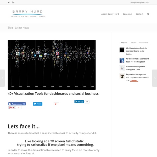
Looking 4 data visualization
The Best Tools for Visualization
Visualization is a technique to graphically represent sets of data. When data is large or abstract, visualization can help make the data easier to read or understand. There are visualization tools for search, music, networks, online communities, and almost anything else you can think of. Whether you want a desktop application or a web-based tool, there are many specific tools are available on the web that let you visualize all kinds of data. Visualize Social Networks Last.Forward: Thanks to Last.fm's new widget gallery, you can now explore a wide selection of extras to extend your Last.fm experience. Last Forward Friends Sociomap: Friends Sociomap is another Last.fm tools that generates a map of the music compatibility between you and your Last.fm friends. Fidg't:Fidg't is a desktop application that gives you a way to view your networks tagging habits. Fidg't The Digg Tools: Digg.com has some of the best web-based visualization tools on the net, so they're a must for any visualization list.
The Best Tools for Visualization
Visualization is a technique to graphically represent sets of data. When data is large or abstract, visualization can help make the data easier to read or understand. There are visualization tools for search, music, networks, online communities, and almost anything else you can think of. Visualize Social Networks Last.Forward: Thanks to Last.fm's new widget gallery, you can now explore a wide selection of extras to extend your Last.fm experience. Last Forward Friends Sociomap: Friends Sociomap is another Last.fm tools that generates a map of the music compatibility between you and your Last.fm friends. Fidg't: Fidg't is a desktop application that gives you a way to view your networks tagging habits. Fidg't The Digg Tools: Digg.com has some of the best web-based visualization tools on the net, so they're a must for any visualization list. One more: Digg Radar. YouTube: You can discover related videos using YouTube's visualizations. Visualize Music Musicovery Last.fm music visual tools: Amazon Data
22 free tools for data visualization and analysis
You may not think you've got much in common with an investigative journalist or an academic medical researcher. But if you're trying to extract useful information from an ever-increasing inflow of data, you'll likely find visualization useful -- whether it's to show patterns or trends with graphics instead of mountains of numbers, or to try to explain complex issues to a nontechnical audience. There are many tools around to help turn data into graphics, but they can carry hefty price tags. The cost can make sense for professionals whose primary job is to find meaning in mountains of information, but you might not be able to justify such an expense if you or your users only need a graphics application from time to time, or if your budget for new tools is somewhat limited. If one of the higher-priced options is out of your reach, there are a surprising number of highly robust tools for data visualization and analysis that are available at no charge. Data cleaning
Gapminder: Unveiling the beauty of statistics for a fact based world view.
20 Powerful Infographic Design Kits
Infograpics have become so popular these days and as a result more and more high quality infographic design kits are made available to help designers. Infographics can be used very effectively to present complex data in a nice visual and powerful way. It is done using hand-picked design elements that relate to the data they represent e.g. demographic data can be effectively illustrated using small carefully colored human icons as overlay on a simplified map. Online marketers love infographics for their ability to go viral on social networks and often they are offered as easy to embed code making it fast and simple for e.g. bloggers to share them in posts… very useful value oriented way to build links and online presence. Infograpics designs are also used commercially in information products. The huge availability of amazing infographics makes it critical to stand out and have a unique and clever design. Tips and Tricks for designing great Infographics Infographics Design Elements
20+ Tools to Create Your Own Infographics
A picture is worth a thousand words – based on this, infographics would carry hundreds of thousands of words, yet if you let a reader choose between a full-length 1000-word article and an infographic that needs a few scroll-downs, they’d probably prefer absorbing information straight from the infographic. What’s not to like? Colored charts and illustrations deliver connections better than tables and figures and as users spend time looking back and forth the full infographic, they stay on the site longer. Plus, readers who like what they see are more likely to share visual guides more than articles. While not everyone can make infographics from scratch, there are tools available on the Web that will help you create your very own infographics. Read Also: The Infographic Revolution: Where Do We Go From Here? What About Me? “What About Me?” Vizualize.me Vizualize.me allows you to create an online resume format that is beautiful, relevant and fun, all with just one click. Piktochart easel.ly
The Ultimate Guide To Infographics
What Are Infographics? I found many definitions of what Infographics are as well as explanations of how they are useful in a variety of settings. Here are a couple of the definitions I liked followed by their sources: Information graphics or infographics are graphic visual representations of information, data or knowledge. And finally, my favorite, an Infographic that explains what is an Infographic: by Hot Butter Studio. These three examples do a nice job of defining what infographics are, but what is the value of an infographic in education? The Value of Visualization from Column Five on Vimeo . The Science Behind Infographics Now that we have a basic understanding of what infographics are, This refers to the part of the video where the narrator asks the viewer to count the number of 7s in the number set. Smiciklas also notes that “Robert Lane and Dr. Infographics and Education They allow students to comprehend, interpret, and analyze complex information in a quick and clear manner.
15 Effective Tools for Visual Knowledge Management
Since I started my quest a few years ago searching for the ultimate knowledge management tool, I’ve discovered a number of interesting applications that help people efficiently organize information. There certainly is no shortage of solutions for this problem domain. Many tools exist that offer the ability to discover, save, organize, search, and retrieve information. However, I’ve noticed a trend in recent years, and some newer applications are focusing more on the visual representation and relationship of knowledge. I believe this is in part due to the wider adoption of mind mapping (and concept mapping), and leveraging concepts and advances in the semantic web community. 15. Link: Platforms: Win, Mac, Linux Cost: Free (Open Source) DeepaMehta is a “networked semantic desktop” that replaces the traditional computer desktop. 14. Link: Platforms: Mac Cost: $179 Tinderbox stores and organizes your notes, plans, and ideas. 13.