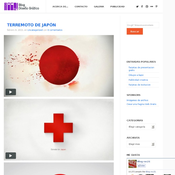
Graphic Design Theory: 50 Resources and Articles
As designers, we often focus on the practical aspects of design above all else. We focus on what works, with little regard for why it works. And in our day-to-day work, that outlook serves us well. It lets us get our work done in an efficient, professional manner, and generally nets good results. But spending some time on the theory behind the graphic design principles we use every day can expand our design horizons. General Design Theory There are a lot of general design theories and principles out there that apply to all forms of design, whether in digital or print mediums. The Principles of Design This article from Digital Web Magazine covers the basics of design theory, including balance, rhythm, proportion, dominance, and unity. Graphic Design Theory? How Good is Good? Can Graphic Design Make You Cry? The Lost Principles of Design An illustrated guide to the basic principles of graphic design. Want to Know How to Design? Layout Principles Color Theory Typography
Best of The Week
This is a weekly post where we bring together great articles you might have missed.All these hand picked articles are for web designers and developers and we are sure you will find many useful yet innovative articles in this post.Enjoy!!!...
Blog de diseño grafico - Pixeros.com
arQtistic - Architecture as an art
Turn Your Photos into Beautiful Glass Etchings!
Before printers spewed out photos on paper, photos were printed on glass! Sure, that sounds like the kind of thing your Uncle Buck would make up, but we’re telling you, it’s totally true. Just to prove it, here’s a tutorial on how to put your own photos on glass with etching! It’s a different technique than 19th century photographers used and is as easy as old school iron-on transfers. The results? Etch Any Photo Onto Glass Why it’s clearly cool: Using this technique, you can personalize every glass surface you can think of. Flat pieces of glass are easy to find and cheap to buy–think craft stores or old frames. All you need is your favorite photographs and just a little bit of elbow grease (or etching cream!). What You’ll Need: Step 1 – Ditch The Colour Once you have your photo picked out, desaturate it to black & white. Step 2 – Stamp it Out! The stamp filter in Photoshop does an amazing job of preparing a photo for etching. You can find it under Filter > Sketch > Stamp. Step 3 – Invert!
Design daily news
Smog Design Incorporated .·°
Diseño web, iconos, fuentes, plantillas, archivos psd, tutoriales photoshop
La Breve Historia
octubre 3, 2012octubre 3, 2012Cultura Colectiva “Te espero. Hace mucho que te espero. Cada punto es un pensamiento. Me gustaría que volasen hacia ti. Twitter143 143facebook1470 1470pinterest0 0google plus0Share 0linked in0 0email0 0stumbleupon0Share 0meneame0Share Share “Te espero. Hace mucho que te espero. Cada punto es un pensamiento. Me gustaría que volasen hacia ti. Que estallaran en tus oídos. Que escuchases los fuegos artificiales. Te espero y no estás. No estás en la cama. No estás en el baño. No están tus silencios. Ni tus ruidos, ni tus olores. No estás y punto. Y aún así te sigo esperando. Te espero y te quiero. No pienso terminar nunca. Si termino podría significar que no vuelves. Como en aquella historia triste de esa mujer que no tenía esperanza. Podría significar que te olvido. Y no hay nada peor que el olvido. Me dejaría sin recuerdos. Me dejaría sin nostalgias. Me quedaría más sola que nunca. Aunque, a fin de cuentas, me has dejado sola. Te quiero y no estás. Pero tu no estás muerto hasta que yo lo decida.
3-part portraits
Photography Germany-based street photographer Adde Adesokan asked strangers to portray them in these 3-part portraits. Their personalities seem to be captured well in these stunning images. The result is amazing.
IdeaFixa | ilustração, design, fotografia, artes visuais
Nuevos trabajos de Toykyo
Uno de mis estudios favoritos de diseño e ilustración sin lugar a dudas es Toykyo del cuál ya les hemos hablado en un par de ocasiones; fundado en 2006 en Bélgica abordan casi todos sus proyectos a partir de la ilustración de personajes. Este estudio también es responsable de las colaboraciones con diferentes artistas a través de Casey Studio. Toykyo Comments comments
Blog, Diseño Grafico, Diseño Web, Desarrollo Web, Recursos | ARTEgami
DIY Artwork - Easy Painting Ideas - Paint Projects
UPDATE: The long weekend is the perfect time to start some new projects, so why not try this awesome (and so easy) artwork DIY? This story was originally published on July 25. If there are two things that have been commanding our attention lately, they're cool artwork and chevron prints. Inspired by the work of artist Nancy Ramirez, two stellar Refinery29 interns collaborated on this easy-does-it way to spice up an empty wall. From the moment we spied this Nancy Ramirez painting on Pinterest, we were smitten. To do this project, you'll need: A canvas, in any size you choose Painter's tape Acrylic paints in your preferred colors, plus one bottle of white paint A paintbrush (or two, if you'd rather alternate brushes than wash one between colors) Scissors A disposable plate, wax paper, or scrap cardboard to use as a palette Paper towels or a drop cloth to cover your work area Assemble your paints and squeeze a quarter-size amount of each color onto your palette. Et voilà!