background preloader

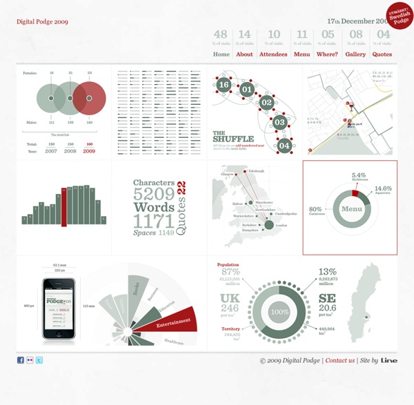
Digital Podge 2009 - Measurable Fun

Digital Podge 2009 - Measurable Fun
Digital Podge 2009 17th December 2009 Swedish Podge 2010

Ahrens - Büro für visuelle Kommunikation + Design, Lars Ahrens, Design, Webdesign, Grafik, Mediengestalter, Freelancer, Werbeagentur, Werbung, Bonn, Köln, Bad Neuenahr 50 Great Examples of Data Visualization Wrapping your brain around data online can be challenging, especially when dealing with huge volumes of information. And trying to find related content can also be difficult, depending on what data you’re looking for. But data visualizations can make all of that much easier, allowing you to see the concepts that you’re learning about in a more interesting, and often more useful manner. Below are 50 of the best data visualizations and tools for creating your own visualizations out there, covering everything from Digg activity to network connectivity to what’s currently happening on Twitter. Music, Movies and Other Media Narratives 2.0 visualizes music. Liveplasma is a music and movie visualization app that aims to help you discover other musicians or movies you might enjoy. Tuneglue is another music visualization service. MusicMap is similar to TuneGlue in its interface, but seems slightly more intuitive. Digg, Twitter, Delicious, and Flickr Internet Visualizations

McKinney Découvrez 5 sites avec une navigation et un concept original #19 - Blog Du Webdesign Magazine Des sites originaux, fun et créatifs ! Voici ce qui vous attends dans ce nouveau numéro. Vous pourrez découvrir une façon originale de présenter la vente de Sneakers et également une jolie expérience réalisée en Html 5. Bonne lecture. Born with design Une présentation originale pour ce portfolio qui nous plonge au milieu d'objets que l'on retrouve au quotidien. Name that sneaker Un très bon site pour la marque Satorisan qui propose de découvrir sa dernière collection de Sneakers sur son site. Freakischik Freakischik aka Florence Rampin est Directrice Artistique sur Paris et travaille actuellement avec l'agence interactive Dagobert. Moonda Agence de communication interactive située à Bordeaux, elle travaille dans divers domaines de la communication, événementielle, web, jeux interactifs, etc. Floweroscope Pour terminer cette sélection, un site qui offre une expérience créative réalisée en Html5 !

A Brief Look at Grid-Based Layouts in Web Design Take a look at some of the biggest sites out there today that are showcasing top-notch designs. It’s very likely they’ve used a grid of some sort. Grids enable stability and structure in a web layout, giving the designer a logical template to build the site on. Grids don’t mean you have to have a boring design. "The grid system is an aid, not a guarantee. - Josef Müller-Brockmann Grid Basics Let’s talk some grid lingo. Grids are traditionally found in print work but are very applicable to web design. A grid is simply a tool to help designs, not something that should hurt the design in any way. Understand and Follow the Rules When you start learning a new skill in any given subject, you should follow its guidelines. Starting out with grids is no different; you should follow the grid and keep all your design elements aligned and in its place. There are two ways to establish a grid template: Create your own grid Your grid can be as complex or as simple as you like. Break the Rules Vegas Uncork’d

31Three 35 Great Social Media Infographics 35 Great Social Media Infographics [Note: I recently updated this compilation to include some more recent visualizations... you can see it here.] Here’s a collection of terrific social media infographics that might come in handy. As you probably know, infographics are visual representations of information, data, or knowledge. They illustrate information that would be unwieldy in text form and they act as a kind of visual shorthand, making information easy to understand and consume. It’s very helpful to use infographics in presentations, reports, articles, etc., to convey concepts. Most of these have been scaled down or cropped. If you know of any good ones that I’ve missed, please leave a comment and let me know! 1. 2. 10 Levels of Intimacy in Today’s Communication 3. 4. 5. 6. 7. 8. 9. 10. 11. 12. 13. 14. 15. 16. 17. 18. 19. 20. 21. 22. 23. 24. 25. 26. 27. 28. 29. 30. 31. 32. 33. 34. 35.

GoMo: An Initiative From Google Limbus Studio | design & communication | webdesign - création gr Masonry A Collection of “Coming Soon” Web Pages “Coming soon” pages are a great way for websites to engage and connect with visitors, even before the actual site is published. A well designed “coming soon” page is a great teaser to grab the attention of potential visitors and make them look forward to the website’s launch. These pages usually include a short sign up form or social media links to notify visitors of updates and the release date. From minimalist approaches, to elaborate illustrations, there are virtually unlimited ways to create an eye catching design for these website teasers. In this post, you’ll find a great collection of “coming soon” pages that you can use for inspiration when designing your own. Earth Hour Dialed Tone Foundation Six Creative Daddy Just A Love Watcher Knot Theory Accentuate Freshter Rumble Labs deveSigner Gigdom Tweet Snack Johnny Walker Plumbing Space Rabbit Moses Mehraban Luke’s Beard Uooo.TV FavMovie Deaxon EnStore Better Blogger Jobrary After Some Words MediaLoot The Helvetia myNiteLife SquidChef Groupfire Fast Society Sweet

40 Useful and Creative Infographics Six Revisions Menu Main Categories CSS HTML JavaScript Web Design WordPress Web Development Design Inspiration UX Design UI Design Freebies Tutorials Tools Links About Contact Advertise RSS Twitter Facebook 40 Useful and Creative Infographics By Jacob Gube Information graphics (or infographics) are graphical depictions of data and information. In this collection, you’ll find forty beautiful and educational infographics, displaying the uncommon spectacle of "art meets science". 1. The proportion of ingredients for popular coffee drinks and their pronunciation keys. 2. This infographic showcases the history of the Swine Flu, starting from 1976. 3. 4. 5. The top breweries and beers in the U.S. 6. 7. 389 Years Ago A rundown of the historic events in African-American culture. 8. 9. 10. 11. An illustrated guide at how the Global Warming phenomenon works. 13. A packed visual piece on tobacco chemicals and tobacco trade worldwide. 14. 15. 16. A graphical representation of consumer spending across the globe. 17.

Google Chrome - Away From Home Voici la nouvelle publicité vidéo pour Google Chrome, réalisé par le studio Süperfad. Vantant les mérites du navigateur que cela soit sur écran d’ordinateur mais aussi sur Android ou tablette, cette création de papier simple et efficace se dévoile dans la suite.

Related: