
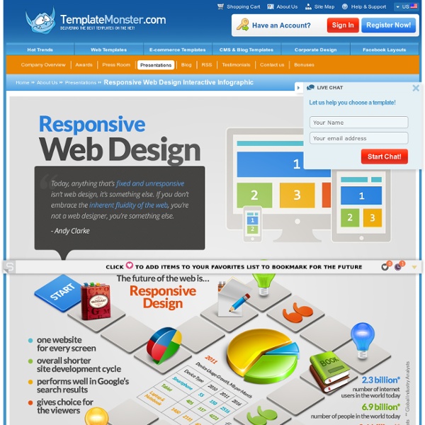
Interactive Guide About Responsive Web Design On Board! Everyone is familiar with Infographics, but not many people know that they are considered to be the inheritants of weather maps. At some point in your life you’ve probably created an Infographic, if you’ve ever drawn out a quick map to help someone find your house, or created a chart graphing with data you collected. These small units of visual information contain lots of information when they are closely studied, and they organize the info in a very accessible way. For the last couple of years the popularity of Infographics increased exponentially. Still, as it happens to something upstart – it bores the audience. That’s why static Infographics ain’t working anymore! But, what does it mean interactive? Here we’ve united the most important information one needs to know about Responsive Web Design and backed it all up with 15 blog articles, 5 quotes, 11 free PDF books, Google recommendations, as well as 65 tutorials, 20 plugins, 19 tools and some examples of Responsive Website Templates.
Herramientas gratis para crear infografías y guía para hacer infogramas La infografía es una representación gráfica que incluye mapas, tablas, gráficas y diagramas, que permite comunicar de manera simple conceptos complejos. Los pasos para crear una infografía son: 1. Elija el tema de la infografía El primer paso para hacer una infografía es elegir el tema de la infografía. Algunos ejemplos generales de temas para hacer infografías son: La explicación de un conceptoLa explicación de una tecnologíaDatos estadísticosResumen de un documento Es ideal que la idea sea popular en Internet y en especial en las redes sociales ya que esto facilitará la viralidad de la infografía cuando esté concluida. 2. Se debe realizar un proceso de recolección de datos del tema a abordar. 3. Es importante organizar la información recopilada agruparla por tema y subtemas, para esto puede ser útil un programa de mapa conceptual. 4. Una vez organizada la información recopilada, se debe empezar a realizar un bosquejo de la infografía. 5. En el diseño se debe tener en cuenta: 6.
The ultimate guide to flat design It is easy to say that 2013 has so far been the year of flat design. Even Apple, the driver of the skeuomorphic design trend for many years, is trying some level of flat design when it releases iOS 7 later this year. So are you ready to try it out as well? Not sure how to get started? WebdesignerDepot is here to help with a guide of flat design resources. We’ve put together a giant list of everything flat design, from free UI kits to color palettes to typography options. If you want to test the flat design waters or swim out a little deeper, we have everything you need to get started, from ready-made tools to tutorials for the do-it-yourselfer. Flat design 101 Flat design is a style that lacks the “tricks” designers often use in order to create a realistic or three-dimensional effect. Flat design techniques avoid embellishments such as bevels, embossing, drop shadows, gradients or artificial textures. Animation is typically avoided in flat design projects and large images are in. UI kits
InfiniGraph | Source of Social Intelligence 14 Infographics to Help Organize Your Kitchen With the right preparation and setup, your kitchen can be a magical place where you create the most amazing gustatory sensations. Without the right preparation? That space could become, at worst, the scene of a culinary disaster — and at best, a messy place where you just cooked a mediocre meal. The 14 infographics below have one main purpose, above all: to help you find the right tools for your kitchen and enable you to cook in it the culinary feats you’ve always imagined yourself preparing. One of the most common reasons a recipe fails is because of incorrect quantity conversions. To help keep that from happening, these next few guides can help head off those calculations. Conversions aren’t the only important information to have in the kitchen, though. The Splendiferous Array of Culinary Tools shows how wide of an array there is of kitchen gadgets, and the general purpose each of them serves. It’s also important to know what food to stock and how long it lasts.
» QR Code pour se connecter aux Pirates Box Récemment, je découvre l’application « Wifi Générateur de code QR » pour Android. Une application très pratique pour partager son Wifi avec ses invités sans qu’ils aient à taper la clé Wifi. J’ai tout de suite pensé que ça serait parfait pour se connecter aux Pirates Box. Génerez le QR Code pour le Wifi de la Pirate Box avec l’application et envoyez l’image du code vers votre ordinateur ( via Mail, DropBox …) afin de l’imprimer sur vos Stickers, Flyers etc … Il n’y a plus qu’a scanner le code avec par exemple Barcode scanner pour se connecter directement au Wifi de la Pirate Box. Vous pouvez également utiliser ce générateur de QR Code en ligne pour créer l’image. Voici le Stickers récupéré sur et modifié avec le QR Code généré.
ShopMail - Product Offer Responsive Email Template Mojo Themes ShopMail is a set of email templates,designed to provide your customers new product offers,services right in there inbox in an attractive way & to increase your sales. Features & Content Total 182 HTML Email Templates(12 Colors,13 layouts in each color)5 Different shops presented- Clothes,Shoes,Flowers,Cosmetic,Electronics.Almost no images used in making template elements(except icons,top banner)Mobile Optimized for various mobile email clientsYou can copy/paste content blocks (tables) from layout to another to create your own layout.Layered elements PSD files,top banner 13 PSD files,8 full PSD files.Detailed documentation with HD video demonstrations covers PSD & HTML editing, sending the template, using it in Mailchimp,Campaignmonitor and useful tips.Tested hard with various email clients.Checkout screenshots,testing links Click here to watch Video Demo 1 Click here to watch Video Demo 2 Make Captions On & While Watching At Full Screen,Change Quality To HD. MailChimp Templates PSD Files
Visual.ly: un nuevo servicio para crear y compartir infografías en la Red Ampliar foto Visual.ly ofrece opciones para explorar, compartir y crear nuevas infografías Ampliar foto Algunas infografías que circulan por la red se pueden encontrar en Visual.ly para utilizar como inspiración o consultar su autoríanoticias La sabiduría popular casi siempre funciona; en el caso de Visual.ly, un nuevo servicio de Internet para compartir, crear y usar infografías visuales, se trata de hacer bueno aquello de una imagen más que mil palabras. Y es que, ¿a quién no le gusta recrearse en la lectura de datos con todo tipo de gráficas visualmente atractivas, iconos y explicaciones cortas, directas y al grano? Llámense infografías, visualizaciones de información o esquemas de representación de datos -todo depende de los diseñadores, estadísticas y las diversas escuelas de pensamiento- lo cierto es que esta forma de presentar la información es tan útil como atractiva. Ahora Visual.ly ofrece un archivo completo y especializado para compartir este tipo de trabajos con los demás.
La vidéo du jour 02 avril 2014 My face is in space Réalisé par Thomas Jobbins le court métrage « My face is in space » raconte l’histoire de Larry, un doux rêveur des années 1970, passionné par l’espace. 31 mars 2014 Robert Mapplethorpe par Patti Smith Entrecoupant les souvenirs de ses expériences new-yorkaises avec Robert Mapplethorpe de chansons acoustiques et de lectures de son récit autobiographique « Just Kids », Patti Smith fait souffler un vent d’émotion parmi les nombreux visiteurs rassemblés dans l’auditorium du Grand Palais. 29 mars 2014 Ici, là et partout Réalisé par Sawako Kabuki, le court métrage «Ici, là et partout », évoque l’aspect éphémère de l’amour à travers des objets qui se métamorphosent successivement. 22 mars 2014 Les Halles reviennent au Petit Palais « Les Halles », toile monumentale (400×630 cm) de Léon Lhermitte réalisée en 1895, retrouve les honneurs de la Grande Galerie du Petit Palais, Musée des Beaux Arts de la ville de Paris après soixante dix ans de réserve. 17 mars 2014