Bebe le strange
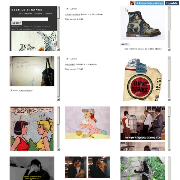
bebe le strange 'Images -- millions of images -- that's what I eat' --William S. Burroughs (click here for pics only) alyptoph: (Source: velvetharrys) (Source: shelley-fabulous) RIP Peaches Geldof daily-boombox:Ladytron- Seventeen Play count: 6,877 negat0ry: doc martens pascal boot (the classic eight-eye) now comes in a reproduction of the right panel of heironymus bosch’s garden of earthly delights gtfo (Source: solestruck.com) (Source: daynaelaine) songs4lyf: Metallica - Whiplash Play count: 3,815 (Source: kaliforniababylon) 4cp: gameraboy: Marc Davis explaining the “elongating stretching room” in the Haunted Mansion for the Disneyland Tenth Anniversary Show in 1965. (Source: thewholigans) soundsof71:sarah-kuran:jimmy page (Source: lolcatsinlove) Powered by Tumblr | Theme by Heather Rivers
The Lab Magazine Online
watching traffic | written and directed by ed stockham
YIMMY'S YAYO™
DesignWar : art, design, photography, architecture, streetart, fashion, advertisement, cinema & tv - free graphic stuff
The World’s Greatest LP Album Covers, 45’s too
JJJJound
welcome : AMUSEMENT
Here to There [oF] - "programmed illustrations" by @theowatson + Emily Gobeille aka @design-io / + WIN ONE!
Inspired by the childhood memories of artworks on their bedroom walls, Here to There is a project by Emily Gobeille & Theo Watson (Design I/O) created two years ago, now available as a limited run of prints. For the project, the duo developed a suite of software tools using openFrameworks to programmatically build elements based around concepts like algorithm, permutation, cause and effect, and topology to name a few. More than 25 mini openFrameworks applications were created that would output graphics as postscript. The graphics outputted by the OF apps became the basic building blocks for the posters, which were combined with character design, narrative and illustration, to create the story of the two worlds of Here To There: the ‘City’ and the ‘Jungle’. Some of the apps would process input input images, while others were drawing tools which would be used to create custom elements for the posters. To read more about the project, visit the project page. Contest Contest now closed.
Stripeyhorse Creative
June 29th, 2012 We really like the new logo design for British Gymnastics. Using bright bold colourful graphics the swirls track the motion of a gymnast. There is also a video that accompanies the logo design, check it out on our facebook page. Via the Creative Review website And strangely enough in the comments someone has linked to this website, the go to wall for in-situ visuals. June 8th, 2012 We think these posters are just kinda cool! June 6th, 2012 Some really cool and colourful Origami street art has been popping up in France. More of her paper designs can be viewed on her personal website, she also works in lace and other materials. Via the website: May 30th, 2012 Jonathan Harris speaks a little about ‘Rethinking Social Networking’. He describes Twitter as a terminal velocity in terms of how fast communications can go. Via the Swiss Miss website May 16th, 2012 The festival season is upon us once again. We just really really want one of these! April 18th, 2012
I Love CDs
Matt Ottdal has a series of old and new typography experiments. He decided to showcase them in his favorite format, CD covers! "This is my tribute to the Compact Disc format before it settles down into the grave with the Compact Cassette. This is just a collection from old and new typographic experiments. And in my imagination, it would be great if each of my clients had their own music soundtrack. In that case, this is my collection" Designed by Matt Ottdal
WANKEN - The Blog of Shelby White
Related:
Related:


