
Advanced CSS Menu Trick CSS really opens the doors to a lot of powerful and rich opportunities. It is funny how such minor things can create a whole new look, feel, and effect of a site. The beauty of CSS really is that it gives you power, but not too much power. It is not a tool like flash that really invites you to run away and take things too far. We are now coming to a point where the browsers are supporting a lot of new features, giving us more opportunities to take advantage of previously unused pseudo elements. The goal of the demo – example What we want to do here, is instead of simply altering the state of the navigation item the user is currently rolling over, we want to alter the non navigation items as well. The first step – CSS roll overs The first step of the game is building some CSS roll overs. Image Examples Menu Before Button Sliced, fixed and hover states The CSS The HTML IE7, Safari, Firefox, all support the :hover pseudo selectors so let’s take advantage of that. The CSS Live Example
How To Build an Animated Header in jQuery Home > CSS, Front End Development, HTML, Javascript > How To Build an Animated Header in jQuery Why not give a little flair to your header. This tutorial will show you how to animate your header’s background image using jQuery to give your website that little extra something. What We Are Building We are going to build a header that animates it’s background. We will also encase the header in shadow for the little extra dramatic effect. How it’s Going to Work The header background image is going to be super tall. Now that we have our background image, we will also need to create a shadow overlay image. After that it’s just a matter of animating the background image with jQuery so it scrolls. Getting Started The first thing we’re going to need is the HTML in place. Here is the HTML: The CSS We aren’t going to do anything too difficult here. Here is the CSS: Just a note, the png transparency won’t work in IE6. The jQuery There are a couple ways of animating the background with jQuery.
The Parks of the World The urban park is an impactful place. Humans of the 21st century are spending more time than ever living, working, and socializing in busy, overcrowded, mega metropolises. The 7 billionth person was recently born, and it is estimated that three quarters of the world’s population will be living in cities by the year 2050. Thus the importance of green space allowing this growing population the room to spread out. Aside from the obvious major environmental impact that parks have, we should investigate the social influences. Who uses these parks and what for? This project started in part because of a simple question that I wanted to find the answer to: How does the size of Golden Gate Park compare to that of Central Park? With this project I’ve begun to examine the size differences between each of the large city parks that I’ve visited around the globe. Parks are more than just a section of town with grass and trees where dogs run around and yuppies play frisbee.
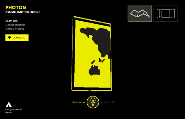
Powerful New CSS- and JavaScript-Techniques (2012 Edition) Advertisement Since our last round-up of useful CSS techniques1, we’ve seen a lot of truly remarkable CSS geekery out there. With CSS3, some of the older techniques now have become obsolete, others have established themselves as standards, and many techniques are still in the “crazy experimentation” stage. Since the release of the previous post, we’ve been collecting, sorting, filtering and preparing a compact overview of powerful new CSS techniques. Please note that many techniques are not only CSS-based, but also use HTML5 and JavaScript. Table of Contents CSS Transitions And Animations CSS transitions and animations are often used to make the user experience a bit more smooth and interesting, especially when it comes to interactive effects on hover or on click. Interactive CSS3 lighting effects7 An interesting effect to create interactive lighting effects with 3-D transforms, CSS gradients and masks; the cast shadow was created using box shadows and transforms. Visual Techniques with CSS
Dynamic Page / Replacing Content By Chris Coyier On This article is an update to this old article, which had an ugly demo and a variety of techniques in it no longer probably considered good practices. This new demo is much cleaner, up to date, and fuller featured. Because the old article was a bit of a different scope, I'll leave it alone, just refer to this one. Update January 2013: There are better practices now, detailed here. Let's say you wanted to make a website where clicking buttons in the nav would dynamically load some content. View Demo Download Files #The HTML: It all works without JavaScript There is no excuse for the navigation of a website to be completely broken without JavaScript enabled. The navigation links to the files that contain that content, and are fully formed functional pages on their own. <nav><ul><li><a href="index.php">Home</a></li><li><a href="about.php">About</a></li><li><a href="contact.php">Contact</a></li></ul></nav> #jQuery JavaScript The JavaScript is the fun part here! #Prereq #Code Dump
jQuery to animate image from left to right The Communications Market 2012 (July) This is Ofcom’s ninth annual Communications Market report. This supports Ofcom’s regulatory goal to research markets and to remain at the forefront of technological understanding. Viewers watched an average of four hours per day in 2011 – up from 3.7 hours in 2004. Over a third (37%) of UK adults with home internet watch online catch-up TV. Read more... UK radio listeners listened to an average of 22.5 hours of radio each week, up by 24 minutes on 2010. Listening to the radio on digital devices has increased to 29.2% of total listening, with DAB accounting for two thirds of this. More than four in ten UK adults say they own a DAB radio set, a 4.4% year-on-year increase. Total UK radio industry revenues reached £1.2bn in 2011, an increase of 3.5% year on year. Read more... Two fifths of UK adults now own a smartphone, with the same proportion saying their phone is the most important device for accessing the internet. The average Briton now sends 50 texts per week Read more... Read more...
Prefix free: Break free from CSS vendor prefix hell! -prefix-free lets you use only unprefixed CSS properties everywhere. It works behind the scenes, adding the current browser’s prefix to any CSS code, only when it’s needed. The target browser support is IE9+, Opera 10+, Firefox 3.5+, Safari 4+ and Chrome on desktop and Mobile Safari, Android browser, Chrome and Opera Mobile on mobile. If it doesn’t work in any of those, it’s a bug so please report it. Just before you do, please make sure that it’s not because the browser doesn’t support a CSS3 feature at all, even with a prefix. In older browsers like IE8, nothing will break, just properties won’t get prefixed. Test the prefixing that -prefix-free would do for this browser, by writing some CSS below: Properties/values etc that already have a prefix won’t be altered. It’s not ideal, but it’s a solution, until a more intuitive way to deal with these cases is added in -prefix-free. Please note that in unsupported browsers like IE8, no such class will be added. Firefox (and IE?)
CSS UL LI - Horizontal CSS Menu Second Picture is devoted to original tutorials about 3D graphics, Photoshop, Photography and Web Design. 31.10.2008 Category: Web Design In this tutorial we're going to create a professional horizontal CSS menu. First we are going to create a HTML list by using Unordered List (ul) and List Item (li) elements. Picture 1. Previous knowledge about some basic HTML and CSS is required. ul (Unordered List) li (List Item) a (Anchor / Link) This is a CSS tutorial so I'm not going to go through the creation of the graphics used in this tutorial. HTML List (ul li) With Links Let's start by creating a list with links in HTML: <ul> <li><a href="#">Home</a></li> <li><a href="#">Products</a></li> <li><a href="#">Services</a></li> <li><a href="#">About</a></li> <li><a href="#">Contact</a></li> </ul> ul tags define the whole list and each list element is defined with li tags. Picture 2. UL CSS Styling First I change the background color to black. Now we are going style the ul with CSS. Picture 3.
Garage Door Style Menu Originally published on July 21, 2008 as only a jQuery technique. Now updated to include CSS3 and a combo technique which is mo' betta. A garage door style menu is where an image (the "door") slides up to reveal something behind it. We'll do this in two ways, with CSS3, and with jQuery. Then we'll combine them into a progressive enhancement way to handle it. The jQuery Method Right out of the box, jQuery provides the animate function, which allows us to morph some CSS attributes over time. Thankfully, there is a plugin to help with this, the Background-Position Animation Plugin by Alexander Farkas. View Demo Download Files 1. We are going to need three different types of images here. Notice my guides. Second, we'll need to create the garage doors which we will call the "shutters". Lastly, we need a window which will act as the garage frame. 2. Here is the menu markup: The ID on the menu will give us all the specificity we need. 3. The menu background is applied to the UL itself. 4. if (!
Separate Mobile Website Vs. Responsive Website Advertisement The US presidential race is heading into full swing, which means we’ll soon see the candidates intensely debate the country’s hot-button issues. While the candidates are busy battling it out, the Web design world is entrenched in its own debate about how to address the mobile Web: creating separate mobile websites versus creating responsive websites. It just so happens that the two US presidential candidates have chosen different mobile strategies for their official websites. We’re going to see how well their mobile Web experiences stack up. Why Bother With Mobile? Why are the candidates attempting to create mobile-optimized Web experiences? What’s more is that people are arriving to the mobile Web through more diverse channels than ever before. These are just a few channels that drive people to the Web on mobile devices. The candidates see mobile as a big opportunity to turn visitors into voters. Why Would Anyone Visit A Candidate’s Website? The Information-Oriented Visitor
How to Build a Kick-Butt CSS3 Mega Drop-Down Menu Often used on e-commerce or large scale websites, mega menus are becoming more and more popular, as they offer an effective solution to displaying a lot of content while keeping a clean layout. In this tutorial, we'll learn how to build a cross-browser, awesome CSS-only drop-down mega menu, using nice CSS3 features. Step 1: Building the Navigation Bar Let's begin with a basic menu, built with an unordered list and some basic CSS styling. Creating the Menu Container We'll now apply some basic CSS styling. Now, let's see how we can improve it with some CSS3 features. For rounded corners, the syntax will be : For the background, we'll use gradients and a fallback color for older browsers. The first line applies a simple background color (for older browsers); the second and third lines create a gradient from the top to the bottom using two colors : #0272a7 and #013953. We can now add a darker border and polish the design with a "fake" inset border created with the "box-shadow" feature. HTML Part
Building an Animated Cartoon Robot with jQuery Why? Aside from being a fun exercise, what purpose does something like this have? None that's plainly obvious. Its about as useful as a miniature ship in a bottle. View Demo Overview This project was created by layering several empty divs over each other with transparent PNGs as background images. The backgrounds were animated at different speeds using a jQuery plug-in by Alexander Farkas. The robot is comprised similarly to the background animation scene by layering several DIVs together to create the different robot pieces. The Markup <div id="wrapper"><div id="cloud-01"><div id="cloud-02"><div id="mountains-03"><div id="ground"><div id="full-robot"><div id="branding"><h1>Robot Head. The structure of the divs closely resembles our diagram. The Style The CSS for this project is just as simple as the markup. Absolute positioning is used to pull any header or paragraph text 9999px to the left of the screen. The jQuery JavaScript Disclaimer: The original script to animate the robot was horrid.
RomneyMakes.com – The Realtime Mitt Romney Wealth Calculator 18 reviews Why it's awesome For those of us with better things to do than remembering how to tie a necktie, now you don't have to. Technology wins again by embedding a zipper mechanism into the tie itself, so you will never have to remember if the rabbit goes into the hole before it goes around the mountain. Why you need it Tying this tie is easier than tying your shoes. It's that easy and looks perfect every time.