
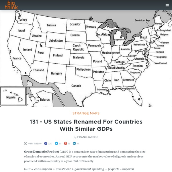
3 maps that explain America The United States of America is a young country, but it's also big and complicated and fascinating. It can be tough to distill all that down to a few maps, but here are three that capture the story of America about as well as anything. If you enjoyed this, please read our much more comprehensive 70 Maps that Explain America, which goes through everything from early colonization to slavery and its legacies to the history of American global power. 1) Watch America become the country it is today Esemono This map shows the non-Native American political borders of North America from 1750 (by which point most of the continent had been claimed by European colonial powers) through today. 2) The most common ancestry in every county U.S. The United States considers itself a nation of immigrants, and this map shows just how true that really is. 3) North America's stunning environmental wealth and diversity (Commission for Environmental Cooperation)
100 questions for a better conversation Have you ever been at a party or on a blind date only to find yourself with nothing to say? It’s an awkward feeling; still no one is stepping up to ride the room of silence. Thankfully, you’ll never have to experience that situation again. The fine folks at The School of Life have created One Hundred Questions as a kind of conversation starter-kit. Topics include: Personality & EmotionsSex & RelationshipsFamily & FriendshipWork & MoneyTravel, Culture & TasteLife & Death One Hundred Questions | School of Life Who said that there had to be an absolute answer for each and every question?
7 Maps to Help Make Sense of the Middle East - Metrocosm This amazing tangled knot of a diagram, made by U.K. data journalist David McCandless, displays the key players and notable relationships in the Middle East. However what it communicates clearest of all is something you no doubt already know: The Middle East is a confusing place. While the seven maps below don’t provide an exhaustive list of the facts, figures, rivalries, or conflicts in the Middle East, they do give some insight into the trends and forces that drive them. And hopefully, they are helpful in making sense of the region. 1) From the Middle East’s Baby Boomers to its Millennials, Education Has Come a Long Way This map shows regional literacy rates for two different age groups: ages 14 to 24 and ages 65 and up. The map is from Oxford Economist Max Roser‘s Our World in Data, a collection of data-driven graphics guaranteed to leave you optimistic about the state of the world. 2) In Majority Muslim Countries, Little Support for ISIS Sources Source: Wikipedia (Israel, Palestine)
How I Outgrew Libertarianism I was a Libertarian in college. I even volunteered for the 1980 Ed Clark/David Koch (yes, that David Koch) Libertarian party presidential campaign. As promised, the following is the story of how I outgrew Libertarianism. There were three factors: 1. Hypocrisy I became increasingly aware that many Libertarians arguing stridently against governmental regulation had business interests which would benefit directly. Furthermore, real Libertarianism isn't socio-economic Darwinism. "Let the most ruthless grab all the gold, and hope someone patches up the wounded later" didn't strike me as a cause I could get behind. 2. But every century or so eggheads proclaim some smug new utopian plan (which always sounds great on paper) destined to create a permanent steady state of prosperity and happiness. 3. I envisioned myself in such a scenario, making decisions, expending energy, and using my resourcefulness to compete. Here's the problem with "thinking it all through":
Half the World's Population Lives in Just 1% of the Land [Map] Half the world’s population lives in the yellow. The other half lives in the black. This map was created using gridded population data compiled by NASA. Whereas populations are typically broken down by geographic regions such as countries or states, gridded population data divides the world population into a grid of tiny square-shaped cells, without regard for administrative borders. The population grid used here comprises 28 million cells, each one measuring roughly 3 miles x 3 miles. The yellow region in the map includes every cell with a population of 8,000 or more people. In total, the world’s population is evenly split between the two areas, half living in the yellow and half living in the black. Plenty of open space As discussed in a previous post, by 2100, the world’s population is projected to balloon to 11 billion. Does the earth have enough room to accommodate so many people? Judging by this map, the answer is a clear yes. A higher resolution view India, Bangladesh, and China Europe
The most beautiful death Brave New World novelist Aldous Huxley was diagnosed with cancer in 1960, at which point his health slowly began to deteriorate. On his deathbed in November of 1963, just as he was passing away, Aldous — a man who for many years had been fascinated with the effects of psychedelic drugs since being introduced to mescaline in 1953 — asked his wife Laura to administer him with LSD. She agreed. The following letter — an incredibly moving, detailed account of Aldous's last days — was written by Laura just days after her husband's death and sent to his older brother Julian. Transcript follows. 6233 Mulholland Highway Los Angeles 28, California December 8, 1963Dearest Julian and Juliette:There is so much I want to tell you about the last week of Aldous' life and particularly the last day.
The 10 Best New York City Maps of 2015 - Metrocosm Despite spending an inordinate amount of time each day looking at maps, it is beyond me to select a list of the best maps from among everything posted last year on the web. There are far too many, more than I could ever hope to find, for the list to have any real meaning. Sticking to what I know best, I have compiled my favorite maps of 2015 that cover New York City. Because of its density and diversity of people and culture, its high availability of public data, and its large tech community, New York makes for some outstanding maps. With all the great work that has been done, this list could really be many times larger. The most commonly spoken language in each neighborhood that’s not English or Spanish Throughout it’s history, New York City has served as the primary gateway to the U.S. for immigrant populations from all corners of the world. This multicultural character of New York is clearly apparent when you examine which languages are spoken in the home. New York City of the past
Animated interactive of the history of the Atlantic slave trade. Source: slavevoyages.org For the full interactive version, use a larger device. Interactive by Andrew Kahn. Usually, when we say “American slavery” or the “American slave trade,” we mean the American colonies or, later, the United States. This interactive, designed and built by Slate’s Andrew Kahn, gives you a sense of the scale of the trans-Atlantic slave trade across time, as well as the flow of transport and eventual destinations. History of American Slavery, Ep 2: The Atlantic slave trade during its heyday and the remarkable life of Olaudah Equiano. There are a few trends worth noting. In the 1700s, however, Spanish transport diminishes and is replaced (and exceeded) by British, French, Dutch, and—by the end of the century—American activity. In the final decades of the trans-Atlantic slave trade, Portugal reclaims its status as the leading slavers, sending 1.3 million people to the Western Hemisphere, and mostly to Brazil. Enroll now in a different kind of summer school.
667 - Pop! Goes the World: 7.2 Billion and Counting | Strange Maps by Frank Jacobs The world has added over 800 million people over the last decade – a number so vast it is almost meaningless. Unless you convert it to more familiar units of measurement: Four Brazils. Two and a half times the U.S. More than half of China. But nothing brings the size and shifts of the world's population into focus like a world map. Both maps compared here were published on July 11, World Population Day – the first one in 2004, the second one last Friday. World Population Map for 2005 (6.4 billion) The U.N. designated July 11 as a day to 'reflect' on population issues, in commemoration of the fact that humanity passed the 5-billion mark on that date in 1987. World Population Map for 2015 (7.2 billion) Projected population growth between 2005 and 2015 represents an increase of about 12%. Let's zoom in... North America N. N. By 2015, North America will have added about 50 million inhabitants, most of which in the U.S. (+26 million) and Mexico (+13 million). South America S. S.
Mapping the Affordable Housing Deficit for Each State in the U.S. Every single county in the U.S. lacks affordable housing, and in no state can someone earning a minimum wage salary rent a two-bedroom apartment at market rate. A new report by the National Low Income Housing Coalition paints a fresh, grim picture of this ongoing affordable housing crisis. Using 2014 American Community Survey data, the report’s authors calculated the number of units families earning below 30 percent of the median income in their areas could rent comfortably, without devoting more than 30 percent of their income towards housing. Their count included units that were vacant, as well as those that were occupied by households in the income bracket defined above (called “Extremely Low Income” or ELI families in the report). Overall, the report found that only 31 such units existed for every set of 100 poor families in the U.S. But the national deficit—appalling as it is—masks even more dire housing gaps in several states.
Six maps that will make you rethink the world Save We don’t often question the typical world map that hangs on the walls of classrooms — a patchwork of yellow, pink and green that separates the world into more than 200 nations. But Parag Khanna, a global strategist, says that this map is, essentially, obsolete. Khanna is the author of the new book “Connectography: Mapping the Future of Global Civilization,” in which he argues that the arc of global history is undeniably bending toward integration. I spoke with Khanna about several of the incredible maps from his book, which he uses to illustrate some proposals for our future world that might, at first glance, seem pretty far out — like dividing the United States into seven economic mega-regions or politically integrating North America. This interview has been edited for length and clarity. One of the most impressive maps in your book is the map of the world’s mega-cities. The example of Johannesburg and Pretoria, the capital cluster of South Africa, is revealing.