
25 Beautiful Responsive Web Design Examples for Inspiration Six Revisions Menu Main Categories CSS HTML JavaScript Web Design WordPress Web Development Design Inspiration UX Design UI Design Freebies Tutorials Tools Links About Contact Advertise RSS Twitter Facebook 25 Beautiful Responsive Web Design Examples for Inspiration By Jacob Gube Responsive web design is the practice of enhancing the experience of the user by adapting the web page layout to the device he or she is using when accessing the site. Check out the beautiful responsive website layouts below for inspiration in your own responsive web design projects. 1. 2. 3. 4. 5. 6. 7. 8. 9. 10. 11. 12. 13. 14. 15. 16. 17. 18. 19. 20. 21. 22. 23. 24. 25. Related Content About the Author Jacob Gube is the Founder and Chief Editor of Six Revisions. This was published on Sep 15, 2012 Previous PostNext Post 33 Comments Georgios Sep 15 2012 I am anxious to the further development of responsive web design. Rumjhum Sep 16 2012 This collection is a bunch of fresh grapes which act as a mind appetizer for me. Jacob,
Pulsar - Fully Responsive Parallax WordPress Theme Proin montes! Mus sit nec sit in massa lundium turpis eros nisi pulvinar quis a nec, integer porta ut magna pellentesque, purus a turpis rhoncus quis porta pulvinar eu porta pulvinar! Et magna egestas eu rhoncus adipiscing egestas, tincidunt ut! Ac duis, in turpis pid ac nisi mattis turpis porttitor, sociis cum arcu? Massa etiam mus! Adipiscing eu, tempor mauris risus aenean placerat enim elementum est, ridiculus et ac augue platea augue sed urna urna parturient sed. Tincidunt, etiam tempor magna cum vut porta amet tincidunt, quis odio integer ultricies, odio aliquet adipiscing nisi ac habitasse, pid lorem lorem penatibus pulvinar in. 10 Useful Responsive jQuery Slider Plugins Perhaps after surfing through so dozens of web pages, one might find to be a little repetitive, you might wish to look for a new manner to present your new website, but on the other hand you want it to be something different, creative but not too complicated. Perhaps, we could suggest you to build something more responsive. In fact, the popular solution to all these problems would to install an independent JavaScript library, otherwise known as jQuery for a responsive content, which is also known as the responsive jQuery slider. The jQuery slider enables your web to feature responsive sliding content to sliding images and not only that it is also something that is applicable to all websites, be it professional or personal. By adopting the responsive jQuery slider into your web design, you will find that you can feature more contents even when you are dealing with a limited amount of space. Flexslider This slider has an awesome feature that resizes to fit the screen which it is displayed.
30 illustrations vectorielles personnalisables à télécharger gratuitement Source de l’illustration Parmi les amateurs de dessin vectoriel, les concepteurs ont toujours besoin de graphismes vectoriels gratuits pour illustrer un site, et parfois il peut être un peu difficile de trouver le bon. Voici donc 30 images vectorielles libres très variées : illustrations, fonds d’écran, carte de visite professionnelle, affiche de festival, bannières de promotion, stickers, boutons etc, que vous pourrez utiliser en les adaptant à vos besoins. Source des bannières de promotion Source de l’illustration Source de l’affiche Source du bon de réduction Source de la citation Source de la carte de visite professionnelle Source du flyer de location Source du flyer commercial Source de l’illustration Source de l’offre spéciale Source de la carte Source de l’arrière-plan floral Source des bannières florales Source de l’illustration Source de l’illustration Source des stickers Source du graphique Source du graphique Source des boutons Source de l’illustration Source du badge étoilé Trackbacks
40 great examples of parallax scrolling websites Today's advanced web technologies make it possible to create remarkable effects in the browser. While these effects can be gimmicky, when employed in the right way they can result in a distinctive and memorable website. One fairly recent web design trend is parallax scrolling, which involves the background moving at a slower rate to the foreground, creating a 3D effect as you scroll down the page. It can sometimes be overwhelming, but when used sparingly it can provide a nice, subtle element of depth. You'll find more advice in our pro tips for building parallax websites post. But to show how it should be done, we've collected together sites that employ the technique to good effect. The 41 greatest free web fonts 01. A-dam designs original boxer briefs and shorts for men with character, using GOTS-certified organic cotton and hand-made by people with fair wages and normal working hours. 02. 03. Choose a website builder: 16 top tools 04. 05. 06. 07. 08. 09. 10. 11. 12. 13. 14. 15. 16. 17.
touchSlider jQuery Plugin | MobilizeToday touchSlider — is a free CSS accelerated jQuery plugin optimized for desktop and mobile browsers. It can be used for sliding images and content. Features are listed below: Cross-browser support, desktop and mobile CSS accelerated Multipurpose options Responsive layout Ready for images and content Callback functions support Compatible with: Apple iPad, iPhone and iPod Touch Android Phones and Tablets BlackBerry 6+ Windows Phone 7 Google Chrome Firefox Safari Internet Explorer Opera The plugin detects if browser supports CSS transitions, resulting with 3 possible options for animation: Automatic (3D CSS transition is used if detected) JavaScript (jQuery methods will be used for animation) No Animation (slider will work with no animation, useful for browsers with poor support of JavaScript like BlackBerry OS 5) touchSlider has three available modes for sliding: Fixed value scrolling. Parameters Usage Examples
11 Beautiful Portfolios to Keep you Inspired Your portfolio is the main channel for you to show your work to your clients, so it’s very important to put some effort into it. Designers, photographers and other creative professionals can take advantage of images, type, icons and other elements to deliver an impressive portfolio. From simple and clean approaches, to bright colors and animations, every professional has their own style and vision when creating a portfolio. Today we selected some beautiful and inspiring portfolios to show you. Make sure to check out all of them to keep your inspiration flowing. Tyler Copeland Thomas Ciszewski The Brave Man – Florian Wacker isnostudio – Christophe Bouche Brad Hogan Dennis Field Roman Kirichik Ryan Barlow Tim Brack Michael Ngo Frank Chimero About the Author Gisele Muller loves communication, technology, web, design, movies, gastronomy and creativity. Related Posts 540 shares 11 Inspiring Examples of Dark Colors in Web Design Read More 490 shares 11 Impressive Service & App Websites
Free Wireframe Sketch Printable PDF Sheets These PDFs are perfect for anybody who does a lot of sketching on random sheets of paper. Included are 10 printable templates for website designs, and iPhone and iPad app mockups. Just print a few copies out on to either A4 or US Letter size paper and sketch away. The designs are proportional and use a grid of 32 pixel squares for guidance and straightforward translation to Photoshop or Fireworks etc. when you are finished. On each sheet there’s space for your job title, project name, designer name and notes. Included in the package are A4 and US Letter size PDFs of the following 10 variations: Web - 1 Screen - GuidesWeb - 1 Screen - BlankWeb - 4 Screens - GuidesWeb - 4 Screens - BlankiPhone - 3 Screens - BlankiPhone - 10 Screens - BlankiPad - 1 Screen - GuidesiPad- 1 Screen - BlankiPad - 4 Screens - GuidesiPad - 4 Screens - Blank Free License Feel free to download and use this item for both personal and commercial projects with attribution back to MediaLoot.
TouchTouch – A Touch Optimized Gallery Plugin Martin Angelov I want to share a little experiment with Tutorialzine readers – TouchTouch. It is a jQuery plugin that turns a collection of photos on a webpage into a touch-friendly mobile gallery. It works on all major browsers (except for IE7 and below) and most importantly is specifically designed with iOS and Android in mind. Highlights Smooth CSS3 animations and transitions;A responsive CSS interface that fills the screen and responds to changes in device orientation;Preloads photos only when they are needed;Supports swiping through photos;Displays onscreen arrows and listens for arrow key presses on desktop browsers; TouchTouch relies entirely on CSS3 for animations, which means that transitions are extra smooth on mobile devices (naturally, this also means that you won’t see any on older browsers). On the desktop, you get that same responsive interface and smooth animations. jQuery touch-optimized gallery How to use Using it is simple. $(function(){ $('#thumbs a').touchTouch(); });
12 Original Flat Web Designs for Your Inspiration | My Visual BriefMy Visual Brief As we are all aware, one of the trending styles these days for mobile & web UI projects is flat design. Designers have grown quite fond of flat design and it has been the chosen design direction for most up and coming websites. Flat design places the importance on functionality over design. In a nutshell, no more shadows, gradients, beveled edges, and reflections. Today we’d like to share with you some of the more original examples of flat web design that we’ve discovered while keeping My Visual Brief’s design database up to date. The Big Picture Here are some interesting examples of websites which use big photos for the backgrounds… 1. As you can see, this website for Folklore Surf is a beautiful example of original flat design. 2. Bold, bold, bold! Sunera’s website by Anna Reshetova. 3. Can you say, “wow?” Interact with me! Here are the websites that invite a user on a playful interactive experience through the way one needs to navigate them… 4. 5. 6. What’s your special today? 7. 8. 9.
CSS3 Responsive Slider / Carousel Using Radio Buttons - noJS Select catcher Created by Ian Hansson (@teapoted) Art from Brendan Zabarauskas (@bjzaba_). Browser Support: Best In Test: Firefox (transition performance) Full Support: Chrome, Firefox, Opera, Safari (latest versions of all browsers) Partial Support: IE9 (Functional, but does not support transitions) *No JavaScript Functionality (1 compatability fix though) iOS devices don't handle labels properly. You can view this page without the js iOS fix here. How Does It Work? The actual slider is much like any JavaScript slider. To save our input we are using radio buttons. We put the radio buttons at the top so when they are :checked we can use a general sibling selectors (~) to change our slider. That is all the essential CSS, the other gaff is just styling and animation. Created by Ian Hansson (@teapoted), Feb 2012.
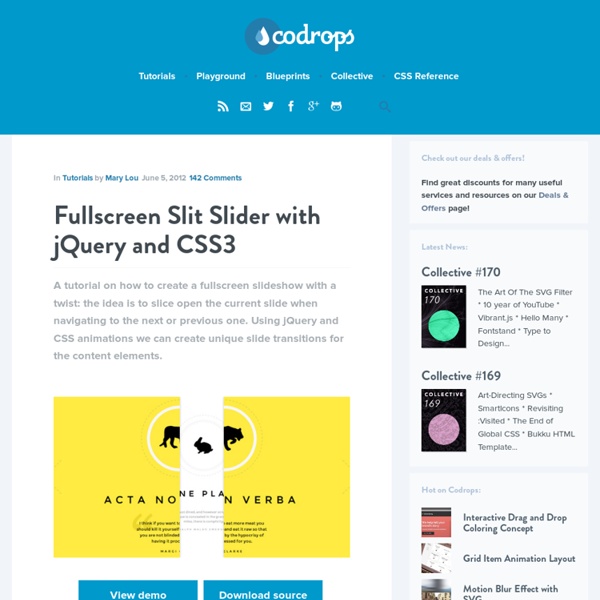
Apartament 27 – Music Club Slideshow with jmpress.js Today we will create a slideshow using jmpress.js. The jQuery plugin that is based on impress.js will allow us to use some interesting 3D effects for the slides. View demo Download source You have for sure already seen impress.js, a really great JavaScript library for creating extraordinary 3D presentations. The icons used in the demo is by Artcore Illustration and they are licensed under theCreative Commons BY-NC-ND 3.0 license. So, let’s start! The Markup We will have a main container which is a section with the class jms-slideshow. Let’s take care of the style. The CSS Since we want to make the slideshow responsive, we will give the main container a percentage width, with some min and max values: The next wrapper is dynamically added, and this will be the visible slideshow wrapper: The background color classes will be applied to the previous wrapper. The steps will have the following style: Inactive steps will have 0 opacity. The inner parts of the slides will have the following style: