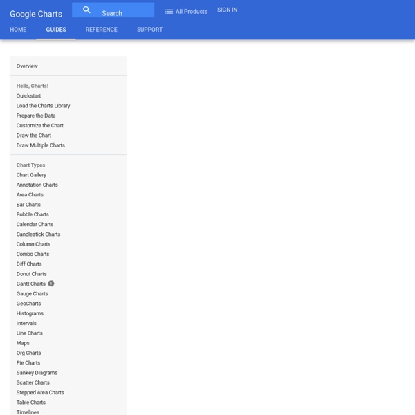
Visualization: Motion Chart - Google Charts
Overview A dynamic chart to explore several indicators over time. The chart is rendered within the browser using Flash. Note for Developers: Because of Flash security settings, this (and all Flash-based visualizations) might not work correctly when accessed from a file location in the browser (e.g., rather than from a web server URL (e.g., Example (Note that the following code will not work when loaded as a local file; it must be loaded from a web server.) Loading The google.load package name is "motionchart". The visualization's class name is google.visualization.MotionChart. var visualization = new google.visualization.MotionChart(container); Data Format The first column must be of type 'string' and contain the entity names (e.g., "Apples", "Oranges", "Bananas" in the example above). Setting Initial State Open a working chart and set the settings that you'd like to capture. Configuration Options Methods Events Data Policy
Colorblind Web Page Filter
Climat
The World Top Incomes Database
How to: Comment faire un Google Motion Chart
Google Motion Chart est un outil puissant et simple d'utilisation qui permet d'interroger facilement un grand nombre de points de données. Voici en quelques étapes simples comment réaliser le sien. Faire parler des tableaux de données, c’est pas facile. On peut les décrire à la main, mais c’est long et fastidieux. On peut en faire des visualisations, mais ça coûte cher en design. OWNI l’a testé pour expliquer les causes de la crise grecque. Tutoriel par l’exemple : Tentons d’expliquer pourquoi un pays émet du CO2. 1. Trouvez une base de données. Sélectionnez les séries de données qui vous paraissent pertinentes. 2. Pour pouvoir travailler proprement, il disposer de données homogènes. On va ici se limiter à analyser les 27 pays de l’UE de 1990 à 2007. Les onglets AI et CA donnent accès à des données plus détaillées. 3. Mettez à jour le tableau et exportez. Exportez dans Microsoft Excel. On récupère maintenant chaque tableau dans Excel. 4. 1990 1991 Belgium 12 3 Bulgaria 15 4 5. 6. 7.
How to Find the Right Chart Type for your Numeric Data
22 Feb 2016 Charts help you visualize numeric data in a graphical format but the problem is there are just too many types of charts to choose from. This diagram will help you pick the right chart for your data type. couch mode print story Charts help you visualize numeric data in a graphical format but the problem is there are just too many types of charts to choose from. You have bar charts, bubble charts, pie charts, line histograms and so on. If you are finding it hard to pick the right chart type for your type of data, refer to chart chooser diagram. The poster, designed by Andrew Abela, is also available as a PDF. Related: Create Graphs Online with Google Charts You may also want to check out Chart Chooser – an online tools that lets you shortlist charts visually. Comments are closed but if you want to respond, please send me an email or tweet.
Related:
Related: